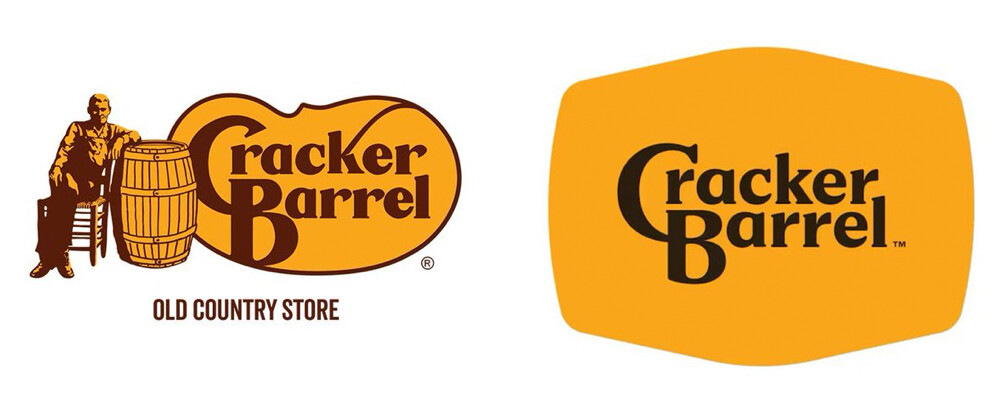
Cracker Barrel is in the news for a new logo replacing their previous 47-year-old logo. What do you think? A needed brand refresh or the abandonment of an iconic mark? It reminds me of a western belt buckle, but I have no idea if that was the intention.
3 Likes
I really like it, but between brown and black. My only suggestion is to keep the brown color and change the black one.
It needed a refresh. There seem to be different versions for yellow space.
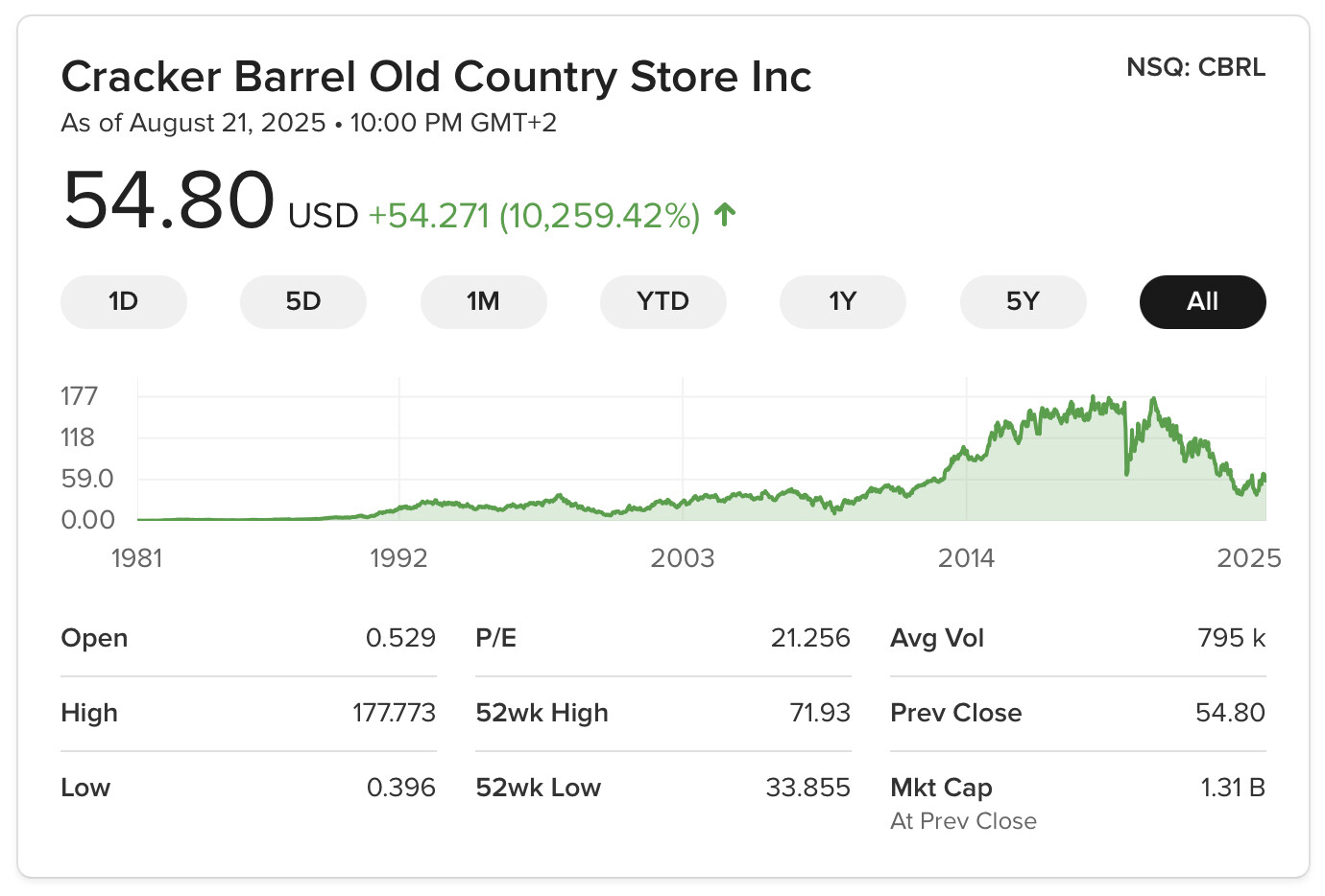
like https://investor.crackerbarrel.com/news-releases/news-release-details/cracker-barrel-reports-second-quarter-fiscal-2025-results-and
![]()
favicon
1 Like
I dunno about Western belt buckle, but if that’s a barrel on its side, they missed the mark a bit on the shape.
As a signblank, it appears overly large compared to the word mark (which should probably have stayed brown.)
3 Likes
1 Like
Looks like they’re having a Tropicana moment, ![]()
1 Like
This is a good example of why new companies should invest in good branding and a professional logo right from the beginning. When they don’t and they become successful with loyal customers, it’s very difficult and expensive to fix the problem.
Yeah, I suppose it makes it a bit better, but it’s still too big a change for customers who visit Cracker Barrel precisely because it reminds them of days long gone, with a not-so-great imitation of grandma’s house and her home cooking.
3 Likes
Take a look at this examples : https://logos-world.net/cracker-barrel-logo/
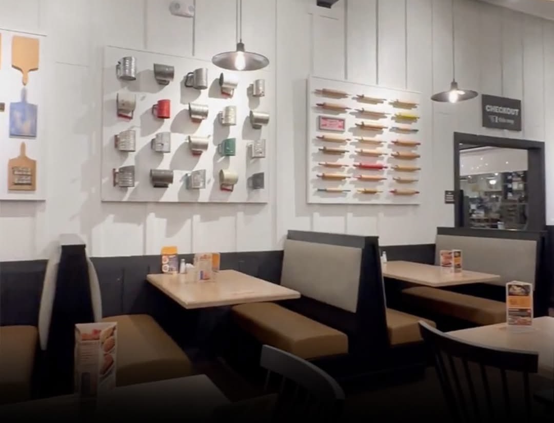
I would love to see the CI manual but I suspect it is more likely interior design and other factors that caused a decline since years.
1 Like
![]()

6 Likes

3 Likes
That was short lived marketing ploy. Got everyone’s attention though.
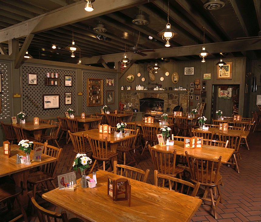
I might honestly be able to say I don’t give much of a care to decor. I’m not there to eat the scenery. If the food is good, not caring if it looks like something out of a cottagecore magazine or whatever. I’m not sure I’ve ever been to a Cracker Barrel. But they seem similar to a few other places I’ll stop at when on the road for an install so maybe. One of my favorite clamshacks is a run down 1950s diner where all the decor is past its expiration date, but the clam plate is worth every penny.
2 Likes
We don’t eat there too often, but their pancakes are good.
1 Like
They make a great cheesy hashbrown casserole
2 Likes
One question and the slogan was : "Cheesy Hashbrown Casserole for the whole Family ! " (LOL)
1 Like
It’s a shame enough people on twitter can make a company to go complete uno-reverse-card on their rebrand. I would understand if it was actually awful, but this one was fine. Some of these big businesses need a backbone in my opinion.
1 Like
And the president of the United States told them to change it back too.
1 Like
I looked up the agencies that handled Cracker Barrel rebranding: Prophet, Viral Nation, and Blue Engine. I have no idea what went on behind the scenes between them and their interactions with Cracker Barrel’s management. Hindsight is easy, but any one of those three agencies should have known they were creating a perfect formula for a customer backlash.
Cracker Barrel’s entire brand and customer experience is built around comfort food and a tacky reimagination of what a Southern US country store might have looked like 100 years ago. Apparently, that combination appealed to more people 20 years ago than it does today, as their business has declined significantly.
They needed to reevaluate and update their visual brand and customer experience, but the way they did it broke every rule that should have been learned from the New Coke fiasco to Tropicana to Jaguar. When an organization’s brand is deeply intertwined with its customers’ expectations, big, sudden changes can be upsetting to its user base.
Instead of Cracker Barrel announcing a major overhaul in a misguided effort to get short-term viral media exposure, they should have iteratively refined their image over 4–8 years. For example, they could have started by making subtle changes to their restaurants’ decor or quietly using the updated logo on their printed menus, while keeping the old one elsewhere.
As these small, gradual changes were made, Cracker Barrel could have made incremental adjustments, shifted gears when needed, paused or moved forward when warranted, and continually assessed how to best move to the next step. This would have allowed Cracker Barrel’s user base to gradually adapt to the cumulative piecemeal changes while aligning the restaurants’ visual branding, interior decor, and user experience with what appeals more to today’s restaurant customers.
I’d love to be a fly on the wall at Cracker Barrel to see how they shift blame while searching for a convenient scapegoat. I’d also love to be in the rooms at the three agencies as they do post-mortems on what went wrong.
2 Likes
With declining sales they should have focused on their food menu.
Most people don’t give a rat’s a** what your logo looks like, as long as your product is good.
Fix the product…
1 Like
I actually didnt mind the new logo
1 Like