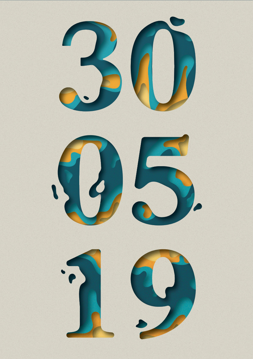
What needs work to me are those edges. They need to get smoothed out.
Also, are the extra blobs meaning anything? Is there more to this piece than what you are showing? I’m not sure a fluid, flowing look with a fixed looked of a cut out can be accomplished perfectly. Right now it looks as though you stamped a cut out and did a paint pour inside. If that is what you are going for then it’s working I have no issue with the colors, if that is what your Dad likes.
Is your dad old enough to know what lava lamps are?
The light blue on dark blue is working pretty well in places, and has that lava lamp look to it.
The yellow bits not so much.
Personally i’m not getting “liquid” as much as a clay or putty. Perhaps even cake-ish. Red’s ‘paint-pour’ I can also see. Nonetheless a solid more liquid.
I think the vector shapes, lava-lampish blobs, and outlines are really working. Honestly it’s pretty fun actually!! Just needs a little bit of sharpening up I guess.
However, for me, this thing just doesn’t make much sense. I don’t see what this execution/treatment to the type has to do with a wedding. Maybe it’s just something you and your dad will get?
So yeah, the graphics are working (I agree, it’s not water, it’s lava-lamp-juice), but I just don’t understand the point.
Lol, yes true. When I said ‘execution/treatment to the type’ I was meaning the ‘style’. For instance, why not use tradition curly-cue lettering (not my favorite, but it’s reliable)?
Or for instance, why not use metallic letters or lettering that resembles something military? Either of those would have just as much to do with a wedding as lava-lamp/water cutouts would, so why did they pick this specific style rather than something that [A] makes sense easily (Snell Roundhand) or [B] something else that doesn’t make sense (military stencil, etc).