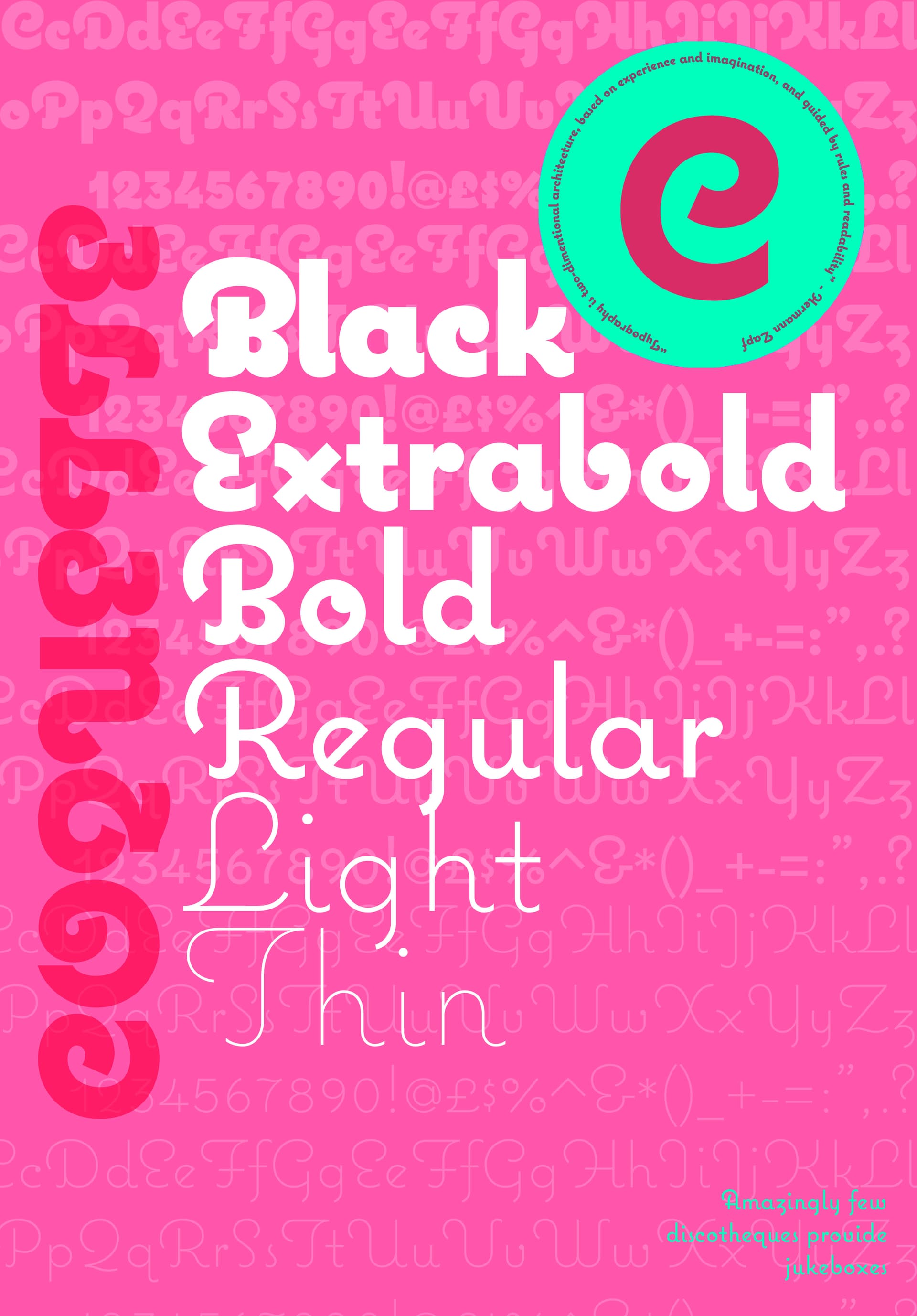
I only really looked closely at the first poster, with the rest more as references. The alphabet sequence on the first line seems wrong unless it’s intentional? It goes Ee Ff Gg Ee Ff Gg Hh Ii (and then Ii again).
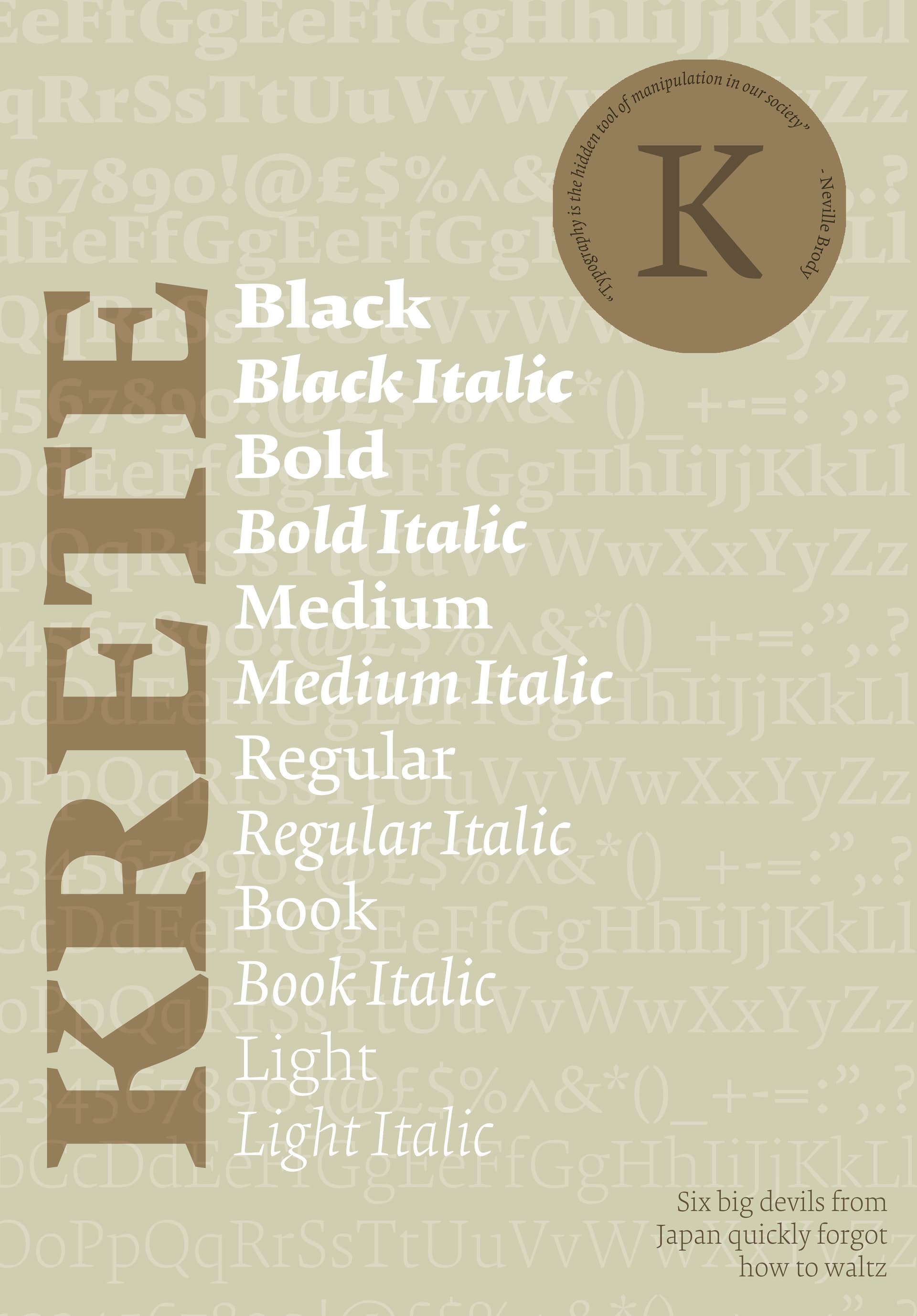
The later posters don’t have this issue. Their sequences look correct, except on the fourth line of the brown one where it repeats Ee Ff Gg Ee Ff Gg.
I’m also not sure what the colours are doing what’s the rationale behind them?
On the pink one, for example, the circle text that says “…guided by readability” (the Zapf quote) is ironically the least readable part of the whole design. It’s tiny, distorted on a circular path, and awkward to follow. Very odd choice.
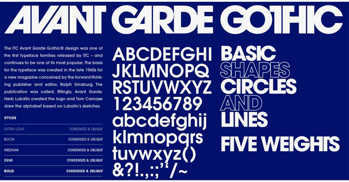
Out of curiosity I searched for other font-themed posters and found this one:
It’s much clearer and more engaging. It shows the history, the alphabet, numbers, symbols, weights everything. Sure, it’s missing the quote and the pangram, but those could be added easily.
I think my main critique is that the posters feel over-designed. Too many transparency layers, hard-to-read text, and no real hierarchy or narrative. Even something as simple as telling the story of a typeface needs structure a beginning, middle, and end.
The Avant Garde poster isn’t perfect, but at least it has a flow, a heading, an introduction (admittedly a long one), and a natural path for the eye from top to bottom and left to right.
If you’re designing a poster, you need to respect how humans process information clear hierarchy, readability, and a visual formula that guides the viewer.