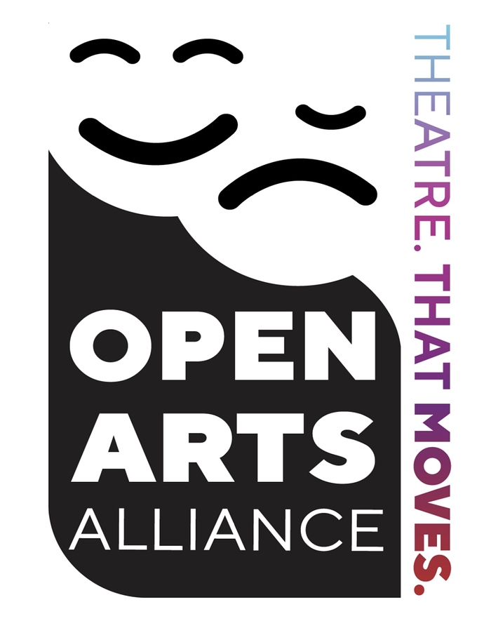
I am currently working on a logo for a friends theatre company and I am struggling a bit. Their brand is joyful, creative, bold, and sophisticated. Attached is where I am now.
Any feedback would be greatly appreciated.
Can I make this work? Should I scrap the whole idea and start anew? Any tips on making this work?
I like a lot about it, but the theater masks look more like emojis than masks. You mentioned the theatre company being joyful, but unless their audience is kids with none of their performances dealing with edgier subjects, I’m not to sure the emoji look is appropriate.
I’m not too sure about them crashing into each other with the comedy mask hiding the tragedy mask’s eye — it impairs legibility.
Also, what’s the deal with the periods after the individual words. You need a complete sentence before a period is appropriate.
A solid black logo paired with a colorful gradient for the tagline is a bit odd too.
I wouldn’t give up on it, though. I think there’s something there if you can make those masks look a bit more adult-like.
Great. Thank you! I totally get what you are saying. It is a children’s theatre. I should have said that.
Thank you. I totally get what you are saying. It is a children’s theatre. I should have said that.
Then the childlike look is appropriate since the logo alone suggests children — at least to me.  I still see the other things I mentioned as being problematic, but they’re all fixable. The missing eye might be most difficult to deal with.
I like the design, minimalism is cool
the right nose is off center under the lip
which does not match the one on the left.
perhaps moving the face lower to the right circle would improve the graphic.
Considering you’re a student and this is for a friend and it’s for a children’s theater company, I’d say you’re off to a good start.
My biggest comment would center on the OPEN ARTS ALLIANCE type. Try tightening up the leading a little bit – without seeing it, my hunch is that it will look better a little tighter. Have ALLIANCE flush right with OPEN. Right now, it looks like the E goes farther to the right than the N. Also, I don’t like how close the A in ALLIANCE gets to the curve. That creates some visual tension. I like the rounded corner, but maybe if the rounded corner was smaller it would help create space between the A and the curve. Try that or try making ALLIANCE smaller and have it flush right with the type above. Without seeing these, I can’t say for sure what the best solution is, but it’s something to experiment with.
Thank you so much. I completely agree with everything.
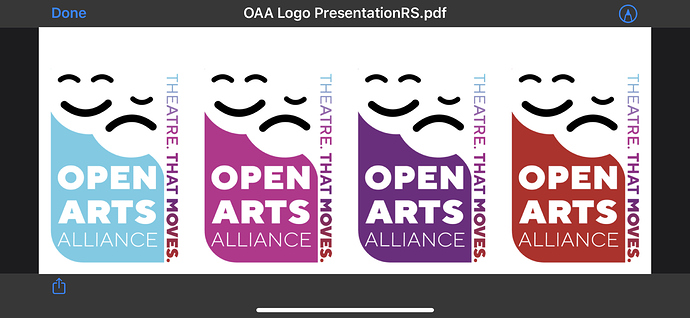
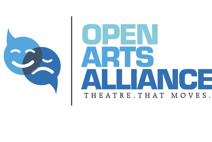
I uploaded the color versions of the design. I am working on the masks. The idea is that one mask is covering the other. But I thing I may switch their position and make the happy face a little bigger to draw some attention. I also included the original logo design.The client wants to use the same shape of the mask as a mention of the identity they have started to create.
Did you do pencil sketches first? You should. At least 50 or more.
I think it’s a decent start, Look at other children’s theater logos for inspiration (not to copy of course, but just to get ideas.). You may even want to look at more general logos aimed at children.
I think there could be some ideas off the speech bubble/masks. Sketching things will help you see if there’s anything there. Sketching lets you be more free and just coming up with concepts rather than trying to force an idea on the computer. And as @Just-B said, I don’t have any idea what the extra period in theater that moves means.
I’m a student too, so take my advice with a big grain of salt.
I like the concept, however the missing eye isn’t too great. Perhaps a small one to the right of the mouth?
9 months later…?


