So, the red needs to be a little bit darker?
Is this for a school project, for fun or an actual business?
School project that I’m doing on my own because i don’t have anything in my portfolio, so this is why I’m doing it.
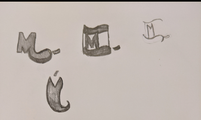
what are your sketches?
I posted them under another fourm.
I’m rather fond of the M with the stem. It is not literal, it is clean, and it leaves something to the imagination. Congratulations.
Thanks, I was trying to be a little more creative with the logo.
There’s a lot of personality in this version. Good progress!
While I do like the M logo I think what I’m going to do is to come up with more variations of that concept. I want to see if I can create something better, but still have that clean, high quality, look. The brand is all about using fresh quality ingredients to create healthy traditional Mexican cuisine. I really want to do a good job on this project because I plan on putting it into my portfolio.
Hi!
if you want my opinion, your logo is good but i think you can change some small things to make is better.
- i thinking the letters are a bit too close to each other, maybe try to put some space between them?
- for the pepper, take off all the sharp corners on the pepper itself. it will make it more clean.
- the highlights on the pepper, what about to make it more clean with no sharp corners and the smaller one could be white.
i hope i explained it correctly haha else i can make a small drawing of what i’m saying
Ok, I also drew some rough drafts at the bottom of this fourm
yeah i saw, i like the first one (the ‘M’ out of the pepper)
i suggest you try different version out of it like add the tip of the pepper on the other side of the ‘m’?
When you say add the tip of the pepper on the side of the “M”, what do you mean by that? I’m a little confused on that.
the pointy side at the end of a pepper? as in the ‘M’ is in the middle of the pepper?like the ‘M’ is made out of the pepper.
does that make sense? haha
I would say no to all of these. I think you need to work on your creative process. You’ve been working on this for awhile now and I believe your thinking is way to narrow. Everything is just peppers, leaves, or aztec design. This is for your portfolio so you want to create something noticeable and unique.
You should look up some ez brainstorming exercises, they help me a lot when I’m developing a concept. Drawing sketches, yes, is a good one but your redrawing the same concept over and over again with no noticeable improvement in your product.
A few that I’ve used (which are very basic):
Mind maps(just like in elementary school)
Word associations(pick a word that represents your brand and then find a word that’s associated to that word then find a word that’s associated to your new word and keep going)
Word randomization(pick a random word from a dictionary or something then try to find a way to relate it to your brand)
Or just look at other people’s artwork online on Pinterest, behanced or deviant art and hope something clicks.
A lot of people think this is boring ass shit or that they are just naturally creative and will think of something awesome without even trying like they are creative geniuses. But honestly, most ideas I come up with after doing this are lightyears better then my first thoughts.
Can you give me an example? The reason my designs are leaves, aztec, or pepper is because after researching that’s literally every Mexican restaurant logo. It either has a pepper, leave, aztec, or lime. The reason why I have a hard time with the creative process is because my professor just gives the project. He then gives us a brief summary on the brief of the project and then we normally do everything our own.
There was hardly any lecture on how to design logos or what the design process entails. Even when we were done with the rough draft he would just skim through it and approve it, so we can leave. That is my thinking process is narrow from your perspective because this is all new to me. In my design class, I’m just use to drawing 5 concept and calling it day. I was never taught how to research, brainstorm, barely taught typography, and color theory. Now, thinking about it I don’t think we ever went over color theory.
But, I really want a professional portfolio and I want to be able to do majority of the stuff that is expected of me. So, I will take your advice on restarting and coming up with more creative, unique ideas.
That sounds like a university course to me…gotta learn by yourself. I gave you 4 examples in my last post
Also just looked up Mexican restraint logos and there are tonnes that are not chili’s, limes ands Aztecs I don’t know what your looking at…that’s also besides the point.
It’s not a university it’s a community college
