You can tell the truth without the name calling
1 Like
This is my last reply, I wont respond anymore. Just wanted to say I’m sorry if I hurt your feelings.
Telling you that your narrowminded and ignorant of whats out there was probably not the best way to put it. However, it was constructive feedback as I’m telling you your thinking is too narrow and you need to broaden it.
P.S I am a student, you technically have been in school longer then I have.
1 Like
Sometimes people say things on the Internet that they would hesitate to say in person. It’s also easy to misinterpret what other people write. A back-and-forth conversation on a forum, like this one, can be difficult sometimes.
You’re a student and you ask lots of questions. There’s absolutely nothing wrong with that. For that matter, it’s a very good attribute. It does come with the risk, however, of getting answers you might not want to hear.
Although I would have phrased them differently, MrChoob’s observations aren’t without merit, even though his follow-up comments might have lacked patience and diplomacy. As you’ve found out, Mexican Restaurant visual identities often center around clichés, like peppers, sombreros and that kind of thing. You mentioned in your first post, “The restaurant is different than your typical restaurant.” Then you went on to say why it was different, which was an important thing to consider. In other words, a Mexican restaurant that’s unlike others should have a logo that doesn’t depend on the old clichés. A restaurant that’s different calls for a different approach to a logo. MrChoob pointed out some pretty good techniques for pushing beyond the blinders we all wear.
Your approach to a logo seems to center around merging two objects into a single shape. Sometimes this can work really well, but honestly, it usually doesn’t. More often than not, that approach just leads to a Frankenstein combination of two things that don’t work together.
Sometimes, it just works best to concentrate on a simple image that matches the personality of the business the logo is meant to represent — with the name just being off to the side or underneath. Approaching it this way eliminates the awkward and frustrating task of trying to merge things together. There is no one best formula for this kind of thing, but stepping back and taking a broad look at all the possibilities provides more opportunities for finding the best solutions.
4 Likes
Apology accepted
Oh, I agree wholeheartdly, that I still need more work, but the way he worded it was not needed. He could have just gave me the info saying that not all Mexican restaurant logos have peppers, lime, aztec, and I would have been ok with that. But I think my issue is that you and Mr. Choob pointed out is that I don’t follow the brief. I think that’s why my design look boring or cliché. Because when I think of Mexican crusine, I think of lime, jalapeno, fire, that’s the first things that come to mind because thats what I often see. But, I will try to go out my comfort zone and stay away from the cliché. The problem is that its been done so many times that it comes off as boring.
Try thinking this way.
Forget about your comfort zone.
Graphic design is not about your feels.
It isn’t about your art, or what appeals to you. Far too many design students don’t find this out until it is way too late.
It’s all about what will sell the client’s message and what will appeal to the client’s clientele. Period.
Graphic design is a commodity. It isn’t your firstborn.
Detach.
Once you move yourself outside of yourself and see things from the other side, you might be able to come up with some ideas that go beyond the usual cliche type stuff.
Then get sketching. Your initial ideas are the same ideas everyone else had. Sketch until you move beyond them.
4 Likes
Try to resist this kind of one-dimensional thinking. There are a lot of graphic design functions in which more of the same is appropriate, but branding isn’t one of them. When giving birth to a new brand, you have an opportunity to do something that differentiates the business from its competition, and that is largely the goal. The available market for this restaurant is already going to the competitor establishments; your job is to equip this new player with tools to take market share from them. You analyze the competition to find and trade on advantages over them, not to fit in with them.
Well at least you’re recognizing part of the problem. Brand design really isn’t for beginners. Although these days, every kid with a pirated old install of Photoshop 6 and an Etsy account thinks they can bang out good logo designs, in the real world, even seasoned designers often avoid brand design projects because the chances of the lone practitioner getting it right (let alone producing an iconic mark to be), are so low, and the process (when you’re doing it correctly), is so arduous that it can be hard to justify the effort-to-output-to-income ratio. Add to that the massive implied responsibility to the client’s success, and the exercise can quickly become little more than a risk-addled burden. In this sense, the profession is at a cumbersome nexus where the concept of agency teamwork is dwindling because quality marketing strategy is undervalued except by the most elite clients. Mid-to-low-market branding projects now go to people who won’t make enough money from them to carry out the rigors of real brand design the way it is, and was, done by marketing-savvy agency teams. This is why crowdsourcing has become a thing that actually gets used. Real brand design goes far beyond graphics, and I’d even say the graphic is the least of your challenges. When you do research for a logo project, don’t just research other logos; you must analyze the market, the businesses (the competitors and your client), the locations, the personalities and experiences, the positions. You must learn to think like a marketing person.
Okay then, they aren’t teaching to do the work of a graphic designer (let alone a designer of successful logos), they are teaching you how to pass . . . err, endure their course. (This can be said of many universities too, but of a community college, it can be said with a greater degree of certainty.) So, becoming a graphic designer, if that’s what you still want, will be mostly on you. Go ahead, participate in that course in earnest and learn all you can from it, but know it isn’t truly moving you toward success as a graphic designer. If you really want it, you’ll have to find someone who is engaged in the job; in a print shop, a newspaper, a sign maker, a promotions company, and endear yourself to them to such extent that they take an interest in helping you learn. It will take a lot of hard work, humility, and luck—and the experience is still pretty unlikely to include any real logo design—but under the current conditions, it’s the path to making your own way into graphic design.
1 Like
So, I did a mind-map for brainstorming the logo. When re-searching, do you re-search what’s in the brief? For example, the adjectives that I circled were earthly, modern, lush, vegan, urban, unique, fresh, clean, natural, cool, and professional do I look at look at logos that describe those adjectives as well? How do I re-search the business because in this case it’s a restaurant-Mexican.
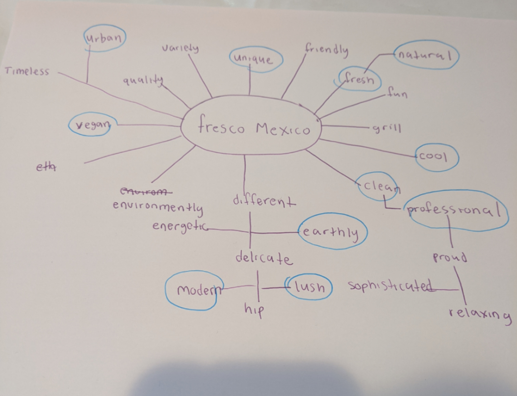
I also thought it would be a better idea to omit the “Mexico” and just have the word Fresco on it instead
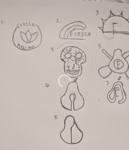
Maybe I’m just a dirty, old man, but I’d avoid option 6.
1 Like
Be gone your depraved and corrupt mind!
1 Like
Fair enough, lol I wanted to use the spoon as the seed of the avocado.
1 Like
Never thought of that until you pointed it, but I’m glad you did because I thought that was one of my stronger ones. lol
1 Like
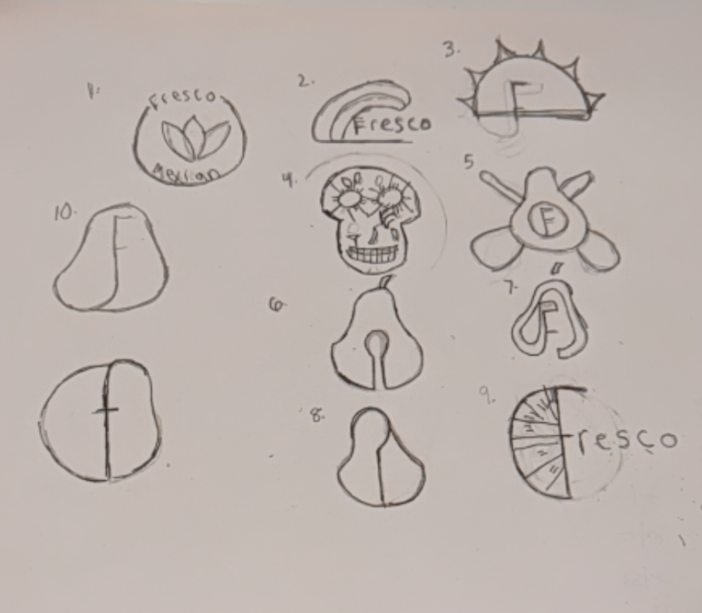
1 (solid if executed well), 2 (could be interesting), and 7 (most memorable and fun by a long shot) are the three best on there, in my opinion. I might encourage you try to do ten more sketches of each, making a slight but significant change each time, so you end up with close to 30 more sketches. The principle behind doing lots and lots of sketches is that our bad ideas always come to us first, but sketching them somehow “gets them out of our minds” so that the good ideas can emerge. Keep going…I would say you are on the tipping point!