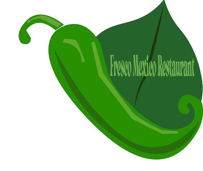
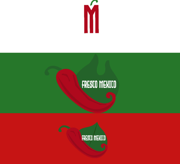
I’m doing a branding project for a Mexican restaurant called Fresco Mexico. The restaurant is different then your typical restaurant. “They” cook their food grilled, and while still having the authentic Mexican flavors, but in a healthy way. Another characteristics that makes this a unique restaurant is that they serve vegan options. I wanted the logo to convey a sense of freshness. This is a first draft of the logo I plan on doing more variations of this logo. I’m not sure about the font that I chose because its kind of blurry when zoomed out. But, I wanted your guy’s input, before I move on to creating more variations. If you could tell me what’s working, what is not working, and what would you do? That would be greatly appreciated.
Hi LD,
If you’re doing branding for the whole restaurant, it would be good if you could show us all the stuff you’re branding, or at least 3 or 4, so that we could get a feel for the branding concept as a whole.
-
For me, this logo, as it is, looks a little ordinary. It only has shades of green, which I guess will mean everything will only have shades of green. Now, if everything else matches the leaf, the pepper and the colours, then it could work, but it seems a little risky for me.
-
Then there’s the text. It’s hard to read which is the primary issue. However, another issue is the Restaurant written at the end. A restaurant can be a Mexican restaurant. However, this one is called Fresco Mexico. By putting restaurant at the end, it sounds extremely old fashioned… (like from the 1970s or something), and at the same time, most people will think you mean Mexican restaurant. This is not the case, since the restaurant is called Fresco Mexico, but it will look like a mistake.
So I would definitely make the writing more clear… and drop the restaurant at the end. If you absolutely must write restaurant in the logo (or somewhere else), I would say put “Restaurant” underneath the Fresco Mexico - not on the same line. Better yet, I’d write something like “Healthy Mexican Cusine” instead of restaurant. Though that’s something the owner will have to decide.
- As for the quality of the graphics, it looks like it’s “low quality” but for me that is not a problem, because you can just have it as a style. I mean, as long as everything else matches this style, then it’s not low quality, it’s just the style. I hope you know what I mean!
I hope this is helpful and I hope whatever you give the owner, he is super happy with… and he gives you a lot more work!!
Good luck!
Thanks, and I totally I agree with the font that it can be hard to read. Especially, if you zoomed in it gets blurry. I do plan on doing two more concepts of this logo. The style is supposed to be minimal, because it’s healthy and clean. At first it wasn’t my intention to use shades of green I was going to use red for the pepper. At one point I wanted to use pastels for the logo. But, I agree with everything you said, and will take that into consideration when I redo it.
student forum.
student project.
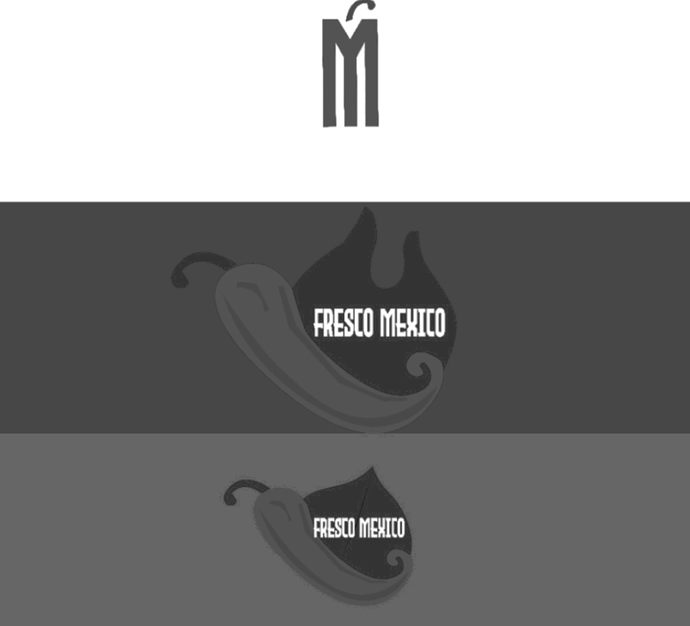
You need to develop some contrast in your logo. Green on green on green isn’t exactly a standout. All of your greens are very nearly the same value. A quick way to check is to bring the logo into Photoshop and make it a grayscale image. If everything turns the same shade of gray (or close) you have problems. We won’t even mention the issues of those with ADA challenges trying to see this (but I did anyway.)
Maybe make the text white.
Ditch the word restaurant as Bear mentioned.
Don’t…as in DO NOT… condense typography like that. The letterforms become distorted and difficult to read. Typefaces are built to parameters that make them look good at the aspect ratio at which they were created. If you have to condense, find an appropriate condensed typeface. It doesn’t help that you are trying to jam 3 words in where only one fits.
Blow this thing up large and see where your jaggies are. You have some pen strokes in there that may not be pretty at signage sizes.
For this branding project, what are your parameters. Usually professors ask for a 3D thing and a 2D thing beyond the logo. Sometimes mocked up into a virtual scenic photo.
Holy Uncropped Image Batman! 
I added a cropped version 

Wondered why my screen refreshed! LOL.
Kitteh magic 

Thanks, it wasn’t my intention to use shades of green. I wanted to use a bold red because like you said for contrast. Now looking at a day later, I realized that maybe using green wasn’t such a great idea. As they all kind of just camouflage together. My biggest issue with this logo is the text is hard to read. How do I fix the pen strokes?
When you say parameters, do you mean document size? This is just a project I’m doing on my own. In past design classes my professors never asked for parameters or 3d and 2d.
I wanted to add highlights, how would do that?
Other then the color, your type isn’t legible. Way too squeezed together, work on your kerning and the size of the type in relation to the graphic
Also work on your Hierarchy, for me personally I would make Fressco Bigger and have mexican resteraunt under it in a smaller size.
As someone posted here, contrast is very important. A logo isnt just viewed close up on a menu. Its also on signage and could be on digital ads. I put your work in greyscale so you could view the contrast.
Squint your eyes at this and where you lose the distinction between value and tone is where the logo needs work in color & type visibility. Keep truckin’ through it.
Can give me some tips on designing a menu?
So, the red needs to be a little bit darker?
Is this for a school project, for fun or an actual business?
School project that I’m doing on my own because i don’t have anything in my portfolio, so this is why I’m doing it.
what are your sketches?
I posted them under another fourm.


