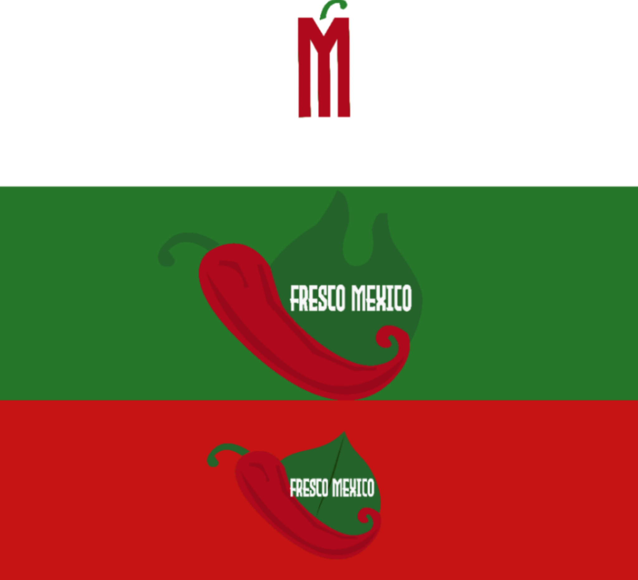
I’m doing a brand identity project for a Mexican restaurant called Fresco Mexico. I posted the original logo on another forum that was the first draft of the logo to get feedback. I took your guy’s advice on omitting the word “restaurant” because I agree if it says Mexico, then clearly people already know it is a Mexican restaurant. I also changed the font as it was hard to read and color to white. This time I did three concept logos the first one is the original logo that has a pepper, and a leave that symbolizes that it is a healthy restaurant. The second logo, I wanted to be more creative the original concept was to have the pepper part of the M, but couldn’t do that. So, I thought to my self maybe just leave the M red as the pepper, and just have the stem. The third one has fire as the leave because I realized that a lot of Mexican logos have fire that also symbolizes the grill part. I want to add highlights to the peppers, but don’t know how to do that, so if you can give me some tips on how to achieve that would be great.
hey any chance we can combine this post with the other 2 or three floating around on the same logo?
I can post this under the other post
One of the mods might be able to combine them.
It’s easier to keep one topic under one thread.
Ok, will do.
Just posted it under the previous fourm.