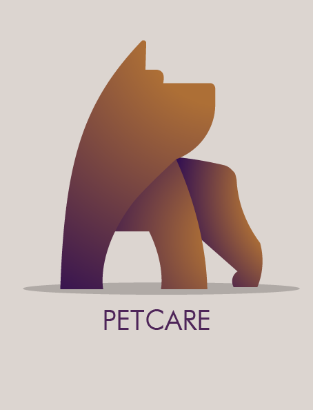
Logos that require gradients to work, don’t work.
Gradients band at large sizes.
Gradients have absolutely no color control in the atomic areas of the crossovers between colors. Every print machine will print them differently.
Looks like a generic logo. If you are offering this up as “stock” then it isn’t a logo either. You can’t trademark a “stock” logo that anyone else can use. A logo that is not trademarked is useless to someone’s business. In fact, most stock sites say right in their EULA that the art on their sites cannot be used for logos. Stock sites that don’t say that, and offer “logos,” are potentially committing fraud.
It’s a nice, minimal illustration that reminds me of paper sculptures I’ve seen. It looks great.
However, as PrintDriver said, practical considerations keep it from being a very useful logo.
Oh, I just noticed this was in the student forum.
What was the design brief (instruction) you had for this logo?
it is simple, i like it
some critiques about it would be :
- i see you rounded most corners except the feet, i would round every corners to unify the design.
- i’m not sure about the font, there are more possibilities that you can try
- although it has minimal design, the head seem a bit empty to me
let me know iof that was helpful haha
Hello guys, (lost access to my original account this is OP with different acc),
Thank you for all your critiques, they were very helpful!
i guess my post did not belong to the student forum , by mistake i thought this was the place for logo critics since im new to this, this logo had no brief whatsoever, but i was thinking of a Pet service of some kind when i was sketching,
Thank you! of course this was helpful,