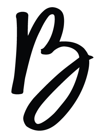
I created this logo for myself. Originally it was tagged with the words graphic design hugging the swoosh of the Y. My name is Billy. So essentially this logo is my signature. My instructor didn’t prefer the words graphic design, she said the mark was strong enough to stand on its own for web, or in stationary. She said it would accompany something.
Its been 4 months since ive designed it, and Im not sure its strong enough to stand on its own without people saying what is it. It could be a point for conversation, but after using it for 4 months I’m still questioning it. Feedback appreciated.
It looks like a B to me, and I think it’s strong enough. Actually, I like it.
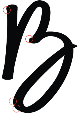
If it were me, though, I’d spend a little time making the curves flow a little better, the outside bottom edge of the bottom bowl has a couple of kinks in it. That little point on the B’s crossbar is a little distracting too.
Yep, I agree with Just-B that your . . . uh . . . just B, is quite nice as a brand mark.
I can see a case for accompaniment by a company name in most applications, but it would be good to come up with something less pedestrian than “Graphic Design,” or worse, “Design,” or worse yet, “Designs.” And of course it should tip what the “B” actually stands for.
I also agree there is need for a few small refinements. Some areas to consider:
The lower-right curvature has some awkward width characteristics too, but it would be tough to point out the exact trouble spots. Some small adjustments could add a bit of elegance to the line.
The point on the right is a natural extension of the stroke, the small one is an anomaly that doesn’t appear to be a natural part of letter’s structure. There’s also too large of a size difference for the two points to be counterpoints to one another.
I think you’ll need to address both these problems to get the two objects to play off one another and achieve what you described.
For what it’s worth, the weights, balances and flow of organic curves are very difficult to get just right. I can fiddle with them forever without coming to a perfect solution, and long before that happens, I lose my perspective on what looks right and what doesn’t. From what you wrote, it sounds like you’re having the same difficulty. Both HotButton and I looked at it with fresh sets of eyes and saw the same problems. Fix these small issues, and I think you’ll have a winner.
Hi I see a cursive Z with accents. The company I work for ------- ------- we do alot of logos and branding. Check this out for inspiration or reference. https://nowhere.com
MacKraken, every post you’ve made on this forum has been little more than an excuse to link to your business. This thread has nothing to do with what is on your Dribble page. I’ve removed the link and will remove all your business promotion links in your other posts. You’re welcome to join in the discussions here, but all links need to be relevant to the thread they’re in. Please do not use this forum as your marketing tool.