Hi!!
After many years not working as Graphic Designer, I need to get back to work on this.
I need to find a job urgently.
So, I designed this portfolio, but I´m not getting any reply from recruiters.
Please, feel free to criticize it, you will be helping me A LOT.
Thanks in advance to the community!!
Portfolio: lauralauriedesign .com
Here’s my impression as I work through your site.
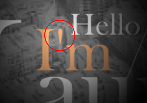
– First thing, and it’s pretty glaring, is that you’re using a foot mark (maybe you’d call it a tick mark in Spain?) instead of an apostrophe in “I’m.” Whether or not a recruiter will notice this, I don’t know. Anyone that knows type will spot this right away.
– The header section with “Hello I’m Laura” is okay. And I mean it’s just okay. I’ve seen worse, but I’ve seen better. I think you can make this stronger.
– For the “A Bit About Me” section, I’d suggest you have a native English speaker edit the English for you.
– The site doesn’t appear to be responsive. I have not viewed it on my phone or tablet, but it doesn’t collapse the way it should when I change the window size on my desktop.
– Overall, I’d say your work samples are solid. You have some that are nicer, and you have some that should probably be eliminated. Eliminating the weaker pieces will elevate everything else.
– I’d fix the kerning on Travel Spirit. You have a pretty big gap between the “S” and “p” in Spirit.
– I hate to say this since you said you designed this portfolio, but I think it needs a redesign. Sorry. This is just my opinion, but I think the visual emphasis should be on your work. I’m picturing a simple, responsive website with an ID banner at the top and then clickable thumbnails of your work right after the banner. I’d even say do away with the categories like you currently have and just show 10 - 15 of your strongest samples. Combine the about me and CV into one secondary page. As it stands, I feel like your work is secondary to the black & white travel photos.
Bottom line, I think you have some solid work, but the emphasis on your website is misplaced.
@Steve_O posted his response while I was writing mine, and we both noticed some of the same things. I wouldn’t go so far as Steve did in saying your website needs a redesign, but fixing some details and reorganizing it a bit might be good.
I really like the work you did for Midnight Company. It’s aggressive, vibrant and bold. You’re not pinned down to one style either. Your work for Travel Spirit, for example, has an entirely different tone more befitting of the tourism industry. I also like your more experimental pieces for University Works — I’m not sure how practical they were, but I love the experimental aesthetics.
As for your website, I’d be inclined to display your work a little more prominently rather than placing it down the page beneath your bio and CV which, to me, are secondary to showing your work. The three flags at the top of the page are a little confusing. At first, I thought they were links to Catalan, Spanish and English versions of your website, but clicking on them does nothing.
The following is a glaring error that sits front and center above the fold on the first page. It was literally the first thing I saw. Your work is great, so the rookie mistake of using the wrong apostrophe is just sort of weird.
Smaller and less important, but on your CV, Wordpress is one word, not two.
Both words in Adobe Illustrator should begin with an initial cap.
Your nationalities should be written either as Spain and Argentina (nouns) or Spanish and Argentinian (adjectives) — you shouldn’t mix them (I’m being picky and I know English isn’t your first language).
Why is there an apostrophe between Buenos Aires and University?
2003/2009 should be written as 2003–2009 (The en dash denotes the range of missing dates, which is almost the sole purpose of an en dash. A slash isn’t used for that purpose.)
The blurb of text beneath “Interest” shouldn’t end with a period since it’s not a sentence and is, besides, inconsistent with how you’ve ended similar blurbs of text elsewhere.
You also have inconsistent use of periods and commas in your work experience section.
I’m sorry for being so picky, but getting the details right on a CV is important.
Maybe I’m feeling a little salty today since I have to get caught up on work instead of going for a nice, long bike ride.
All your comments are very welcome!
Thank you all! and I hope you can go for a bike ride tomorrow ![]()
I keep waiting for more comments to come…
Is one of your designs using a 2002 picture of Britney Spears? The 90s disco banner???
Id put your design work more in the front and center.
If this is for recruiters I’d assume you have a Resume/CV already prepared and this is your portfolio of work. Most jobs i encounter have the 2 separated.