Critique of my work

Good evening all,

I am currently studying design, and as a part of my assessment, I need critiquing on a piece of my work, so any help in this regard is greatly appreciated (but also please keep in mind, I not by any means a designer yet, so I know my work may seem very amateur).

The background of this work is, that I have to create a postcard that reflects the “Colours of Australia”. I have also been recently studying colour theory, so in my attempt, I have tried to produce a natural version of the triadic colour scheme (taking blue and yellow from nature and adding red in the title). Also, the writing on the back of the card was supplied and has to be used to exact way it is written.

Please feel free to reply with any further questions and I will be more than happy to answer.

Thank you all in advance,
Jacinta HonnerAustralia1Australia2

The text was supplied exactly like that?
If so, as a designer, it would require sending a PDF to the client with the errors (politely) pointed out and a question as to whether or not they want them repaired.

  • Cap A after the first period (and check you don’t have a double space after the period
  • Australian literature is… but Australian literature, art and folklore ARE…
  • no comma after “art”
  • should be “settlers’ hardships”
  • no comma after sheerers
  • spell out “and”

The other part of a designer’s job would be to research the postal regulations to find out whether or not their design will mail out. I’m not up on Australian postal regs, but in the US, that address side wouldn’t work. For machine reading, the address area has to be much lighter.

The purpose of a postcard is to mail it to a friend or family member with a message. The image makes the writing area nearly unusable. Function first, then form.

Thanks for your reply,

I was meant to spell check the writing, but completely forgot, so thank you so much for that, I’ll correct that first of all.

I also hadn’t thought the functionality of the postcard through (thankfully I’ve got a bit longer at school before being let loose on the public), and was going purely for aesthetic qualities. Also, being a child of the digital age, I also didn’t realise that there were regulations for postcards, so I shall check up on this, and modify the design accordingly.

Thank you once again for your advice, and I shall promptly get to work on those changes.

Jacinta

Aesthetically speaking,
Reconsider the drop shadow on the red text.
You get shadows on the ground, or on another object, but not against sky. Sky is not a proper background object for a drop shadow in real life. Doing this on the postcard just illustrates it’s depicting a photo rather than depicting real. Not sure I’m describing that accurately.
Besides, it just adds one more element that is just not needed. Always have a reason behind your design decisions. “It looked cool,” is not an adequate reason.

It never really occurred to me that a child of the digital age may have never mailed a postcard. LOL. The same thing about postal regulations holds true when designing business envelopes and mailers like magazines or trifolds.

Not following the regs can have costly effects. I worked at a place once where the marketing person sent out mailers where the company return address infringed on the mailing address space. Guess where our mailers ended up? Yup. Right back in our mailbox.

2 Likes

@PrintDriver has covered most of my concerns.

Overall the approach as is feels like you put minimal effort in.

The image you selected is a bit dreary despite the blue sky. I would expect a contrast of earthy tones and vibrant tones, think great barrier reef meets outback. I might even consider over-painting an image of something or somewhere ostensibly Australian with a lot of colors.

My main concerns were addressed by both PrintDriver and kemingMatters. I completely agree with both of them.

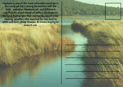
The side of the postcard where stamps, addresses, writing and various postal indicia needs to go doesn’t leave much room for imagery. If you look at most any postcard, you’ll find this being the case. It’s a purely practical matter, and as PrintDriver mentioned, form always follows function — first and foremost, a postcard needs to function as a postcard.

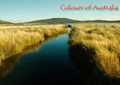
As for the colors of the postcard and, for that matter, the imagery itself, I’m unsure why you think they’re quintessentially Australian. These photos of wetlands could be most anywhere in the world, and if I had to guess where they were shot, Australia probably wouldn’t come to mind.

I’m certain parts of the country look like this, but what I’m saying is that if the assignment is to use the “colours of Australia,” those colors (and the imagery) should be unmistakably Australian.

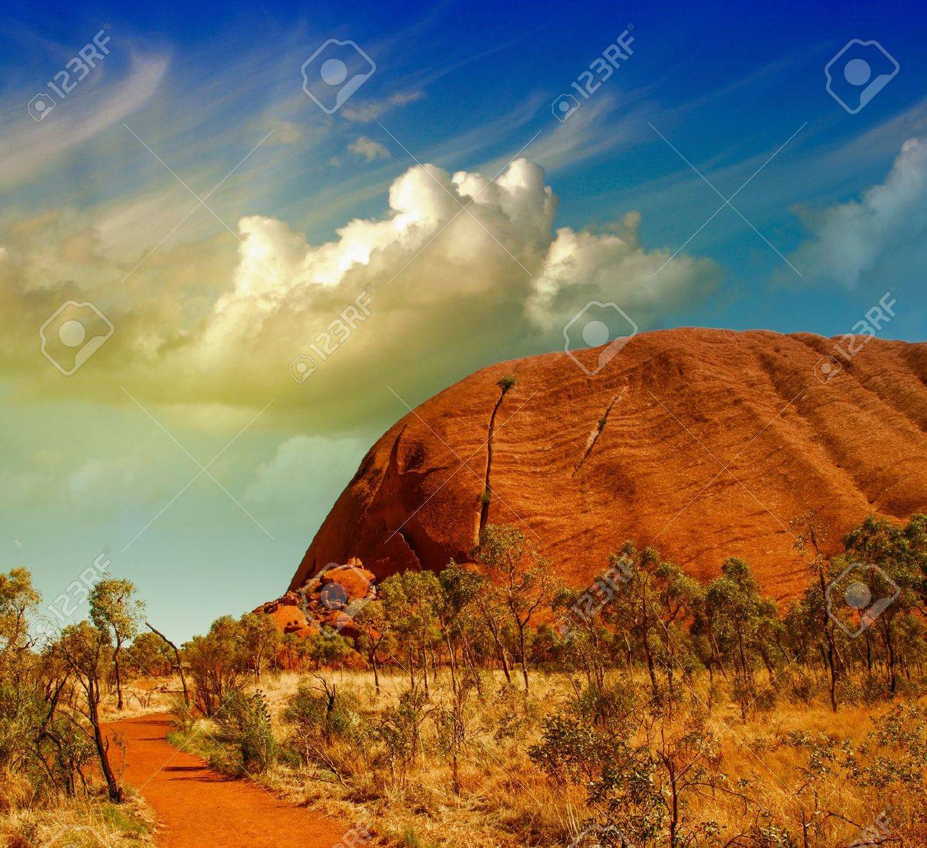
So what are the colors of Australia? From my point of view as an American, when I conjure up images of Australia, I think of the deep blues of the ocean and the sky, and I think of the earthy reds of the outback.

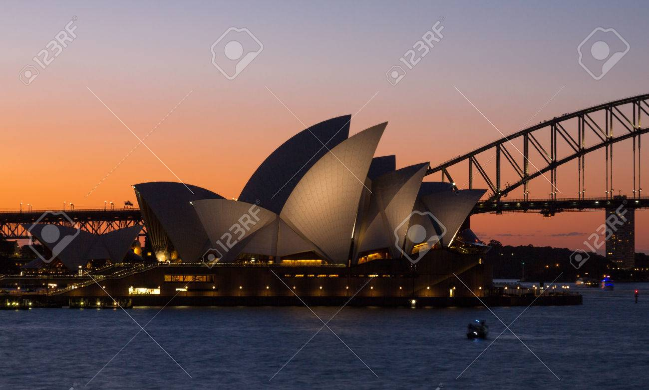
Similarly, when I think of Australian images, I think of Sydney Harbour, Ayers Rock, various marsupials, The Great Barrier Reef, etc. Maybe you don’t want your postcard to represent those stereotypically Australian images, which is totally fine, but you don’t want your photos to look like they could have been shot in Saskatchewan or the Pampas of Argentina either.

I’d suggest doing a little research. For example, a Google image search for Australian postcards will give you a good representative sampling of what other designers have come up with (both good and bad) when faced with similar assignments.

One more thing: it’s generally not advisable to add gratuitous drop shadows, glows, bevels and other Photoshop filter treatments to typography, like you’ve done on the “Colours of Australia” headline. I’m not saying these filters should never be used, but an over-reliance on them to add pizzazz to type is a sure sign of a beginner using one-off gimmicks instead of good, cohesive and well-thought-out design decisions.

Despite all this criticism, please don’t be discouraged. As you said, you’re not a designer (yet). I actually have the first design class assignment I ever completed hanging on the wall in my home office. It’s absolutely terrible, but I keep it there as a reminder to myself of my first less-than-solid steps on what has turned out to be a very long journey.

2 Likes

I agree with all the suggestions above, and have just one more.

Move your elements in so they’re not up against the edges. Give them some breathing room. This is better visually and because trimming at the printer could cut off part of the text. Or else the printer would contact you to correct and resend the file.

1 Like

Thank you all for your responses, I’ll take all of it on board and see what I can do.

The only advice I’ll find a bit difficult is changing the image itself, as I don’t have any other images that are more suited to the feel of colours of Australia, and I’m not currently in a financial position where I can travel far enough to get any more iconic images, so I’ll have to see if I can tie it in to a future holiday.

Thank you all once again for your responses, and I’ll repost an edited version once I have revived it.
Jacinta

This is a school project, right? Is part of the assignment that you shoot your own photos? If so, yeah, that’s a problem. If that’s not part of the assignment, there are plenty of great, low-cost stock photos online that will do the job.

You did look at stock images, right? Here are some on 123rf.com that are unique to Australia. I think.

(Sorry, Mr-B, didn’t catch your post fast enough.)


Unfortunately we do have to take our own images as part of the assignment, so unfortunately I’m not able to use stock images.

Well, hopefully you do at least live in Australia…

I do, but unfortunately where I live, that scene is pretty typical of the landscape, to get to anything ironically Australian, I would have to fly there, and unfortunately, without getting paid for this assignment, I’m not in a financial position to make this possible.

Do you have to use just one image though? Why not several? E.g.: a photo of the water, one of the grass, a closeup of the dirt/soil, one of a flower in your garden, one of some yummy (and colorful) food/dish/fruit etc. - and make a montage?

Does it have to be a photo?

I believe so, it’s my impression that the assignment combines our photo taking with our designing skills, trying to put it together in one package.

Two ideas though that I hadn’t thought of was to montage different images, even if it’s only plants, because I’m sure there are a few “Australian” plants around where I live. The other idea I hadn’t thought of was combining my images with graphic art.

cool to see another student do a postcard from a different country. I had to do a postcard as well in my class this week. keep going! :slight_smile: