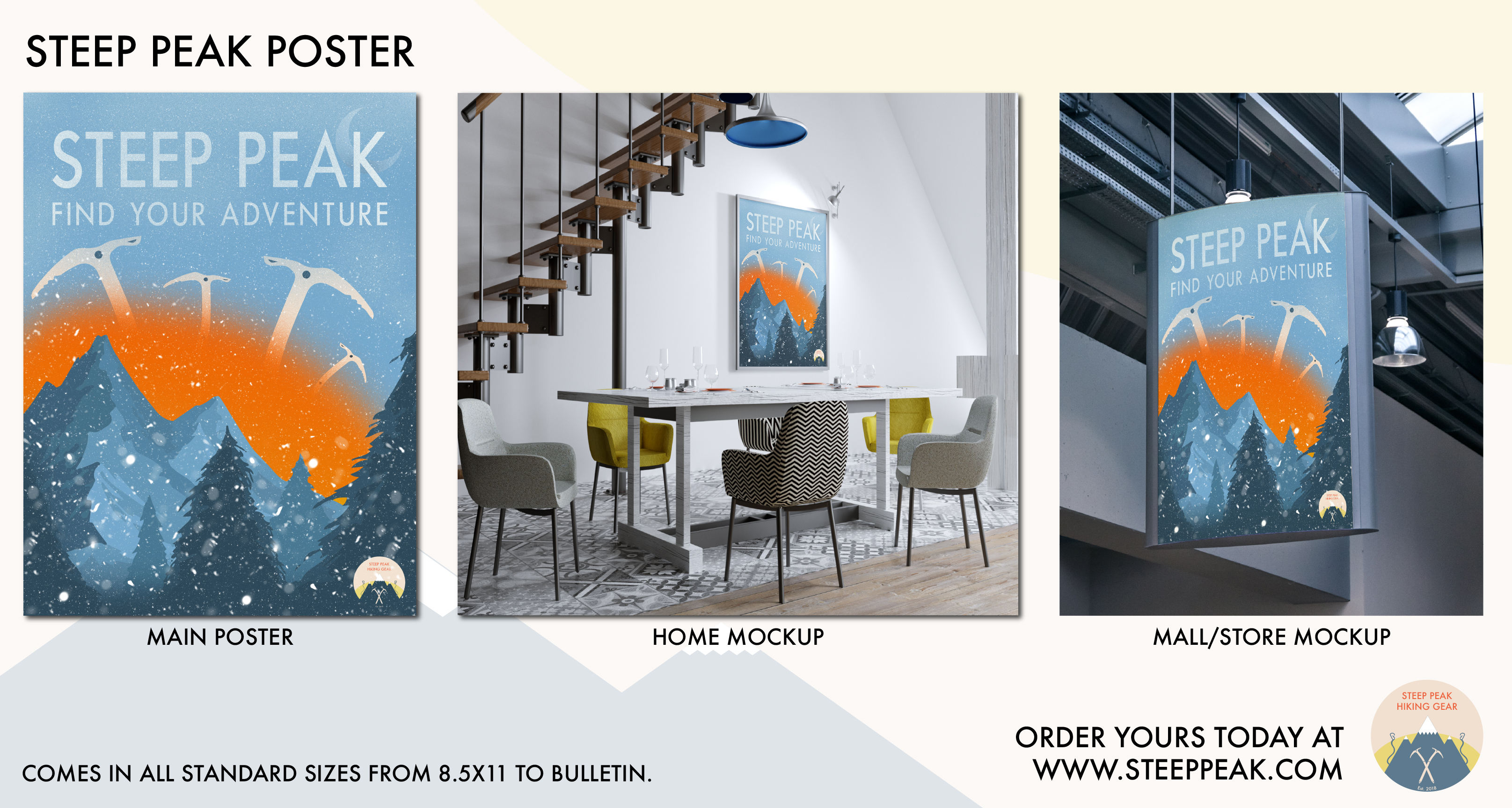
So for my class we had to create a poster for a fake company we created. I chose mine which was Steep Peak Hiking Gear. The company was inspired and similar to stores like Eastern Mountain Sports, AREI, and Patagonia. For my approach I wanted to make the poster versatile so that one could purchase this as a decoration for their home or office but could also be used as an advertisement/sign in a mall type setting. If you could offer me some constructive criticism it would be appreciated!
The poster is arty enough to be wall art.
Not sure what that little moon thing is in the lower corner.
A poster needs a Where on it somewhere if it’s going to work as advertising.
As a mall sign, it doesn’t work so well. You have a tight shot. Picture that small narrow type in a mall full of other signs hung in that fashion (which isn’t so much a standard way of hanging signs in a mall.) If one store is doing that, they all will, because every store would rather a sign that faces traffic rather than just one over the entry. How far away can you read it? How well does it work against all the other clutter and wayfinding?
It may work fine as wall art inside the actual venue as a seasonal theme (depending on the store’s over-arching interior decor theme) but it’s not working so well as a “logo.”
Yeah my biggest concern with it was that it isn’t great for advertising because like you said, in a mall setting the small fonts don’t help it to stand out. I’ll revisit the type and see if I can focus the attention more on the text. Thank you for the feedback!
First off, I like the illustration and the style you’ve chosen. It reminds me of the old U.S. national park posters. I like the mountains, I like the way you’ve handled the snow. It’s nice.
However…
Orange and blue is a dangerous combination. Sometimes it works, but they’re emotional opposites in nearly every way. Everything in the poster looks peaceful, inviting, calming and outdoorsy. But behind the mountains there’s apparently some sort of Armageddon going on. If it were a subtle orange sunset, it could be nice, but this isn’t a sunset; it’s something ominous. Accentuating the dangerous radioactive glow are the four 8,000-ft tall ice ax tools seemingly set on destroying whatever is left.
In addition, stores like REI and Eastern Mountain Sports certainly sell ice tools and crampons, but they’re not a main draw. Now if Steep Peak were primarily a rock climbing store, sure, a natural switch would be to promote ice climbing in the winter. For an all-around outdoor sports store, though, focusing the imagery specifically on ice climbing might not be as appropriate as something that might resonate a little better with their broader customer base, like skiing, snowshoeing, parkas or snow camping.
Perhaps a poster is not the right direction to take this kind advertising. At least not in a mall type of setting.
A poster would be more suited to an in-store campaign or guerilla advertising on college campuses.
I actually like the combination of the vivid orange and blue. Orange, violet and teal are one of my favorite color triads.
I really like everyone’s comments - all very helpful to the student working on this. I would also like to add that the orange does take away from the overall composition. I like it though - the pop of color is unique - it draws our eyes to it, but it’s not quite right - play with it some. And completely agree that your header is not strong enough - the font works, but maybe a heavier style - just some thoughts. But overall great design aesthetics!
You know, I like those colors and color combinations too, but they’re the very colors (plus pink) that seem to elicit the most passionate reactions from people. I’ve learned to use them more judiciously than I otherwise might.
Years ago, I was working on something for a client and showed them a comp where I used a reflex blue and orange as the dominant color scheme (similar to the poster). The client began yelling about them in a purposefully exaggerated way, then began making fake gagging noises. After the theatrics, he asked me to please change the colors since he hated blue and orange together.
I had never gotten that extreme of reaction before or since, but like I mentioned, there are certain colors and color combinations that seem especially prone to being either liked or disliked.