Critique this menu

This user: Alian has left so much out that could help it’s a joke! I’m laughing so hard right now.

This menu is for a fast food restaurant correct? I mean this food is all comfort food for the poor in North America and Europe. The developed countries. I don’t honestly say that only the poor buy it but the locations of KFC are always in the poorest parts of every city I’ve visited.

A simple A B C like menu would be sufficient.

I’m even betting the restaurant isn’t in English.

Thanks but what about design

Personally I’d take black art paper and sketch out the menu then cut it out and glue it to white paper. Then you’d get the white print. And you could glue on maroon colored boxes as well. Easy. Then use some plastic menu covers to protect them. But I’m betting this restaurant is so cheap there is no menu. It’s on a board above the counter. Then everything everyone has said in this thread applies. Unless of course your using a LCD MONITOR OR TV TO DISPLAY THE MENU. THEN SIMPLY ENLARGE THE WHITE PRINT!

LOL. hahahahaha.

You must be taking the piss… which is wearing thin on me now…

Sure, while we’re at it, let’s use glitter pens and Blu Tack to stick on some cut-out stars. Maybe hang a papier-mâché moon over the counter for extra flair.

Look, this isn’t an arts and crafts project. You can laugh all you want, but dismissing an actual printed menu design as if it’s a child’s collage is missing the point by a mile.

Yes, it’s a fast food menu. That doesn’t mean it shouldn’t be clear, properly typeset, and professionally presented. The idea that people eating comfort food don’t deserve a readable, well-designed menu is a bit rich. Plenty of chain restaurants spend serious money on menu design precisely because clarity sells.

Also, assuming the restaurant is too “cheap” to have any standards, or suggesting English doesn’t matter because it’s “probably not in English anyway,” isn’t exactly a constructive take. If it’s on a board or a screen, the same principles still apply: legibility, consistent layout, and avoiding eye-searing contrast.

And no, sketching the menu on black art paper and gluing it to white sheets isn’t how professional production works. It’s not 1982.

It’s not just about slapping some words on a page and having a laugh.

And for the record, printing white ink isn’t some DIY novelty. In professional offset printing, you can’t print white ink as part of the standard CMYK process because the press doesn’t have a “white” channel white areas are simply the paper showing through. If you genuinely want opaque white, you’re talking about either spot colour white ink, which requires custom mixing and extra plates, or using specialty processes like screen printing or flexographic printing. Even then, you need coated stock that can take the white layer without soaking it in or cracking. It’s not remotely practical for short-run menus unless you’ve got the budget and production expertise lined up. This is exactly why most designers avoid relying on white ink altogether and instead reverse the design or choose a lighter stock.

If you’re just laughing you’re in the wrong place…
1 Like

You must be taking the piss… which is wearing thin on me now…

Sure, while we’re at it, let’s use glitter pens and Blu Tack to stick on some cut-out stars. Maybe hang a papier-mâché moon over the counter for extra flair.

Passive aggressiveness. Are you? And then you pass on your insult. Your acting like your the original poster not Alian.

His username is Alian as in Alien? A joke name like Alien? Or a spelling mistake of Alan? Obviously he spelled delicious wrong.

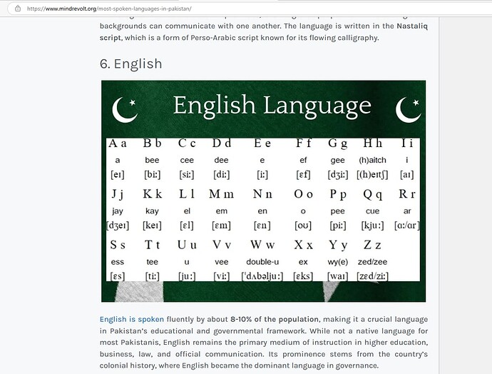
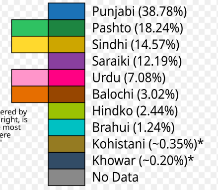
Alian then asked for design not grammar corrections. Looking at two sources. Pakistan doesn’t speak English. Unless you trust the ai search and it says Pakistan official language is English and another language that only 8% speak.

Screenshot 2025-06-27 060513

I’m not trying to work anyone up. I’m not trying to take the piss out of

But Pakistan is a very different country then USA or Canada or Great Britain!

As for cutting out paper insult you gave me smurf. My photoshop edit is so 2025 and your illustrator edit is sooo 2002. Who cares as long as it works.

No mentioned 50 inch monitors. I did. And when I did you clearly thought that was a garbage idea. Yet every fast food chain I’ve been to has large monitors and no written menus. And from this menu. It doesn’t suggest they’re selling anything but fast food.