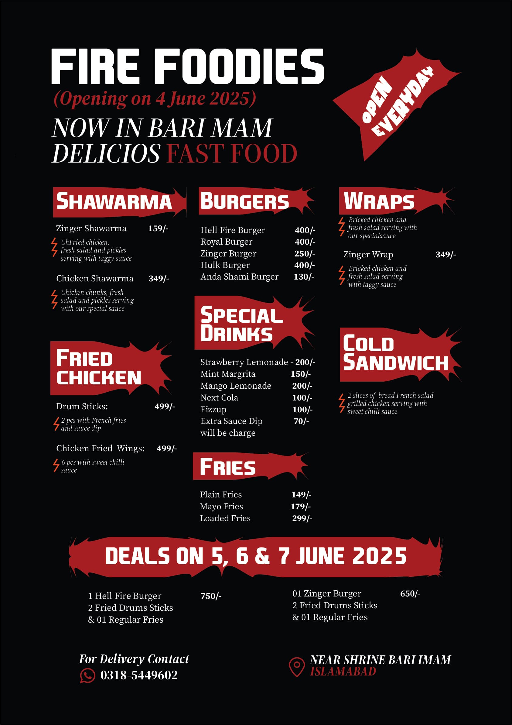
Delicious is spelt wrong
thanks but what about design
What is the physical size of the menu? I find it hard to read with my ageing eyes.
Plus this red does not stand out from the black background.
The white font on black really hurts my eyes. It’s actually hard to read. Although the menu looks ok with the red word boxes.
If I’m not allowed to post examples of what I mean. I am seriously sorry.
Alternatives to get the reader to pleasantly read. And still the font pops out at you.
I’m not going to retype everything I see on menu. But the font needs to be larger. I can barely see the meal items.
Pakistan. Don’t they have Sharia law there? Are there colors that are banned by religious police? This is a question not a statement.
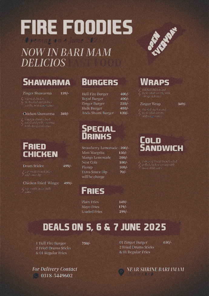
Oh ahh Edit: I opened in Photoshop. I used magic wand tool to select the background and deleted it with delete key on keyboard. Then I added an adjustment layer solid color and placed it below the original layer. I then combined all layers and adjust color and added vignette (camera raw).
It’s not bad, it is definitely pretty clean and well organized. I’m not sure what the red splotches are, but they do clearly help my eye move around the menu and understand what they serve and help me find what I am looking for.
With that being said, details matter. As @Smurf2 mentioned Delicious i spelled wrong and there are a host of other fairly “small” things that need to be fixed including:
“everyday” in “open everyday” should be two words. It may seem minor, but “everyday” is an adjective as in “the sun rising is an everyday occurrence” where as “every day” means “each day”.
Unless it is an odd local phrase, under Zinger Shawarma, the description says “ChFried chicken”, I assume that should be “Fried chicken”.
Drum Sticks is correct, in the deals section though you use “Drums Sticks”. Also in the deals section you mix using 01 (with a leading zero) with regular numbers. Drop the leading zero.
Margarita is spelled incorrectly. Under wraps, specialsauce should have a space between special and sauce. Chili sauce is spelled incorrectly (it should be one “l”, unless that is a local specialized phrase or sauce.
The red squiggle next to the description under the Zinger Shawarma is not aligned to the top of the text like the other squiggles.
It looks like there should be an item name for the first wrap that is missing, as is the price on the first wrap. Likewise, even if there is only one cold sandwich item, I would include the name of the item and treat it like all other menu items. There is also no price for the cold sandwich.
Aligning things matters as well. Your prices especially in the center column should all line up. Currently they don’t. Likewise, the prices under the left hand column do not line up.
for the Sauce dip, it should say “will be charged” with a “d”. All instances of “serving” should be “served”, but once again local use might use serving instead.
Islamabad is too close to Near Shrine Bari Mam at the bottom.
Lastly Red on black for small text, such as Islamabad at the bottom are notoriously hard to read due to there not being much contrast. Even the larger red text at top is a little problematic, but can still be read.
Also the type treatment for “open every day” seems random and misplaced.
No prob with the design. But spelling errors drive me nuts.
Had a local restaurant with premium prices with something similar. I refused to order from the menu that looked sloppy and gave my concerns to the manager and he agreed it wasn’t good enough.
All the best design is undone by sloppy errors.
Everything is part of the design, not just the layout.
Speaking of the layout, I think it’s fine, but I’ve always hesitated to reverse small white typography out of a rich black unless I know the printer cares about quality and will trap and choke the letters as needed and register the colors with precision. Otherwise, there’s too much opportunity for misregistration and dot gain.
Then again, I’m not sure if you’re using a rich black, as it appears to be a two-color printing job. How were you planning to print the deep black? Plain, solid black never looks this rich and deep without other colors behind it (perhaps a 20% screen tint of the red?). Will this be printed offset or digitally, with additional color options available to beef up the black?
I suppose what I’m saying is that even though this looks like a simple piece to print, there are several printing considerations to keep in mind.
I also agree with @CraigB. What he mentioned might seem like pickiness, but it’s not, especially when the number of mistakes adds up to a major flaw. Spelling needs to be perfect.
Yeh the semi serif will likely be lost at the small sizes.
I’d suggest for this to switch to Sans Serif and least a semi-bold version, if not bold - also minimum font size of 7pt (but 8pt preferred) and increased tracking.
I would be far clearer in print.
If it’s just for online then it’s ok.
But for print, needs work.
Black solid in digital print might not look great at all.
For the OP - how about flipping the colours and a plain white background with black text and red for details or something.
Might be far cleaner and easier to print.
What size is this? Depending on the size, it would be very difficult to read. A primary principle of graphic design is “Don’t make your reader (customer) WORK to understand your message!”
The more you make a reader/cistomer work the LESS effective the design will be.
Tell me about it. Went out for lunch earlier and didn’t have my glasses. The writing was so small. Food was still delicious.
Last time I was in the UK, I learnt right quick not to look at the menu. Buy the Tonight’s Special. Fresh made. ![]()
Yeh just ask for what you would like and hope.
Can you add an image preferably an image of their main dish. It can form the background subtly. It help reduce the texts being too much. Otherwise the overall design is perfect.
text over an image creates all kinds of other issues.
I disagree with changing paper color. Just buy colored paper. Customers. New customers will think wow how neat, look at the thought process that went into this menu.
Unless you lose a lot of your menu’s to theft (you don’t cover them in plastic?) Then spending a few more dollars on art paper is a good idea.
That’s great. Now we just need to add an extra colour (white) for the text.
That’s just silly.
You guys are insensitive to the fact that this artist hails from a country that is ruled by it’s religion: Islam.
What is acceptable here may not be acceptable where you can get your hand cut off your or your head for not abiding by Sharia law.
Can someone who lives in Pakistan or Saudi Arabia, tell us, is the menu only for women? Or only for men? Can both women and men look at the menu? They’re very strict about this over there !
In regards to readability. White text on a black background can be harsh on the eyes, especially when the font is small. A lot of people don’t realise that monitors can make this look more vibrant than it does in print. In reality, it tends to look dull or a bit muddy, and if the font’s not big enough, it’s a struggle to read. Using a slightly softer off-white or light grey can ease the contrast without losing clarity.
You also mentioned changing the paper colour instead… well you usually can’t actually print white ink unless you’re paying for special processes, which are expensive and not always available. Most of the time, white in your design just means “the colour of the paper.” So unless the paper itself is white, the text won’t show as you expect. And even if you’re printing black flood over white stock, it can scuff and look patchy.
A simpler option might be to pick a lighter paper colour and run black or dark text over it. That way you avoid contrast problems, improve legibility, and sidestep the hassle of trying to print white.
On the cultural angle the question about Sharia law and colours I’d be careful assuming that’s driving any of these design choices. Unless the client specifically said they were restricted, it’s probably just a stylistic decision. In commercial design in Pakistan, you’ll see plenty of bright, varied colours, so it’s best not to jump to conclusions.