Hello!
I am working on a correspondence course which asks for me to create two magazine spreads.
I am using the Shutterstock photos as a placeholder for the same image until I actually want to use two more of the six I have left for my plan this month. I am having trouble with spacing, and also trying to figure out how to make this look more professional!
Oh, wow! I don’t even no where to start critiquing this. You’ve seemingly not had any experience in doing anything like this before because, well, everything is pretty much wrong. Sorry.
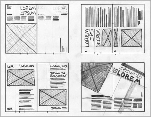
Starting at the most basic level, are you familiar with an underlying grid system? It’s an imaginary grid that all the elements on a page align to. They serve to keep everything looking orderly, lined up, unified, and consistent with each other.
You can’t just toss things onto a page and expect anything to work out. You need to, first, design that grid to provide an underlying and consistent structure to the pages.
I’m also going to move your post to the student section where you can get advice a little more in keeping with your experience level.
OK, so I took your critique and added some stuff.
I don’t know what kind of dingbats would work with this, or how to do page numbers/running footers. Do you have any ideas?
I have to ask: what was the reason behind the initial choice of the blue colour scheme and do you think that feels appropriate given the content of the article?
Also what’s the reason for the various darker and boxes around the blocks of text - I get that there’s an issue of contrast with the white text on the sky blue background, but do you think this is the best solution to fix the issue?
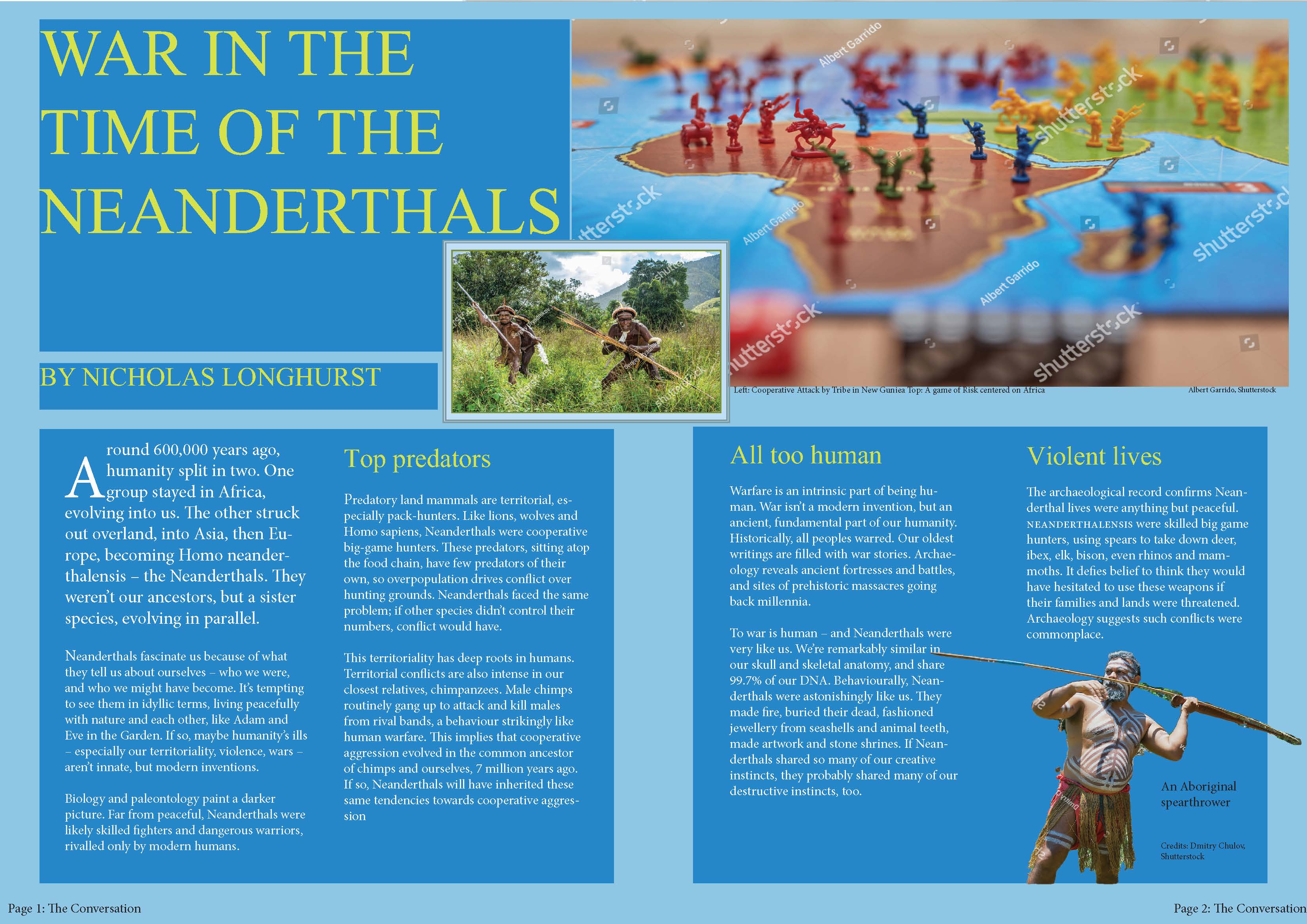
I always love images of Primitive Man that show them smiling.
I’ve always wondered when the smile became a thing. If you smile at any primate, a smile showing teeth, they will either back away from you in fear or charge at you, depending on their size. It’s a threat expression.
Even though there are still some big problems that others have pointed out, I want to mention your redone version is a considerable improvement over your first attempt.
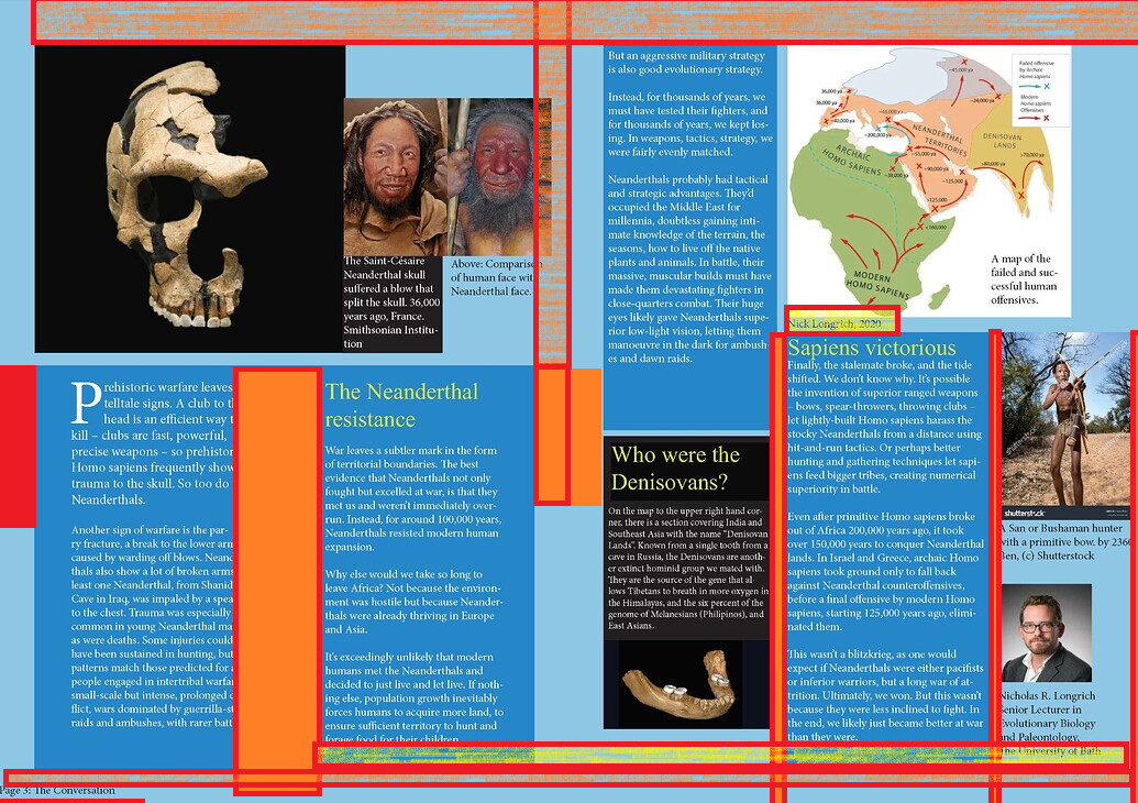
It’s far too close to the foredge. The bottom margins are too tight for print.
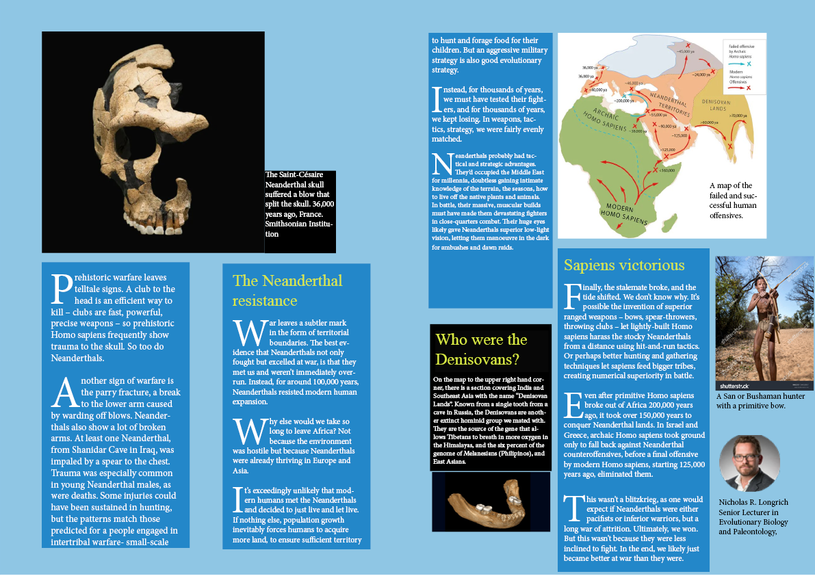
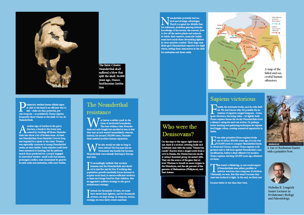
Why is the authors name and date a caption on a picture?
Columns are not evenly spaced - there’s an image encroaching on the spine are, even though it’s a spread, it doesn’t say centre spread, if this was a spread in a 60 page saddle stitch book that was near the beginning the image would be despearately lost in the spine area.
White text on a light background, recipe for a disaster, not impossible, but the printers will hate you - let alone it’s a serif font, so those little hands and feet on the letters will be a nightmare in print on a litho press. Might work out ok if it was printed digitally.
The black area - why are there are 3 different shades of black? Again white serif text on background like this - a nightmare for printers.
Typography is crass and unimaginative and needs serious addressing.
To answer your question about primitive man smiling, I would suggest it happened between the most recent common ancestor of chimpanzees and us, which you mentioned, at 7 million years ago; and the 600,000 years ago when we split from Neanderthals. I know that’s a long time, but smiles and the soft tissue we use to make them don’t fossilize that well. Perhaps it happened when chromosome 2 flipped over when we split from chimpanzees. I don’t know.
Hey mate! @pluto
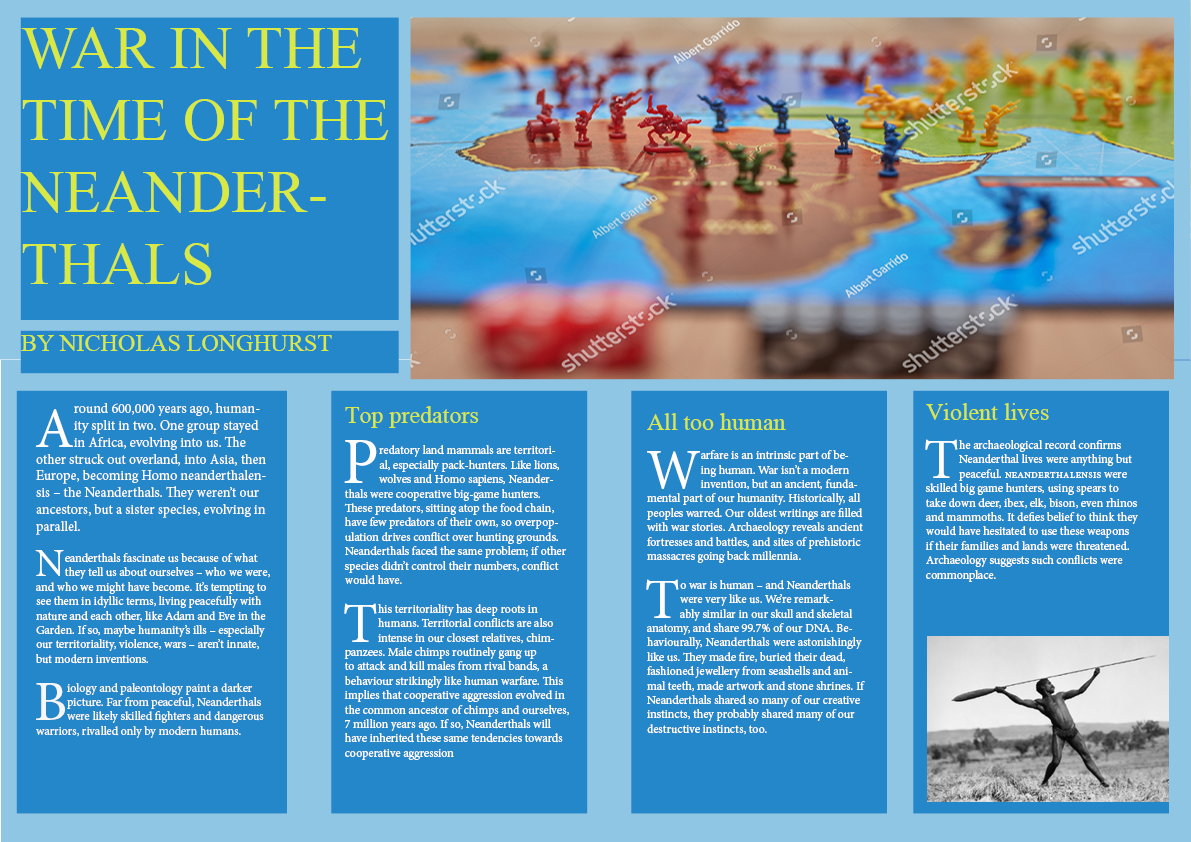
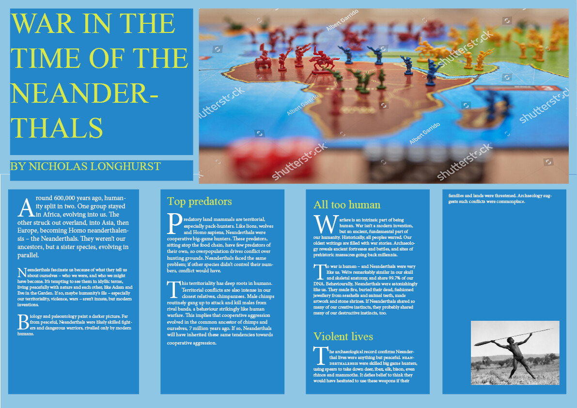
I miss Aussies! I chose the blue color scheme because I didn’t like the typical brown. I was originally trying to make a color scheme and visual hierarchy based on the colors in the Risk Game photo and it didn’t go very well. The brown wouldn’t work, or the green, the yellow, etc. It was difficult to make.
When designing research is a huge part of graphic design. If you don’t know what a magazine has within maybe a quick browse of a checkout aisle at a supermarket may lead you into some inspiration format wise.
When designing you don’t need to know anything about the topic. I have never read a single piece submitted to me for design. I go entirely by the brief - and I have no concerns of what the content is or what the topic is.
Your whole spread could be just of some images and some filler text - it shouldn’t affect your grade whatsoever.
The only thing that will affect your grade is understanding page layout.
Ok - you don’t want to pay that for LinkedIn that’s why I mentioned the Free Months Trial that comes with it - maybe you could ask a sibling/parent/friend or someone to start a free trial that you can use for now.
Anyway - I gave you plenty of links to digest - and I think with a bit of studying and some trial layouts - you can make this so much better.
Reading the story isn’t especially important if the goal is just to make a good looking layout, but doing so is important to make a great layout whose personality matches that of the writing and the story being told.
At this point in the OP’s education, that might take a back seat to learning some basic layout principles, which is perhaps what you had in mind. I’ve never laid out anything without reading the accompanying text.
Thanks mate, hope you’re doing well where ever you are !
Regarding your magazine spread, I get that you want to differentiate your article from existing articles about prehistoric times and are trying to create some visual interest, but I think the blue/yellow colour scheme doesn’t match the content.
Yeh, I know what you mean. I just understand the subject matter, the content doesn’t really matter to me. You can get a gist of the content by a typical glance through headers for design ideas.
A layout for an Electrical Supply companys annual report, compared to something for a music magazine.
You bring in different design elements based on context of the subject, but typically there’s no need to read or understand what it’s about.
And there’s generally an overall design system/grid that is stuck to.
I’m just saying - you don’t need to know that Neanderthals bared their teeth for smiling for agression or for fun - it plays no part in the layout.
Yes, you might get a request to change an image - but that doesn’t affect the layout.
I’ve done plenty of designs were there were no clues give to an image required, and even if I did read some of the text to understand the context, particularly in an area that was do with fleas/mites/ etc for a Vetinary product, I wouldn’t know if that stock image I picked based on a picture of Mite is exactly what they are talking about.
Which has happened, and picking an image you think is right for a layout may be completely against the context of the design on a technical level.
Generally, once you know the target audience, the context of the piece and the style that they want you can go a long way to getting initial spreads on the table very close to what they are after.