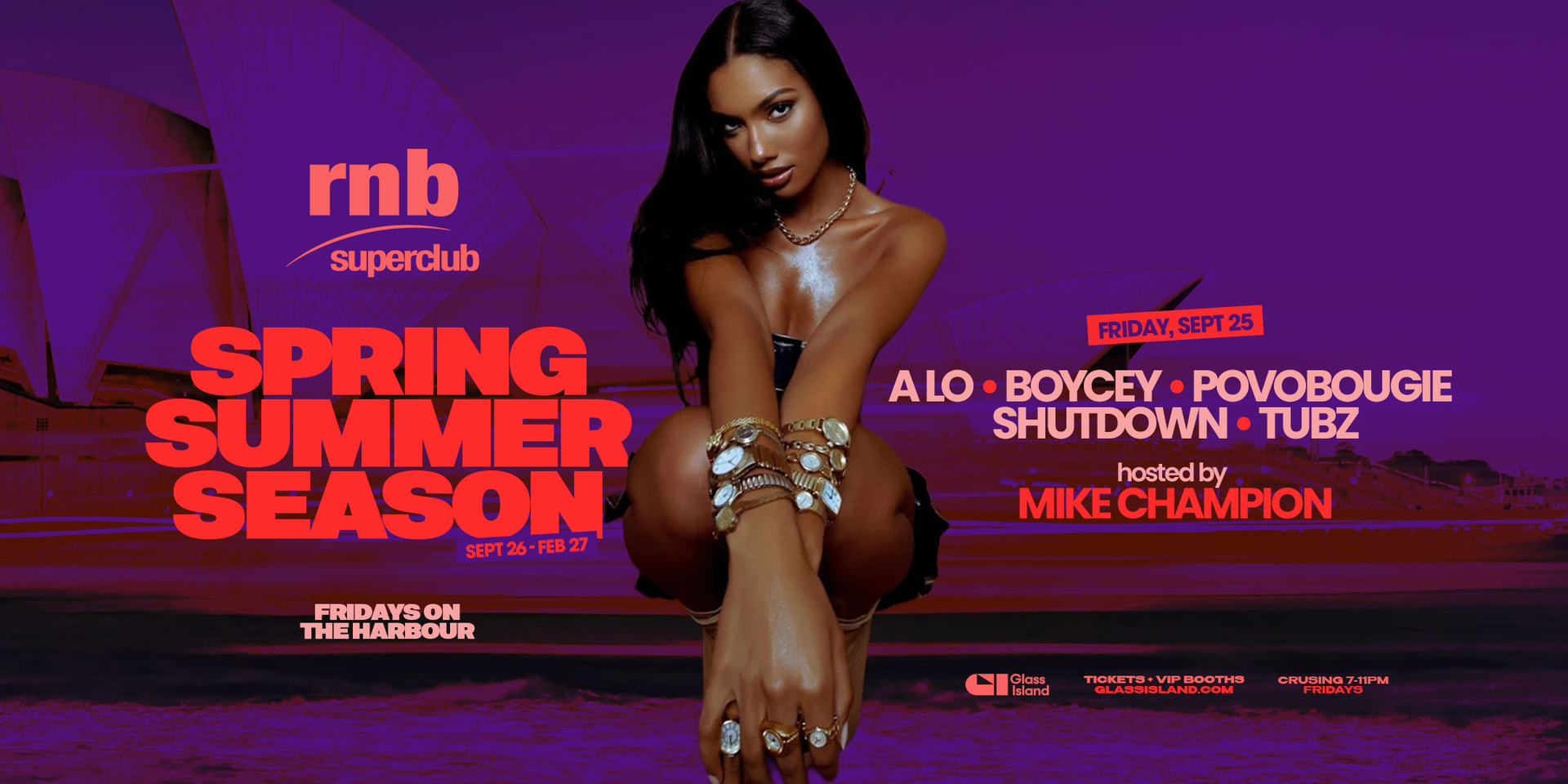
Hey all, please critique this and recommendations to enhance (I’m still new and learning to design)
Its for a spring/summer boat party series on the Sydney Harbour
Hey all, please critique this and recommendations to enhance (I’m still new and learning to design)
Its for a spring/summer boat party series on the Sydney Harbour
No location or pricing. What harbour? Every Friday or just that specific Friday? What’s ‘crusing’ mean? Where do I buy tickets? Where can I see it? Is there an online version? What type of event is it?
The photo looks underexposed. Do some variations where you adjust the levels.
Here are words on both sides and a woman in the centre, but you seem to be missing the focal point.
I seem to be the odd person out on this. I think it looks great and communicates a message that I think the target audience in Sydney will readily understand. Some of the colors are just a bit out of gamut for CMYK, but perhaps it isn’t intended to be printed.
@Just-B I agree visually it’s nice.
The overall balance works well, particularly for an online or social media campaign. I wouldn’t be overly concerned about the colours being outside the printable gamut unless this is actually intended for print.
The main issue is the communication and hierarchy of the event information. “Sept 26-Feb 27” (which ironically are Saturdays), we take it to mean September 2026 to February 2027, but it can easily be read as two specific dates, especially when “Friday, Sept 25” appears elsewhere in nearly the same way. The dates aren’t technically duplicated, but they’re presented in a way that makes their different purposes unclear.
If the event runs every Friday from 25 September 2026 through February 2027, that information could be together
Spring/Summer Season
Every Friday from 25 September 2026
Cruising 7–11 pm
The time is currently extremely small and tucked into the bottom-right corner, despite being one of the most important pieces of information. I would also imagine that “Crusing” should be corrected to “Cruising.”
It isn’t completely clear what “Fridays on the Harbour” means either. Is the event held aboard a boat? Does it depart from somewhere and cruise around the harbour? Departure point or clearer venue information should be included unless the intended audience is already familiar with the venue.
Look, the artwork is fine, but you know yourself essential information is scattered across different areas, and hierarchy is often treated as an afterthought. The structure needs work so viewers can immediately understand what the event is, when it takes place, where it is and how it operates.
The left-to-right balance is generally good, although the “rnb superclub” logo feels as though it’s hanging in no-man’s-land rather than belonging clearly to either the headline or the broader composition.
If it genuinely runs “every Friday” through the end of February 2027, the final Friday is 26 February, not 27 February. That may not be an error if “Feb 27” simply means the month and year, but the design makes the reader work harder than necessary to understand it.
I’m not having a go, we see this all the time. It may simply be that I’m not young anymore, and the intended audience will see an appealing event, visit the booking site and choose a suitable date there. Young people, as I once was, will generally make time for something different with friends or family.
But if the purpose of the artwork is simply to attract attention and send people to the booking site, most of these scattered dates and times may not be necessary at all. Announce the event clearly and let the booking page handle the details.
So it needs to decide what it is either an eye-catching promotional banner or an informative event advertisement. At the moment, it sits awkwardly between the two.
Just my 2 cents