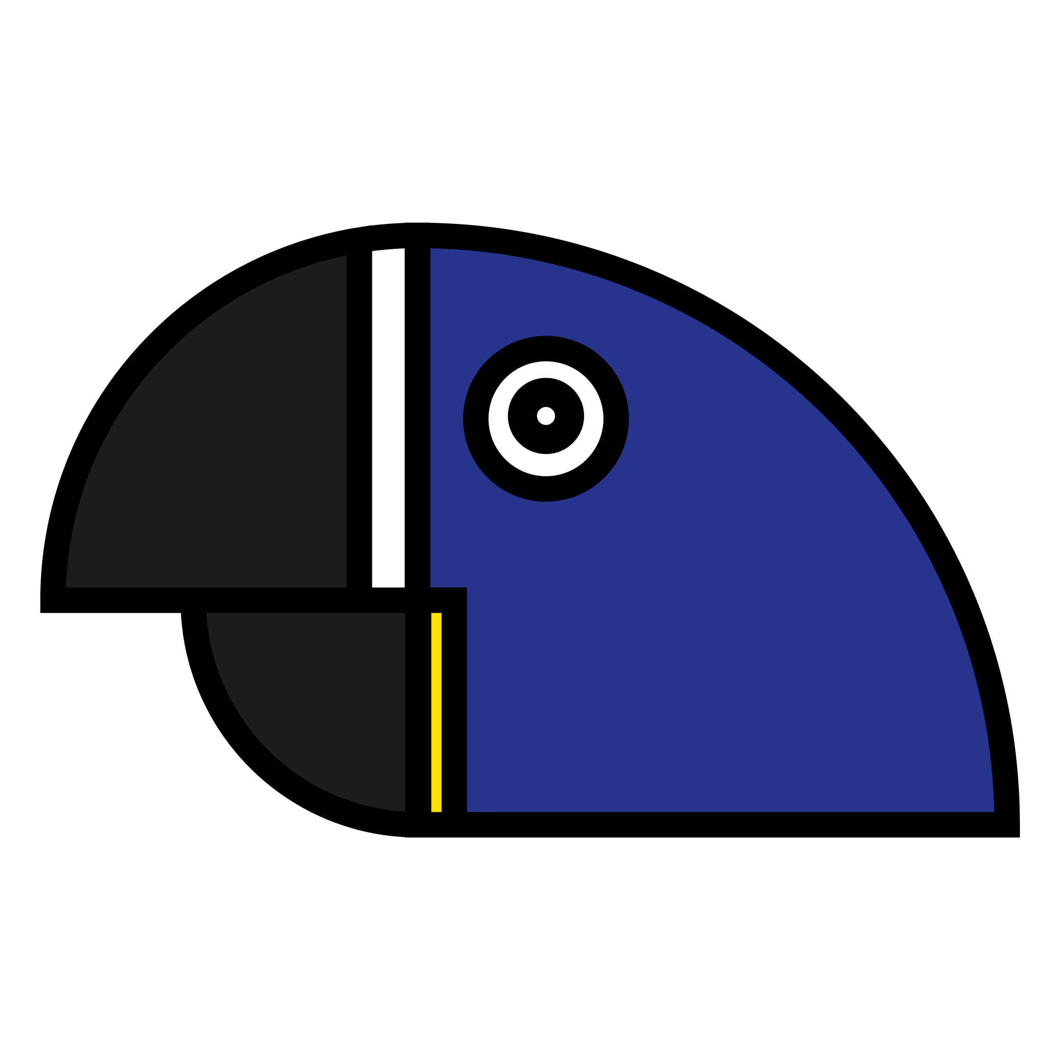
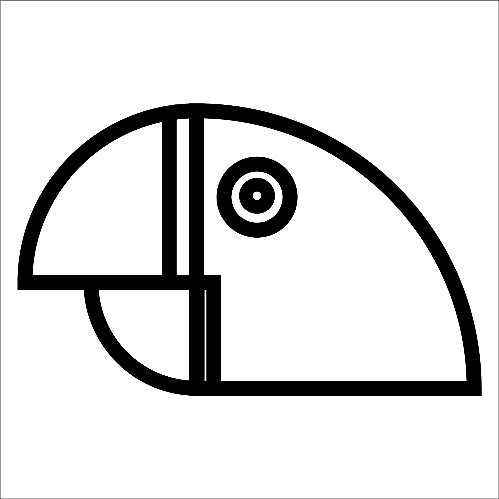
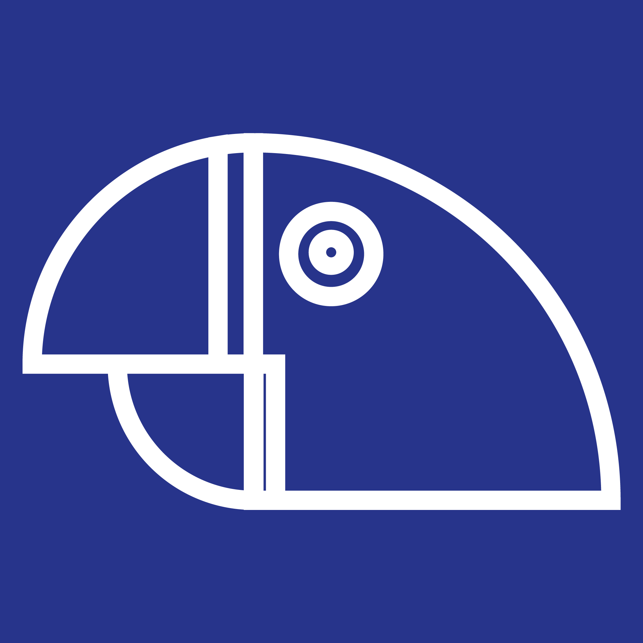
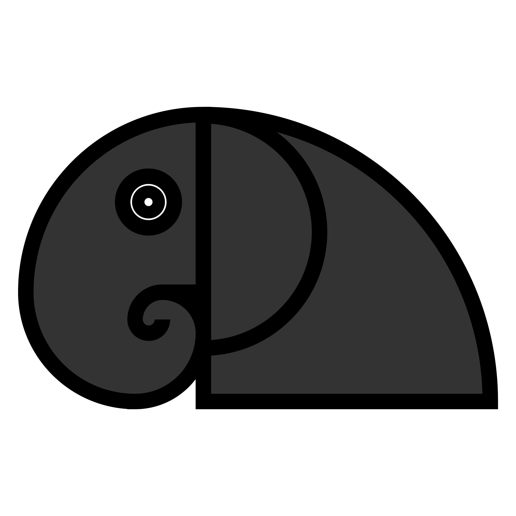
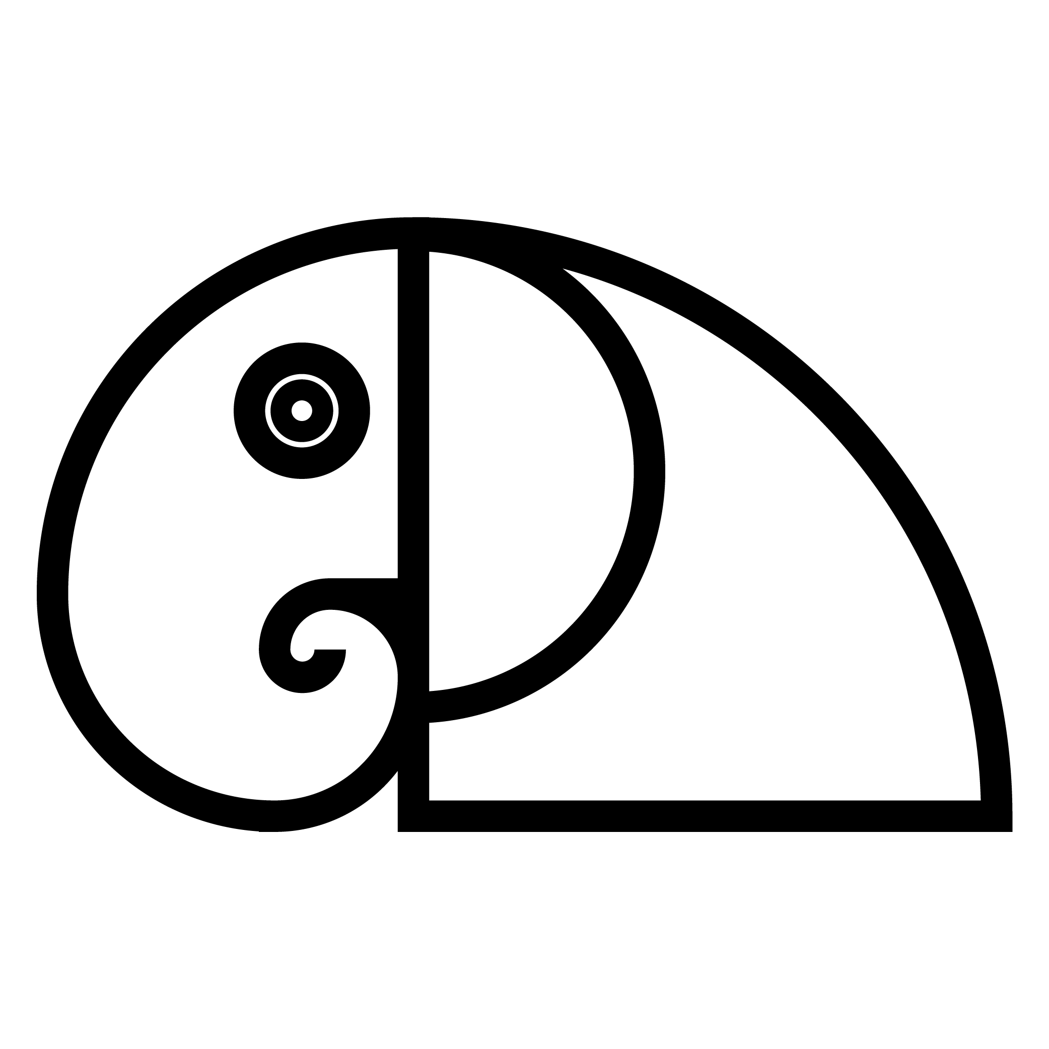
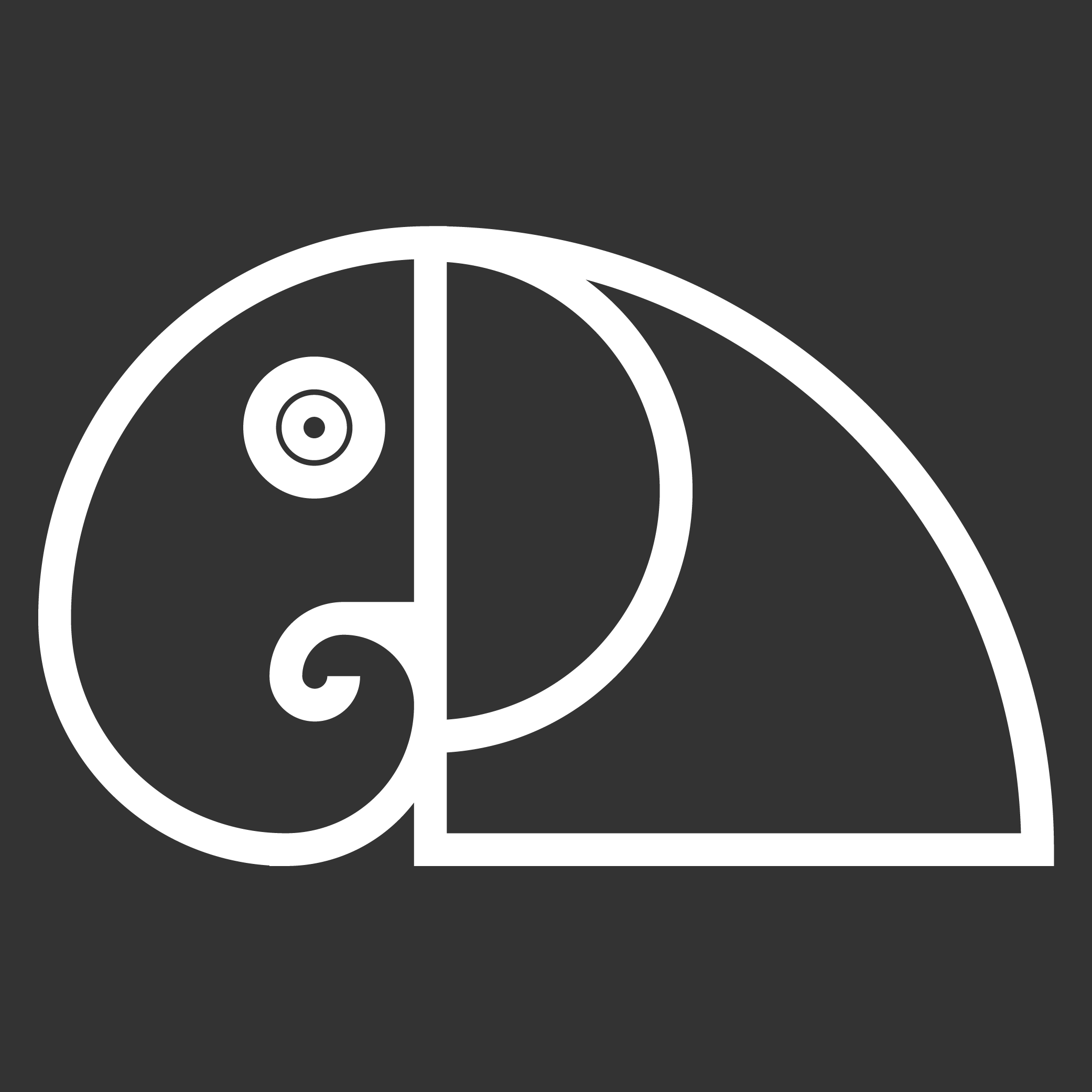
Today was my first day of a new school semester, the discipline being taught is “Form & Function”. For today’s task we had to design icons for animals in a Zoo, to be used in signs and etc. The visual brand identity of the place really. My partner and I chose two animals (elephant and blue macaw), and designed their icons based in the concept of fibonacci sequence nature perfection. Below you can see some of the proposals, I’d like to know what you find about their design and colors, and if you have any suggestions I’d be glad to hear them.
Be careful of your contrast with the darker colors and black.
The whole thing about wayfinding is it has to be ADA compliant (which is probably well beyond the scope of your class project.) It has to be legible to low-vision individuals so high contrast.
the eyes are a little bit disturbing in the single color versions. They draw a little too much attention away from the design.
Be aware that the blue color you have selected may not print that vibrantly in some print processes.
I agree about the eye thing and other production points, but overall, it is a very nice, elegant solution. A bit different to the usual such icons one sees. There’s a bit of substance in the thinking too. My main question would be: Would this fixed approach roll out to all the icons you’d need for an entire zoo? I think with a bit of flexibility, it might well do. Well done. With a little further development, your solution may well have some legs – somewhat ironically!
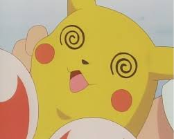
I agree about the eye. On the color version of the Macaw, it actually looks reasonably accurate, but on the single-color versions (and all of the elephants), it takes on a hypnotic-looking quality not unlike that of a spiral-eyed cartoon character:
I could see a case for using the same target-eye on all the animal icons for stylistic reasons, but there are a lot of animals who’ll look pretty weird with it. An elephant’s eyes are much smaller than that, in relation to the head, and this treatment looks a lot less like an elephant because of it.
I’m also compelled to mention that while I get the charm and novelty of the fibonacci thing at this point in your development, I’d predict that if you were really doing this for all the animal identities of a real zoological operation, you’d find yourself fighting much too hard against deviating from the ratio long before you got through it. Marrying your concepts to such principles only makes design more difficult, and always forces a compromise sooner or later. You’ll impress yourself, but in the end no one else will notice or care that you pulled it off, and your process could have been smoother and more natural without it.
Although I agree with the criticisms, these really are quite nice.
In addition to what others have said about contrast, eye size, and the pitfalls of basing designs around mathematical sequences, the thin line between the two lower vertical parallel lines in the macaw is awfully thin — thin to the point of being distracting and threatening to disappear — especially in the two monochrome versions.
Again though, these are criticisms of two very impressive and clever illustrations. I like them.
Was the fibonacci sequence a requirement for the assignment? Because if not, I’d let go of it. It’s an artificial constraint that doesn’t contribute to the purpose of a logo, especially when you’re learning.
I like the logos you’ve come up with so far, because they’re identifiable as a parrot and elephant. They aren’t bad. All I"m saying is, give yourself room to make changes without an artificial, unnecessary limitation.
I actually like the imagery. With a little tweaking it could be an elegant solution.
Most people out there aren’t going to recognize those icons adhere to the fibonacci numbers. But doing so adds a nice proportional relationship to the elements that is pleasing to the eye. But like DP said, don’t be afraid to break the “rules” here and there - as long as the solution isn’t garishly different.
Thank you guys!! I really appreciate your valuable critique!
As for the concept, I guess my friend and I were seeking for some good narrative, and the fibonacci sequence seemed to be a nice match between icon design and nature. But you all are right, it took us quite long to figure out a good-looking distribution of the proportional arcs in order to relate it to the animal the icons were meant to identify. It ended up on us struggling to solve a puzzle, and only for two animals, so perhaps a tough choice as the project would require an extensive variety of icons. Well, after your great comments, I feel more aware about some technical issues that must be taken into account when we’re working on wayfiding and signage.
And yeah, those eyes are just bizarre, (what was I thinking of?) sorry for all the nausea caused hehe…
With all respect, I do not agree with you. If someone chose such a technique, then sooner or later he/she will know if it limited him/her or not. There are plenty of examples of good designs based on the Fibonacci concept. Like in photography some people love use Rule of Thirds and others don’t care but let’s not stigmatize any of these groups.
The rule of thirds is a time-tested principle of good photographic composition. It’s not required, but it’s a solid concept for well-composed images.
Fibonacci sequence is not a principle of graphic design. There are design principles, but fibonacci sequence isn’t one of them. Because graphic design is based around marketing to a target audience.
I’ve seen fibonacci sequence used in photography as a composition guideline, very occasionally. When it works, it’s really cool.
I 100% agree but I did’t say that Fibonacci sequence is a principle my point was to not discourage the exploration of different techniques - golden ratio for exaple in this case.