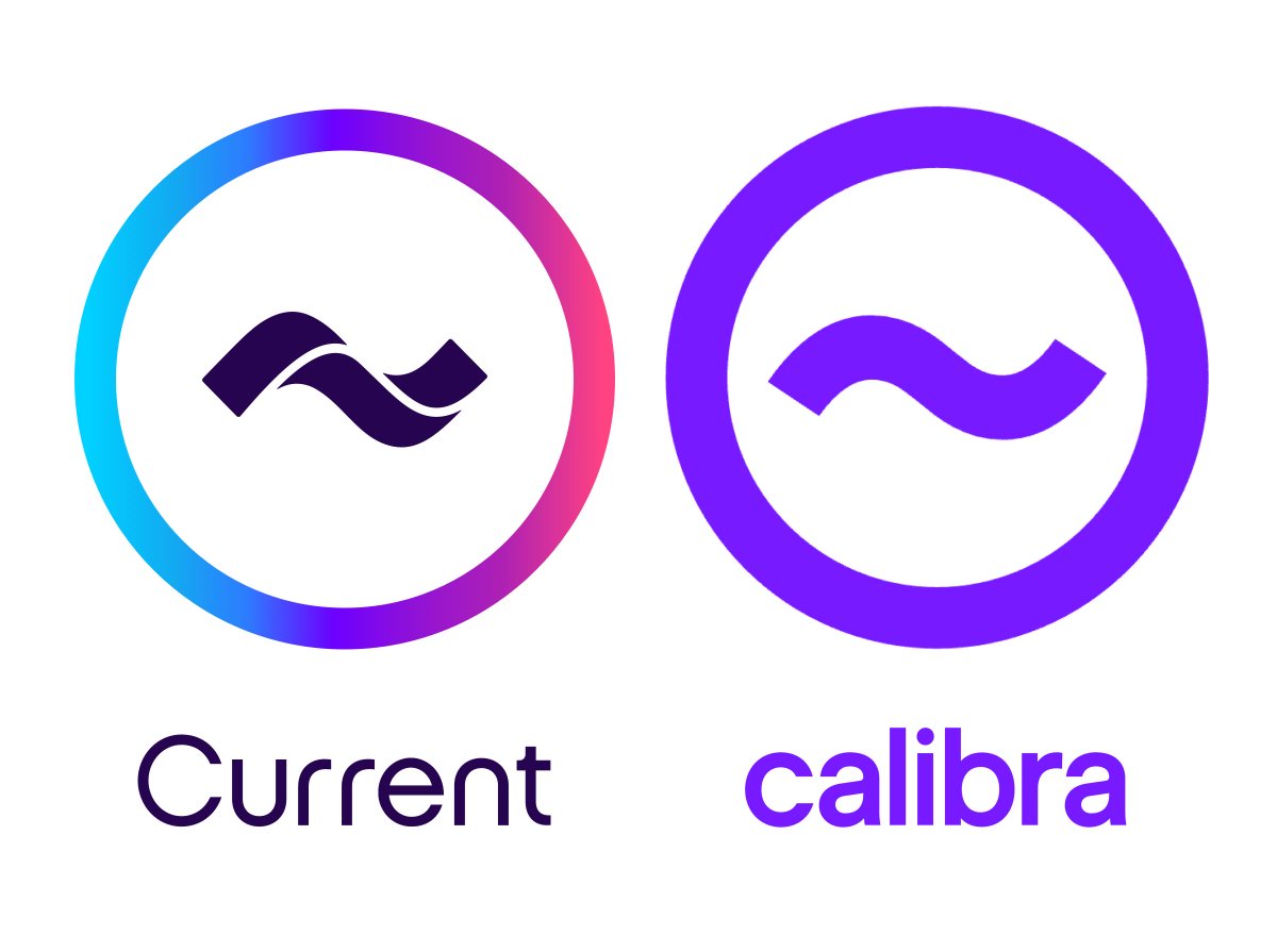
Mobile banking app Current sued Facebook’s Calibra over their very similar logos. Apparently Facebook refused to change the logo upon being contact in July 2019 when the project was unveiled.
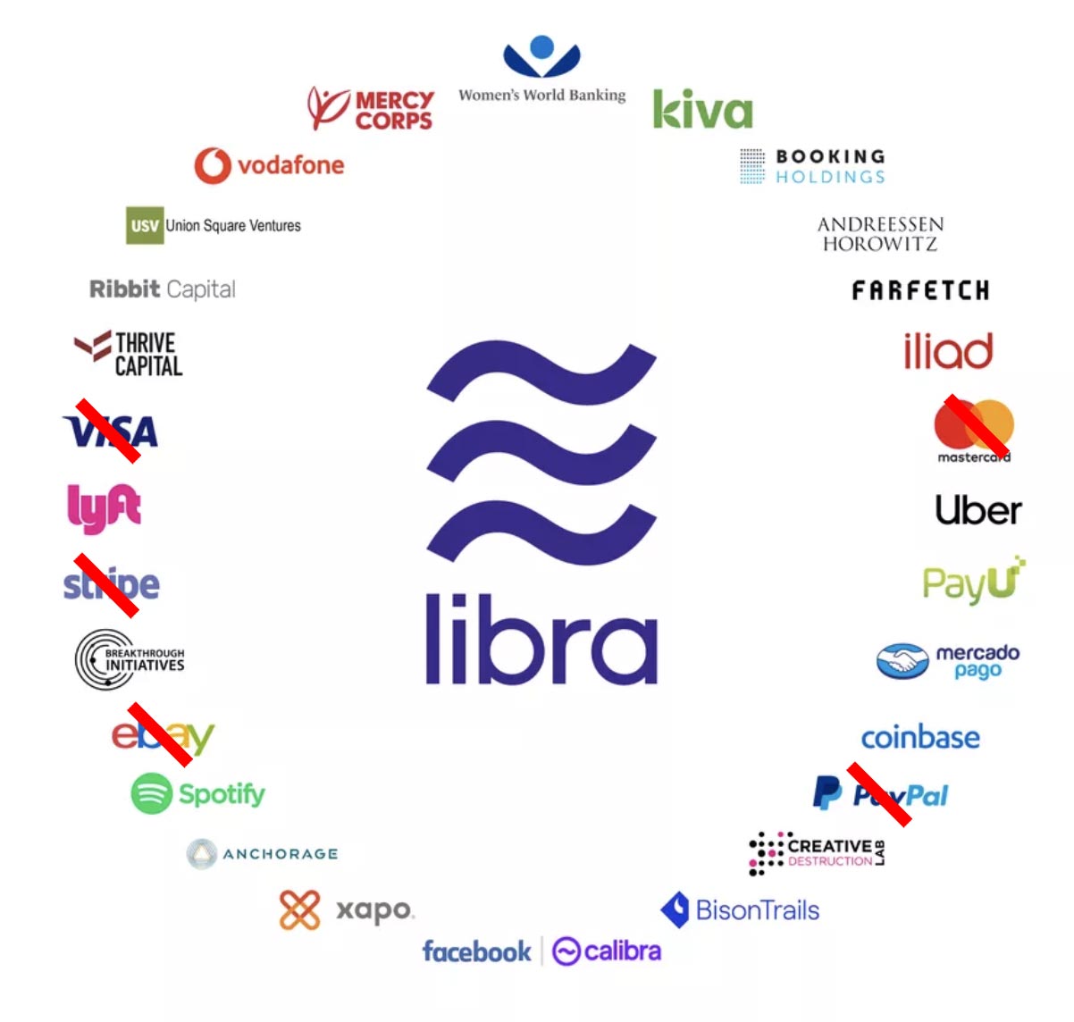
Calibra is a subsidiary of Facebook, responsible for managing the wallet for Facebook’s planned new Libra cryptocurrency. Libra is in trouble other ways too. Recently Mastercard, VISA, eBay, PayPal and Stripe, the largest and most important players pulled out of the earlier agreement to join Libra initiative, after the project received strong pushback from the USA and the European Union.
Not sure you get the issue here.
It’s a trademark dispute.
The banking company named Current had their logo designed in 2016.
Facebook came along and “copied” it for a similar purpose in the last year.
Interestingly enough, the design firm that created the Current logo is also the same design firm that created the Calibra logo.
That’s gotta be awkward.
I wasn’t aware of that. It’s hard to imagine a high-profile design firm doing something so stupid — especially with a major client. I wonder what led up to it.
I gotta say, I’m not too fond of Current’s gradient logo. But more and more, I’m coming to accept all the “looks good on my phone” effects.
As long as you’re good with what plops out of a printer.
And a tilda in math means “approximately.” Not a good concept for a bank.
If you look at the actual Twitterfeed link, someone replied maybe there was some significant turnover at the design firm. Still, seems a little more than coincidental.
Did you even bother to read the post? It’s about copying an already-existing logo, so “attractive” seems mostly irrelevant and “perfect” isn’t the word I’d use. How about explaining your reasoning in a little more detail?
I just finished a rebrand with a client that insisted to use a gradient like that across all of their stuff cause its “trendy on instagram”. I tried to fight it cause they do a lot of printed material, but it was me against a committee of 20. Now here we are trying to create the same gradient with wet on wet printing (colors can’t touch) with only a 90 lpi halftone
Yup. You should see what happens to the price tag when I have to get a two-color airbrush gradient done in auto finish for an exterior sign. LOL. Never mind a complete rainbow gradient…