Firstly, hi and welcome.
Well done for having the mettle to put yourself out there and face criticism. It’s not the easiest thing to do. The more you do it, though, the easier it gets – in theory – once you realise it is not personal and is objective.
All that precursors my thoughts. So here goes…
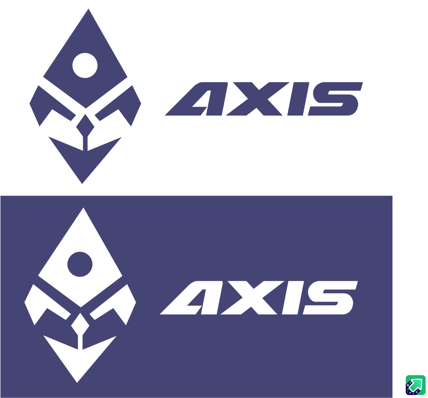
What you have presented, naturally, given that you are just starting out, has issues, but visually it is pretty competent and is better than I would expect from someone at your stage of the game, from an visual stand point. That is not meant to sound as dismissive as I know it probably does. However, From what you have presented, all that can be criticised is the aesthetics of it. As a logo, I’m afraid, it is pretty meaningless.
My big issue here, is not the logo itself. You patently have some talent and a definite aptitude for this kind of work. My issue is the educative path you are going down. It pains me to see someone with obvious ability walking blindly in the wrong direction. Believe me, we see people here, like marching ants, who come along to present their work and you just know they have no ability, but wanna be a designer coz it’s cool.
Your post demonstrates exactly why you should not go down the self-taught, online, YouTube, daily competition route to becoming a graphic designer. You won’t. Well, you might, but you won’t make enough money to give yourself the kind of life you dream of and you won’t be doing the kind of work you want to be doing. You’ll end up scratching in the dirt with the army of ants searching out $50 logo work. That’s not design.
Design is always about problem-solving and is multi-faceted.
A logo with no context, with no brief, no problem to solve is as pointless as a chocolate teapot. It may look pretty and appealing, but ultimately, useless.
Logo design, in and of itself, is meaningless. It should always be just one part of a brand. It should be a visual mnemonic, onto which a company or organisation’s cultural capital can be built. It is the vessel which holds the ethos, culture, aspirations, market position, etc, that represent the organisation in question. It is the designer’s job to communicate this ‘culture’ to a specific and intended audience. A logo is simply the representation of all these things. Through use of typography and imagery, you help evoke the emotional response that your client needs to grow their business.
I know that all sounds a bit intense, but it is intended to help you see why ‘doing’ a logo a day is pointless. You have presented a logo, as you say that is based on a rocket. Equally, it could be a pen nib, a teddy wearing a clerical mitre, what is it for? Is it a courier company? What market are they in? Who is their audience? Where is the company headed? Start-up, or existing company wishing to tweak their market position. I could go on. Design has to have a reason to exist, otherwise it’s just prettification.
The very best advice I can give you is, go and get yourself a bricks-and-mortar degree from an actual university with actual students and lecturers, where you will get daily, in-person critiques of your work.
Learning is massively important and good on you for wanting to reach as high as you can, but you need to learn in the right direction, otherwise you end up with lots of information and little knowledge.
I would be very interested to see your portfolio and other work you have done. As I say, just based on this one logo alone, it is clear you have an aptitude; don’t waste it.
Hope this helps.