Hello all, it’s me again. In a previous post, it was pointed out that I struggle with typography. I have been trying to work on it since, but ran into a small problem when we were required to design one shirt that uses just type and another with a graphic.
Neither shirt feels like it is complete. But I don’t know how to improve either design to where it would be marketable. Any help would be greatly appreciated for this.
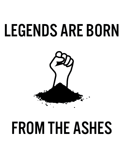
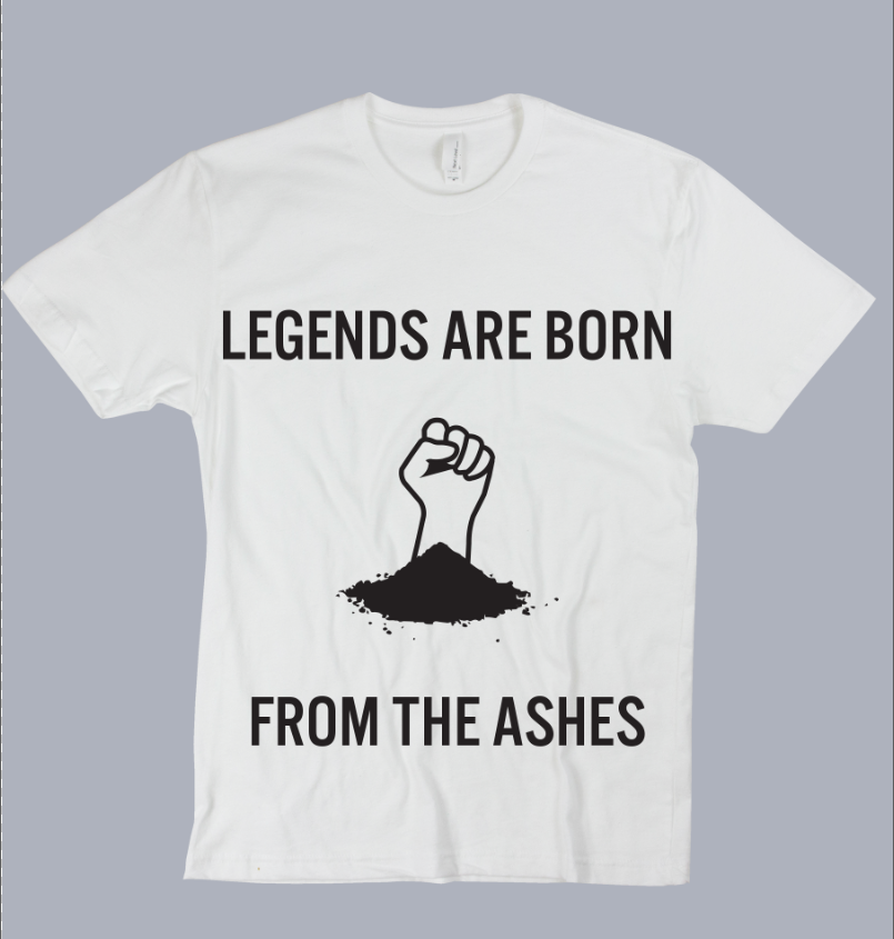
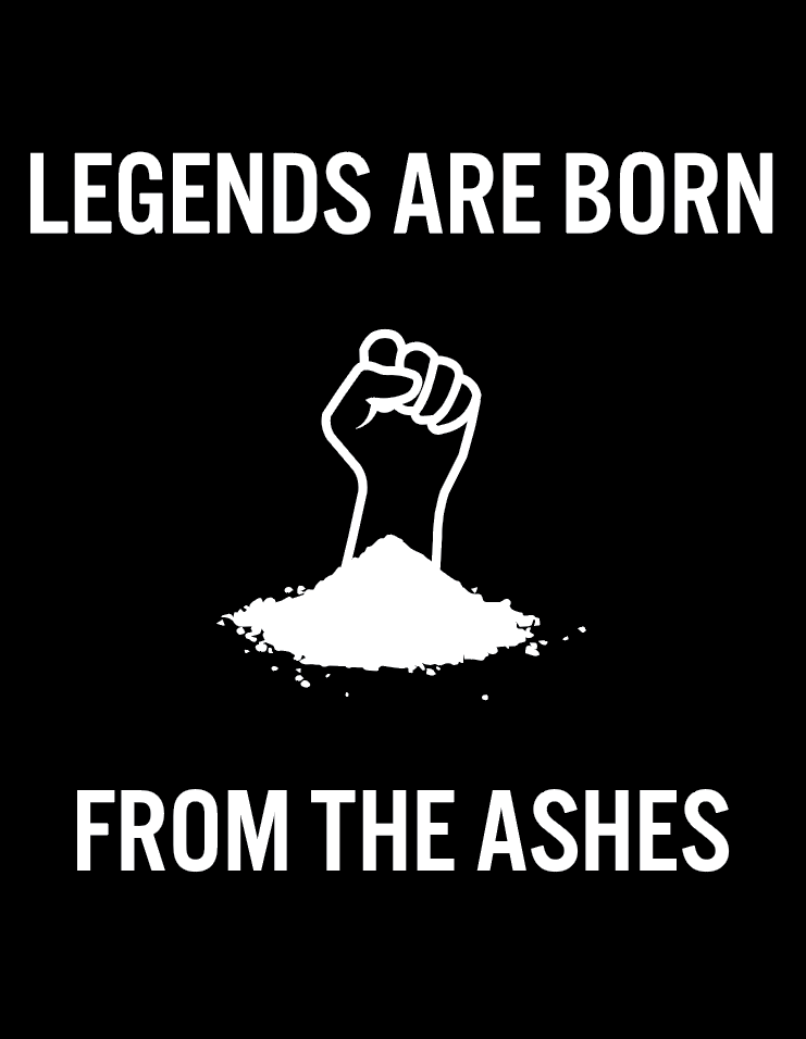
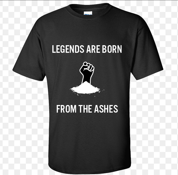
For the illustration: All I see are two separate entities: The fist, and a pile of dirt, independent from each other. Nothing says that the fist is protruding from the dirt.
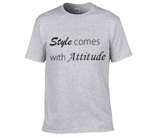
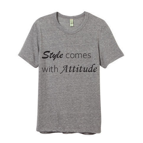
“Attitude” should be the key word, but, as it is, it looks weak, and the kerning does not help.
looks like cocaine from typical Miami 1985 day!
the hand needs more contours, or a defining line near the arm-palm toward the left.
about the style-altitude shirt, who is your target buyers?
i was going to design a T-shirt when i had to go to NYC back in 2004 that read “allah- akbar him instead” with an arrow pointed, like those 'Im with stupid" t-shirts we wore in the 1970s.
I don’t know where you found that typeface but it looks like garbage.
Properly designed, the letters with bowls such as the O and the S should dip down slightly below the text baseline. These letters have been made smaller to avoid that normal dip. It completely throws off the metrics.
(yeah, I know there are some typefaces that do that for effect, but they do it purposely and with positive results.)
1 Like
School projects aren’t intended to be marketable; they’re intended to teach you things. In a real-world situation, you’d rarely have the constraints you mentioned of having to use nothing but type. I suspect the assignment is an exercise designed to force you to see typography as more than just a series of readable words, which, based on your struggles with it, is exactly what you’re realizing. This is good. You’re learning.
Every typeface has a personality. Sometimes a typeface’s personality is pretty much locked in. The Brush Script face you used, for example, has a very strong personality, Everywhere it’s used, that personality is so strong that it’s noticed. Other faces, like the Myriad or Open Sans (or whatever it is) that you’ve used have more malleable personalities that tend to take on the personalities of the layouts in which they’re placed.
You already knew this, though, because that’s why you chose Brush Script and used the generic sans serif for the words you wanted to be more generic. The reason that I’m pointing this out is because you’re already learning things and might not even know it.
What you haven’t learned yet is how best to use those personalities as part of a larger, more complex composition. Just as an analogy, let’s say you’ve gone to a party. Each person there has his or her own personality on display. Collectively, these personalities add up to the personality of the party. Designing the right party requires setting the stage (music, activities, decorations, etc.) for each of those people’s personalities to emerge in ways that contribute to the bigger composition.
Just a suggestion, but head to your local bookstore. If there’s a shelf where all the best sellers are lined up with their covers showing, study those book covers carefully. Most will be dominated by typography that has been integrated into the larger book cover composition. This composition will, if designed right, complement the personality of the book itself.
Look at one book cover after another and ask yourself why the designer choose that particular typeface and why that typeface contributes to the larger personality of the composition and how it’s been integrated into that composition. Ask yourself why the composition is appropriate (or inappropriate) for the book’s subject matter. Try mentally substituting another typeface for the one that’s actually been used, then ask yourself why that typeface would have compromised the personality of the book or, perhaps, improved it.
3 Likes
If you are not stuck with the hand you could use a phoenix, since they rise from ashes.
As for the type you can use the type on path tool to give it more of a shape or wrap around the other type.
What Just-B said is really great thoughts and good advice. I think the main thing everyone is noticing is that you just aren’t trying anything…you’ve chosen two fonts that are just…there on your computer, and all you did was type them out in straight lines. It looks (and is) unfinished.
Again, take a look at successful designs “out there” in the world and get a sense for what works, then take cues from what you see. You are stuck in a very beginner-esque Safe Zone, which is fine, that’s how we all start.
Jump across that safety line and show us a variation or two on any of these designs–that’ll be a good first step. You can do any variation on the text; slice the letters up, slant the text at an angle, make the text form a circle around the illustration, etc etc. Just make sure the starting point for the idea for what you do comes from a successful design, one that you directly saw with your own eyes.
One of the worst beginner mistakes is to do this “I think I saw that style somewhere in my life” thing and go off of that vague notion, rather than putting in the work to find the right examples to work from. Pinterest people like to call it “inspiration”, but really it’s just research, and it’s important. Shoot from the hip when you’re an expert, but as a beginner, copy what works. You’ll learn naturally if you do that.
1 Like
Perhaps “copy what works” is a poor choice of words?
Very interesting design
No that is exactly what I meant.
In a learning phase: copy copy copy. This school project t-shirt should look exactly like a t-shirt he saw online at asos_com or in the mall at Journey’s. Copying is the best way for regular people to put some techniques and options in their arsenal…it’s basically “tracing” someone else’s successful and completed work. As a design student, normal people don’t start off with like, any good ideas. Case in point: the examples shown here are neither good ideas, nor are they well-executed. It’s amateur. But that is because he’s in school, learning. Learning should start off iterative, basically copying someone else’s work outright. That is how you learn.
Now, if he was a genius designer (he is obviously not or he might not have posted his work here to get feedback and help, something that geniuses don’t have to do), then he can skip copying others because he is “born with” the ability to come up with excellent ideas and also to execute them. But, as a regular person myself, I recognize regular when I see it…
I wouldn’t be saying “copy” if I thought this was going to be sent to a real client and then printed and the final product sold off for a profit. It’d be a different story then.
Just-B does make a really good point. Knowledge you gain from this assignment is more important then what you actually produce. From that standpoint there are a few things you need to learn and focus on to improve. Best way to do that is to learn from others. Copying other peoples work will give allow you to create some great products but breaking down why it works so well is whats going to help you improve.
Few resources that really helped me understand design better are:
-
Massimo Vignelli canon which you can get free online. He goes over everything that makes a design great, grid systems, layouts, concepts ect. He may be a little bit outdated in some peoples views such but stilla great read.
-
If your looking to create some great illustrations Youtube obviously has great resources for techniques that you can apply to your graphics. One I really like is Will Schorer who does cool awesome line art in adobe illustrator. Just watching him do his lin eart helped mine a tonne.
-
Typography. There lots to cover in this area, I’m personally just getting more into it myself. I personally bought a typography course on Udemy to help with my understanding. A good exercise that I do every now and then is to take a famous quote and rearrange it in a way that is more decorative with 2-3 different typefaces. One of the issues I would say with your typographic shirt example is the use of 3 typefaces. It says “Style comes with Attitude” adding that with Gestalt theory I would say that “Style” and “Attitude” should have the same typeface because the idea is that they are related. Kerning is also an issue as you look at attitude the A - t spacing and A - u spacing is off compared to the ttit spacing.
1 Like