I am redesigning this website https://www.autoloans.ca/. Please tell me what you feel about the current design of the website. What do you think needs to be changed? How much would you rate out of 10 for the current design?
We can’t do your work for you.
Not knowing any background information about the website, its clients, its change of direction that requires a redesign, etc., no one here is going to be able to answer your questions.
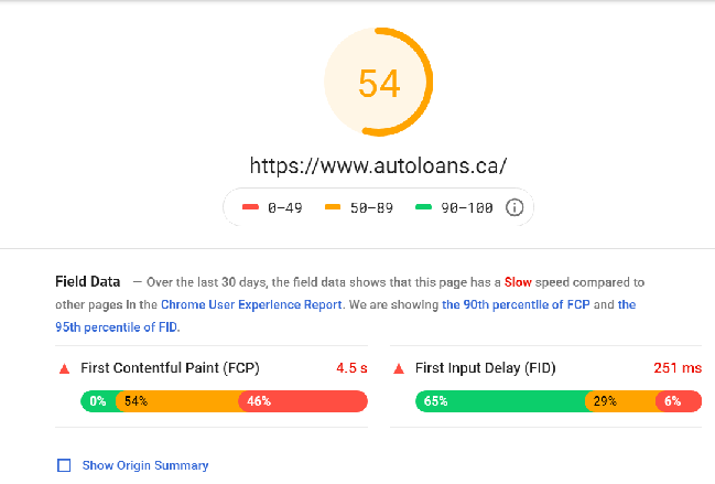
Well, PageSpeed Insights is giving me an error for your site, so that’s probably something to work on.
The button “Learn More About Our Inventory” doesn’t react on hover the same as all the other buttons of that style. Should just remove the underline on hover. Also the quote form along the right bleeds into the 2nd section instead of staying in the top. Maybe set a minimum height on that first div to capture the whole form within it? Didn’t really dig into the code to see what the issue is exactly.
Give some hierarchy to your headline copy. All the same size and all caps does not look appealing. Maybe put a light white mask on top of the background to lay it back a bit would help with eye focus as well. Right now it’s too busy and my eyes skim right over it and move on.
That’s about all the help I feel comfortable giving without knowing anything about direction, target audience, etc… like what @PrintDriver said.
Works for me now, too. Looks like you have a slow server, @nizasusan234