Hello fellow designers,
I’m putting together a web page to show my design and coding skills. Here is the first version. Some constructive criticism will be greatly appreciated.
Thanks in advance!
Hello fellow designers,
I’m putting together a web page to show my design and coding skills. Here is the first version. Some constructive criticism will be greatly appreciated.
Thanks in advance!
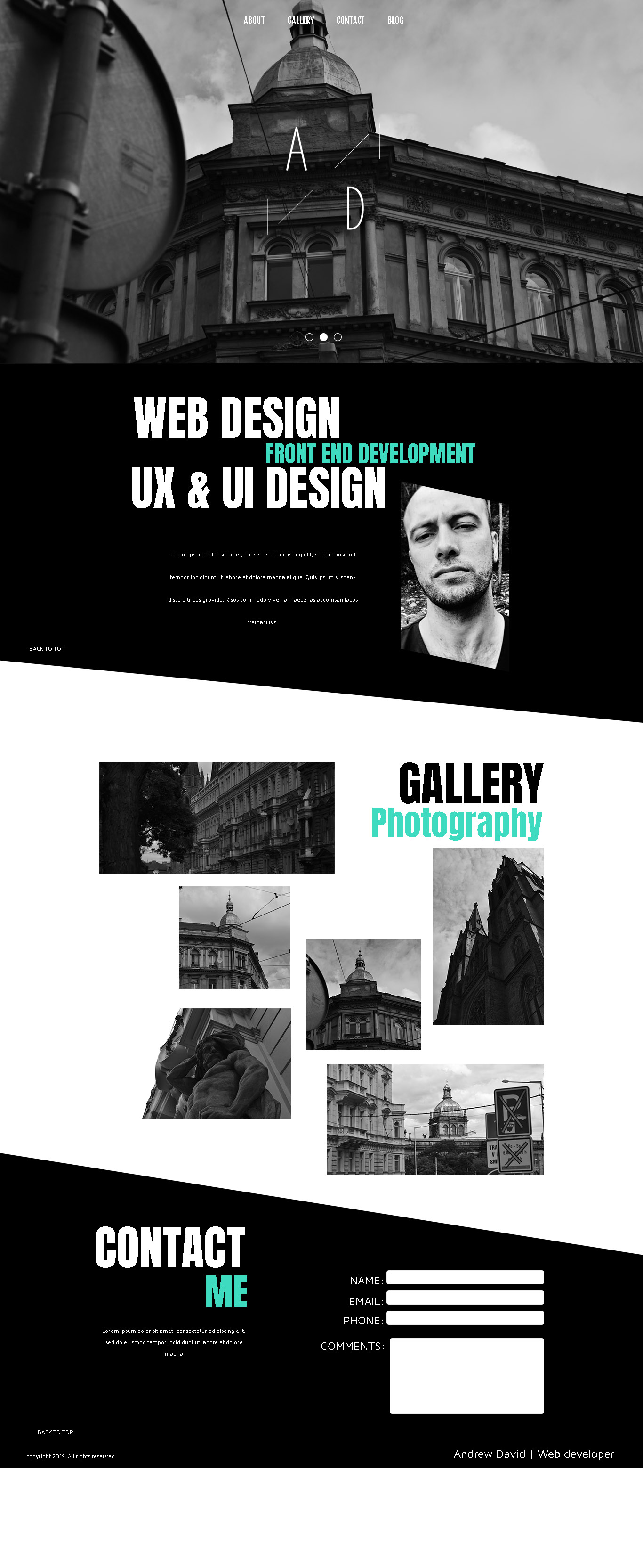
In general, I like your design. But I don’t really like the font of the title. I think, it doesn’t match the banner. Maybe you could choose something more elegant.
You bill yourself as a UX and UI designer, but your gallery shows photography. I would expect the gallery to show UX / UI work samples.
I think the typefaces you’ve used are fine since they fit the overall mood you’ve established. I’m wondering about what seems to be your A/D logo, however — it’s a bit anemic, especially against the background you’ve used. And like Steve, I’m sort of baffled by the old buildings and wonder what they have to do with the subject matter.
I’m with everyone else. It looks good but the logo is a little weak, the images seem unrelated, and I would expect your portfolio to contain samples of your UX/UI work instead of photos of buildings.