The client is looking for a logo that incorporates a “good ol’ boy” feel with the mission to portray their brand as selling land for recreational use, farming, hunting, etc.
I’m having a hard time figuring out exactly what that means, the client doesn’t know really either. Stumped!
Either some kind of iconography to portray those concepts or something similar, any thoughts?
I’d likely base it around a more woodsy, backroads sort of typeface — possibly a slab serif or a Clarendon. I also wouldn’t try to draw a picture of what they’re selling. Instead, you might just want to hint at it with some leaves or blades of grass or something else that’s simple but suggestive of the rural countryside.
Typography. Get this right and it will go a long way to telling your story. The font you have used and the closely-kerned treatment of it does not sing out, country life, rough, rustic, outdoorsy, down-to-earth, cooking freshly-caught fish on an open fire, etc, etc.
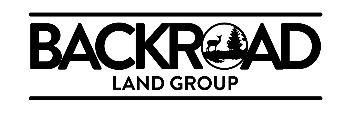
The bucolic silhouette of a deer and scene (aside from not reproducing well at small sizes), is all a bit cliché, obvious and predictable, I’m afraid. Think deeper. Think about the subject, who you are trying to reach. Speak their language. So far you are not (it seems to me) thinking beyond surface decoration.
Finally the size relationship between the type is well off. If thar logo reproduced at say 25mm (about 1”) across, the bottom text would become all but illegible)
That might create a level of detail that would cause reproduction and legibility problems when considering the many different ways in which logos are used. Address those concerns, and I suppose a wooden look could work if done just right.
However, the term “fill” conjures up thoughts of a pattern fill in Illustrator, which is never a good idea for a logo.
Define a persona or avatar for the client’s customer.
Create a mood board to reflect the persona’s taste.
Market research into competitor’s branding.
Spend a week sketching concepts.
Narrow the concepts down to the best 15 to 20.
Post those sketches here for feedback.
Based on feedback, select the 10 strongest options to build in AI.
Post those logos here for feedback.
Narrow it down to 3 to 4 solid concepts to show the client.
Create a presentation that shows each logo in color and black and white as well as showing the logo applied to a variety of marketing materials such as a business card, a brochure, an avatar or a trade display.
Pitch the concepts to the client with the confidence that you’ve done your homework and are presenting rock solid options, that will compete favorably in the marketplace, that will accurately represent your client, and that will server your client well for years to come.