Welcome to the Forum ![]()
I’m not sure what you are looking for here. A critique, advice or just showing us what you made? Are you a student just learning?
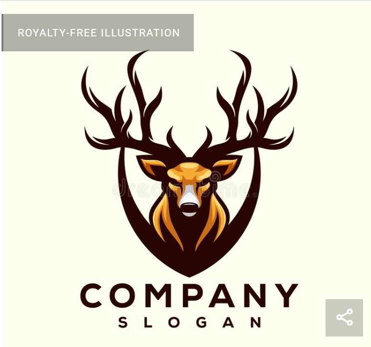
One thing I will say is whatever the reason this is a big no. It’s too busy for a logo. It’s not crisp. There are jagged blurry edges all over place. It’s way too much of everything. But, the biggest “no” of all is this is stock imagery. It can not be used for logos. I’ll share with you a quote that explains it much better than I can.
All it took was one reverse image search and this is the first result:
Also, you’ve used the word “application” are you applying here for something? If so … what? We are a forum full of well seasoned designers. So, if that was your intent .. again .. that’s a no.
If you are a student or just trying to figure things out, then stick around and you can pick up some valuable advice. There are a lot of do’s and don’ts in this profession and sometimes you may not know about them until you ask.
This is a prime example. ![]()