He nailed it, didn’t he?
5 Likes
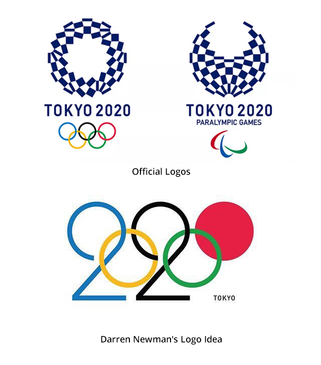
It is extremely clever. My understanding, however, is that the Olympic brand is heavily trademarked. It’ll be a shame, but what can one do?
Wow this is pretty genius.
A creatively brilliant solution that probably wouldn’t fly with the International Olympic Committee because it breaks their brand standards.
Love it!
I can see why it would be considered clever, but I really don’t like what had to be done with the 2’s to make it work. They’re ugly, like two awkward, top-heavy, flightless birds. Lord only knows what a Japanese person would see there; perhaps lunch.
I like it ![]()
I think it’s clever in several ways, but I think I like the real ones a bit better
Over the past few years, most of the Olympics logos have been pretty bad — committee-approved designs that haven’t worked very well. I sort of like the Tokyo logos.
Very smart idea. Lovely. My only criticism (apart from the shoe-horned in 2s, which I agree with hotbutton about) would be that it is possibly trying to fit too many ideas into one logo.
It could be simplified a bit further by using the standard logo with just the red circle filled in, as has been done, with simple, elegant type below it saying Tokyo 2020.
That said, even with the unbalanced 2s it is a nice idea and with a bit more fiddling I think you could get the 2s to work better. Nice one.