I’ve to design some tri-fold membership leaflets for a charity. First fruits attached.
However, I’m an amateur at this. I’d appreciate any comments from the marketing point of view. Is it too edgy? not clear enough? my partner feels that when it’s visible it will just look like a sex education leaflet and people will ignore it - ?
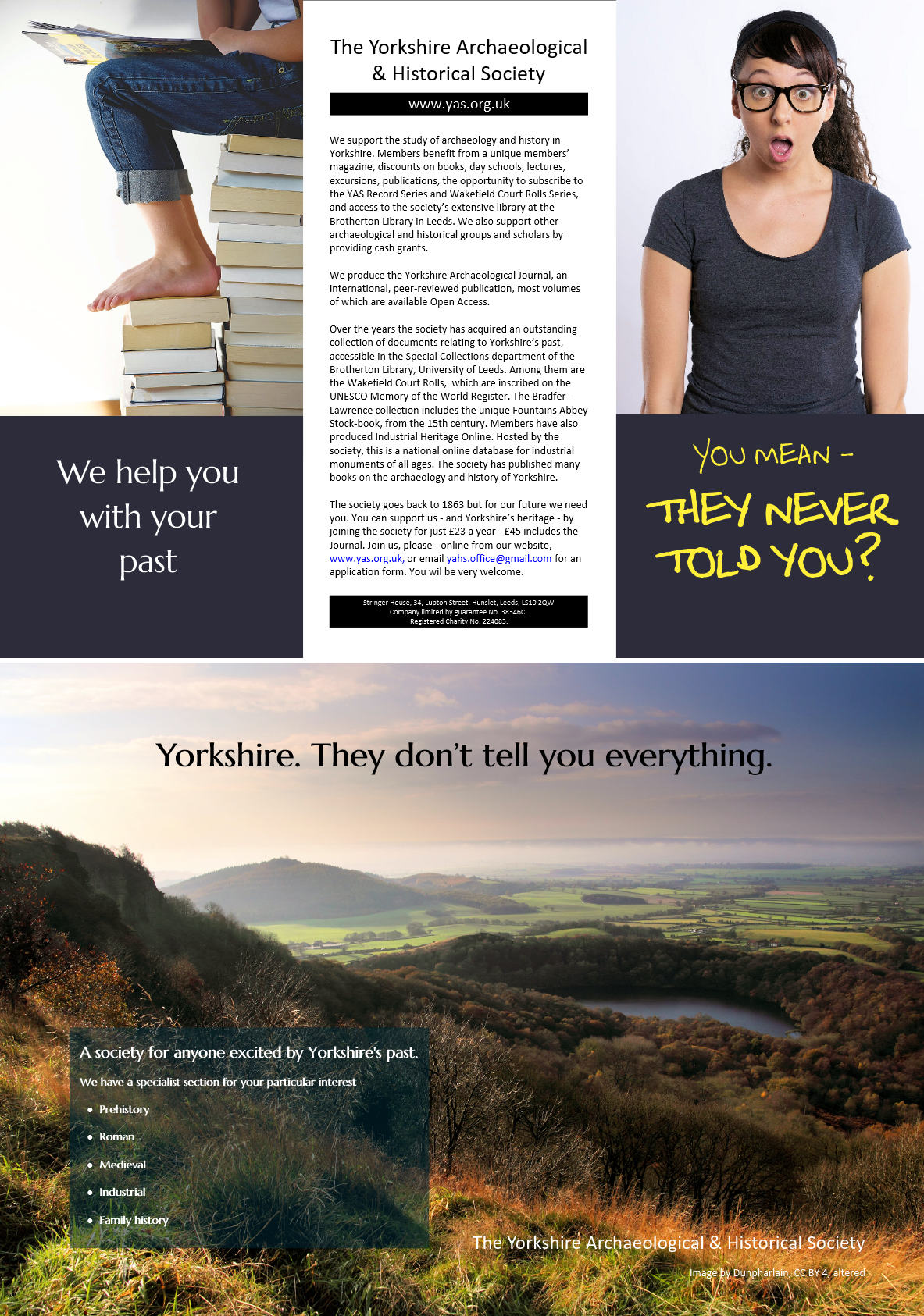
Judging from the left-side panel being slightly narrower than the others, I’m guessing this is a gate fold, right?
So the cover is the front-facing woman. Open that up and you see the person sitting on the books. Open that up and, um, not what might be expected — a big pretty photo of the Yorkshire countryside that isn’t laid out to match the trifold and still doesn’t tell me what this dang brochure I’ve just picked up is about. To get to the guts of the brochure, I need to turn to the back cover that has so much dense copy that I’d likely be disinclined to read it.
So let’s assume someone is interested in the cover because they think it’s about something interesting, like sex education. Well, they’ll be disappointed once they open it and begin to suspect it has something to do with a library of books. But assuming they’re still interested, they open the whole thing up and it’s a photo of the countryside. Huh? There are three sequential disconnects where you’ve shifted the focus of the trifold from something provocative, to books to a pretty landscape. By this point, you’ve baffled the reader. Figuring this out requires actually diving into the the dense copy on the back panel to find the brochure is about something totally unexpected — joining an archaeological society.
I suppose you could look at this shifting subject hierarchy as a puzzle that’s finally resolved by reading the back cover, but my experience says you’ll lose your audience by doing this. In my opinion, you need to be a bit more direct in what this brochure is about. As beautiful as the inside photo might be, put some information inside where people expect it to be and align that information with the folds. Save the back cover for the details, like addresses, contact information and, well, the kind of things people expect to find on a back cover.
Now if this trifold just happens to be an accordion fold instead of a gatefold, you’ve compounded the hierarchical arrangement of the information even further.
Be sure to think about the content that needs to be conveyed, the messaging, how people will interact with the brochure, and what content will be presented as the brochure is unfolded. Also, I’d say the Yorkshire Archaeological & Historical Society could use a logo and some branding elements. Right now, this is about as generic as it gets.
OK, I suppose I was trying to be too clever. I wanted to do something not obvious - something that would engage a potential reader and get them to investigate. But from your reactions evidently I failed.
If this is a mailer, you have no address pane.
If they intend to mail it, it would have to go in an envelope and would lose the special rates for bulk mailing a trifold.
If it is mailed, check your postal codes for clear space for address placement, etc. Also check into how many closures you need to use (usually round stickers) and determine where they will go, even if they will be the clear ones.
If this goes in a brochure holder, like they have at Information Centers, the panel holding the brochure will obscure the type at the bottom of the “cover.”
I don’t think your instincts were wrong. I think that you just failed to logically lead people through the progression you had in mind. Steve-O put it nicely when he said, “how people will interact with the brochure, and what content will be presented as the brochure is unfolded.”
Opening up a trifold is little like moving from one scene to the next in a play. Each scene must walk that fine balance between surprising the audience with the unexpected and losing them with a story line that doesn’t quite hang together.
I’ve always found it helpful to place myself in the position of the audience. By that, I don’t mean imagining how the target audience might react. Instead, I mean how would I react if I were the audience.
When I look at this, I don’t think to myself “this designer is being clever”. I think that the designer hasn’t studied enough brochures to know what works. If you break convention, you need to know why you are doing it.
Right now, it’s difficult for a viewer to know exactly what the brochure is selling. Why would someone pick up the brochure? Someone who actually wants to who to know more about The Yorkshire Archaeological & Historical Society might not pick up this brochure due to the front panel design.