We always learn what the maximum CMYK percentage is for printing methods, but what about the minimum? When does the “color” stop looking good and start to turn spotty?
One of the consistent issues in digital printing is that customers can “see the dots” when printing at lower than about 12% total coverage. Well, um, yeah. That’s sort of like saying you see brushstrokes in a painting.
I don’t have a specific answer, but the great thing with digital presses is that you can see a proof printed on the actual press. I have several jobs that print on digital presses (usually the HP Indigo), and I’ve never had any issues with seeing the dots.
I’m not seeing a question with a definable answer.
Wide format is a different animal. The printers have dpi resolutions (often related to the speed something is printed) as well as ink coverage. I’m more concerned about the upper ends of ink coverage, especially with solvent inks as they tend to do bad things to the adhesive on adhesive vinyl.
There are colors that approach zero where the dots are visible to the naked eye. At that point, it’s all about viewing distance, which in wide format is measured in feet. If you ever have a sales rep bring you large print proofs, they aren’t going to let you hold them. They throw them on the floor to give you a better idea of what they are going to look like at “viewing distance.”
In reference to the DPI/speed thing, wide format has different quality levels. What they are called depends on the printer model. Anything called “production mode” or faster is not saleable for most things in my opinion. Anything less than 300dpi (ink dots, not image ppi) isn’t really saleable either any more unless you are talking billboards and building wraps and such very large high-distance things.
The answer is neither.
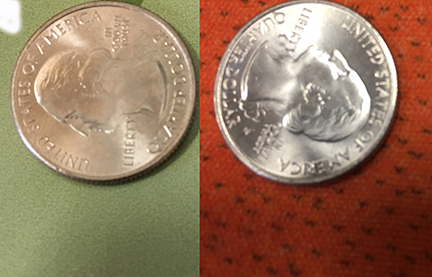
The one on the left is one of the more problematic colors printed on a car wrap vinyl. You can see the cyan dots clearly. But can you see them at arm’s length? No.
The one on the right is a piece of scenic drop for a stadium sized show. Those little black dots that give the orange its burnt color are not visible from 5 feet, let alone the 20’ stage distance.
Thank you. We make labels so I am asking about small artwork in general (viewed close up). 300dpi (raster) 1200dpi (vectors) @190Line screen.
I understand max ink density percentage (dependent on process & press). But is there a rule of thumb about minimum coverage? (The minimum % coverage of CMYK that will print pleasing to the eye.)
I know it’s a very open ended question because you have to take specific hardware into account, but I hope to get a better understanding of how to handle color in low ink areas.
My sincere apologies about the late reply!
There’s an interesting phenomenon with the bottom portion of a color space, referred to as the gamut highlights. (Densities that usually fall below 20%). Most professional color spaces, particularly made by a color analyst for a major manufacturer, never include black (K channel), in the highlights. Particularly because it almost always creates a ‘grainy or spotty’ look.
If you’re still have a grainy appearance even still, you can try padding your color with a dash more yellow - or, increasing your LPI. However to-to much ink will cause your midtowns to appear muddy.
In the end, it really comes down to the CYMK build, the substrate, and your output profile. Also the print method holds a lot of weight. older, offset presses have a distinct, noticeable pattern of dots in halftones, new presses-with modern plate making devices tend to get a nice smooth halftone, with consistent dot-gain. Digital could go wither way depending on the device - Canon digital presses image the drums twice, have a great default output profile, and a mighty fine fixing unit. Also toner dither can create smoother or spottier looks, like the default “honeycomb-like” toner dither of the Xerox Igen, doesn’t benefit low density art, but maintains overall color consistency throughout the run quite well.
In any event, if you fill me in a bit more on the device and color build, I may be able to help more!
I’m mostly trying to figure out how close I can get to making a 6% toner coverage area consistent on long-term customer label series. The increments are so little to work with that I feel we’re sort of stuck because at 6% total coverage, paper variance, humidity and all the other tiny factors are amplified.
Thank you. You already helped by mentioning the black. The Press we’re trying to set has Primary blue instead of Cyan. So we can push the dark side a little more in the low coverage areas without using black.
We’re trying to match a 6 color HP Indigo (liquid) on a 4 color (toner) digital press.
If the Indigo was running all 6 stations in the generation of your benchmark print, you may be wasting your effort. The reason the Indigo has up to 8 print stations is to be able to exceed the CYMK color gamut. Significantly in many cases. A 4 color device, even profiled to its widest color space, won’t even come close.
This has turned into a really good discussion about the difficulties in color manipulation for print.
In response to Biggs: Right! Also, the Indigo is a liquid toner based ink system so you have the extra leeway of using finer distinctions for gradients. The funny thing is that when we look at the series of labels that ran for a couple years on an Indigo somewhere else it has a much wider color range. In other words, we are able to be more consistent once we have the color down. (Our Floor Manager is the Bomb).
The problem I have found is that with this particular press, while it prints beautiful color, has a poor control unit (replaced on the newest model btw - I believe Just-B mentioned this in a different post), it uses process blue instead of cyan, and is not G7 compatible.
So when you guys talk about gradients and how they get muddy, pink, or blue (we use the terms brown (warm cast) or grey (cool cast), I am VERY aware of the difficulties. I have a boatload of tricks to take care of banding, striation, dot gain difficulties, transparencies, spot colors (and spot color transparency and gradients)…
I asked the original question because we are trying to hit a consistent approx 12% transparency of battleship grey. In order to do that we are down to 1 or 2% in each channel. That is well within humidity, paper, and toner variances so I’m looking for solutions/tricks to try.