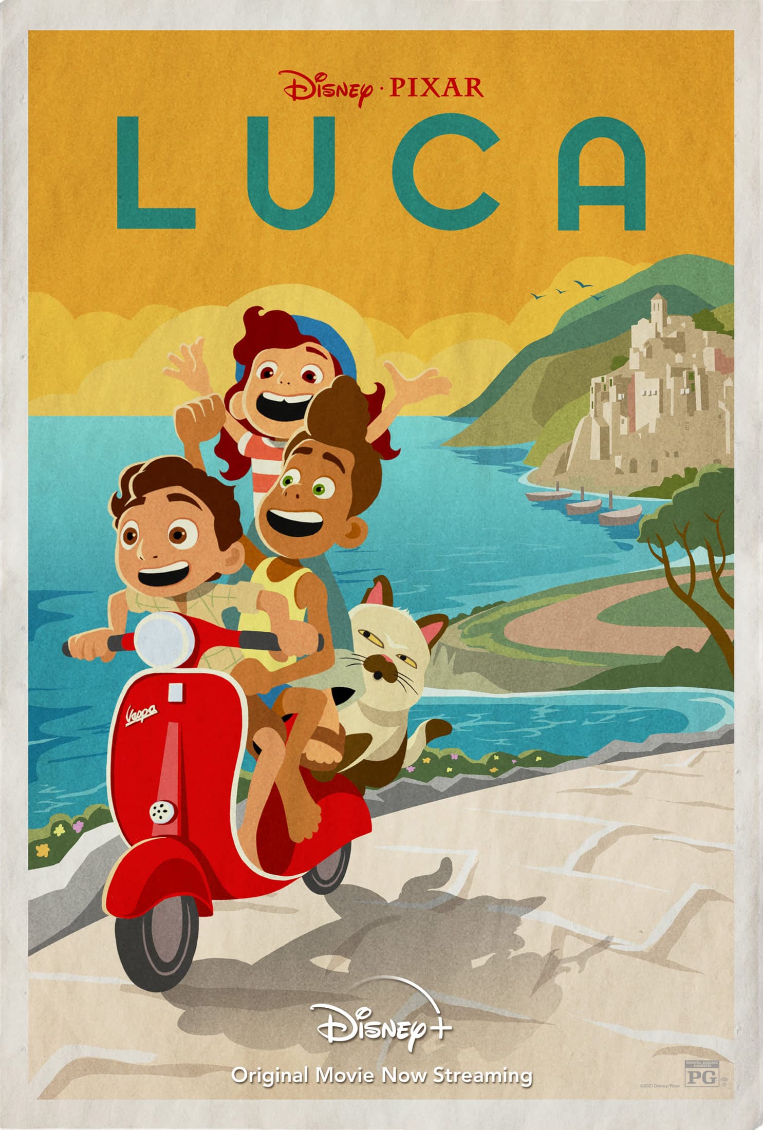
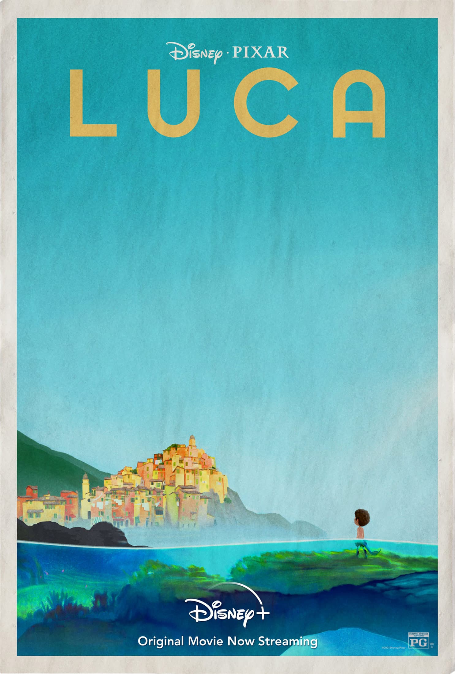
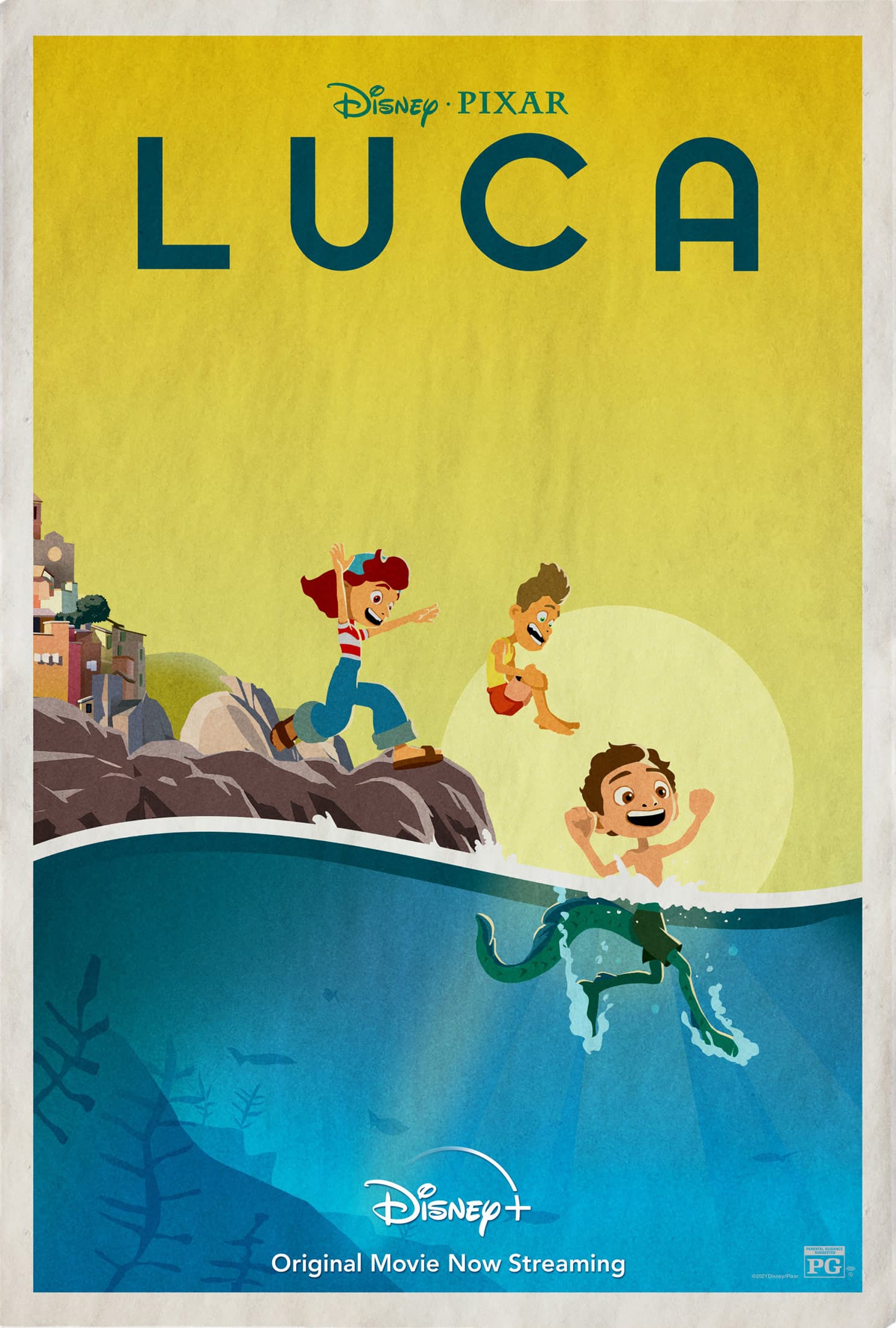
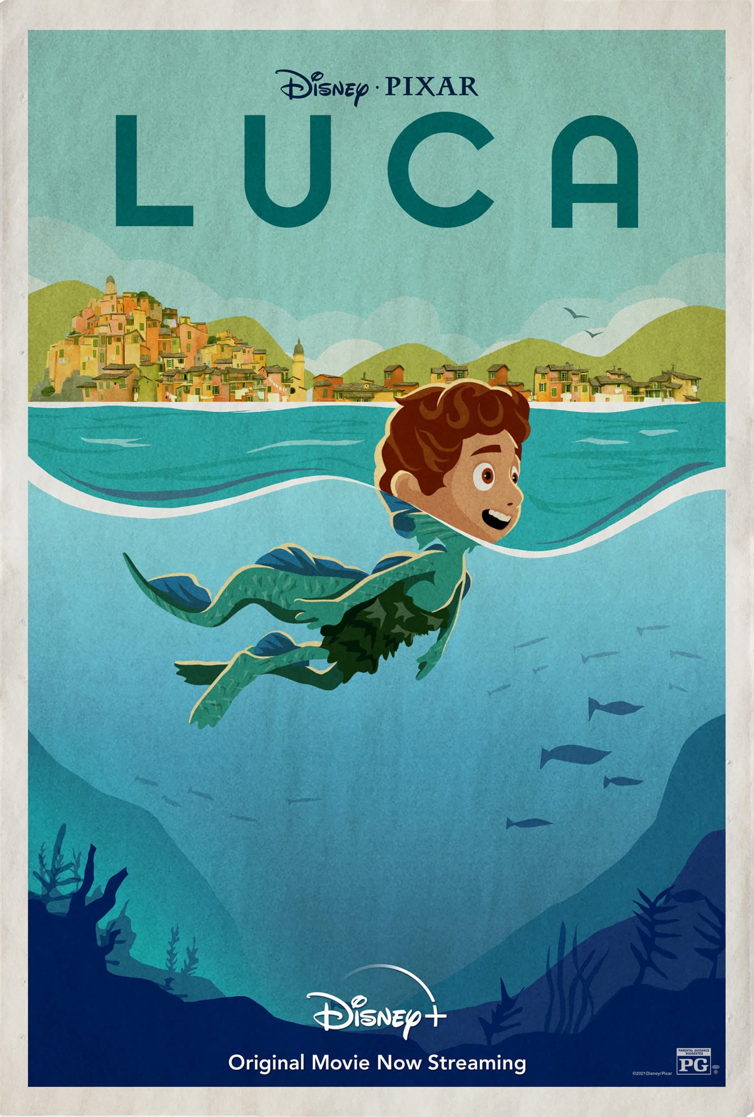
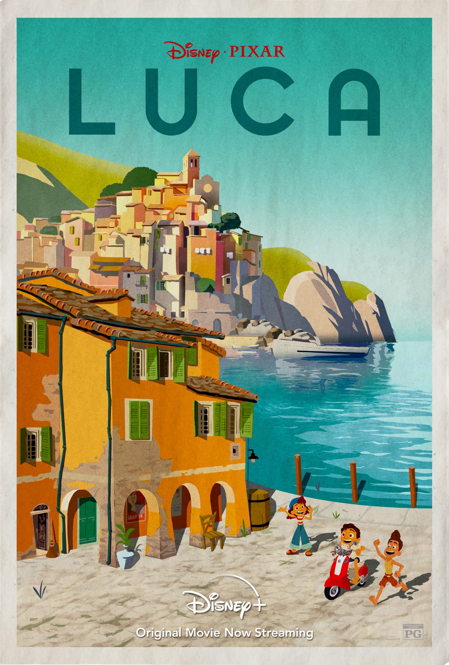
I like the old-style, flat poster illustrations, but I wonder why they chose that style when the movie uses the usual Pixar 3D computer animation. I suppose I was hoping the movie would match the posters.
Agreed. I was hoping the movie was in this style and got a bit disappointed, but still very nice.

I agree. I’d much rather see the flat art version for this movie (if I were to actually go see the movie, or any movie.)
Digital Claymation is losing its charm for me
I would honestly not complain if the first poster was the animation that they went with. It has that Little Prince type of vibe. Still liked the movie though.
Despite liking the posters, I’m less enthusiastic about the grungy layer the illustrator superimposed over everything.
I suppose the illustrator wanted an aged look or something that resembled old letterpress printing on newsprint. However, I think better and more subtle ways exist to achieve the effect without making the illustrations appear like they’re behind dirty glass that needs cleaning.
Illustration 101: “Mind you light source” (#4)
Ha, now that you mentioned the grunge layer, they are all the same too, LOL
They sorta look like a “quality” print off the inkjet plotter, on draft mode, on throw away paper, when still wet. Kinda dark in streaky places.
your! Mind your light source! Geez …
The grammar Nazi shoots himself in the foot.
btw … I have always had a hint of dyslexia (Very mild) that mostly affects the way I see and process numbers.
** back story
I found out when I got my first summer job at a bank processing Master Charge cards back in the very early 80’s. I found out quickly I wasn’t doing something right and it didn’t go over very well … as you might assume lol. They were actually quite nice and realized I had a problem and not just being careless .. so they let me file things for the rest of the summer. I seemed to not cause as much trouble that way.
To this day I struggle with most anything math related. I’m sure it’s why I struggled in school. But, back then they really didn’t care much about learning issues ![]()
I still have to do things several times to make sure I got it right.
Sometimes it happens when I see all cap letters… and I keep seeing this thread as UCLA.
When I first saw it I was wondering why Disney was making college posters ![]()
Anyhoo… I found it funny and figured I would share ![]()
Here I go off on a tangent.
I have problems with numbers too. Unlike letters, which always stay in one place and in the right order, numbers move around.
Dialing a phone number is always a problem. I can’t remember more than three digits at a time, which means looking back and forth between what’s written down and entering the number.
I gave up trying to remember my phone number long ago or, for that matter, any number. Sometimes, I can’t remember the numbers in my home address. I can never be sure that I have them in their proper order.
One of the main reasons I went into graphic design in college was the relative lack of numbers to stumble over.
It’s a form of dyslexia called dyscalculia. Luckily, it’s reasonably mild, which makes me wonder what a severe case would be like.
The only phone number I know is my home number in case my cellphone goes on the blink. I have to know that one so I’ve memorized it. I can’t memorize all phone numbers I know or I would get them all mixed up. I have to do the same as you look at them while dialing and double checking before pressing send ![]()
…and I have mixed up my home address a time or two transposing the building number with the apt. number. It’s made for a couple interesting deliveries ![]() But, that’s only when I forget to do my triple check system or it’s something new where my address isn’t saved.
But, that’s only when I forget to do my triple check system or it’s something new where my address isn’t saved.
As I say I’m sure mine is very mild to what others must suffer with but, even so it’s presented issues a time or two in my crazy life.
A post was split to a new topic: Intro for DavidJones123