
The fonts are the least of your problems here.
we had homework,the designs are not mine, they said we should match fonts with design
Questions:
Top: No comment on the font as context is absent. Is this a manufacturer for teats for quintuplets?
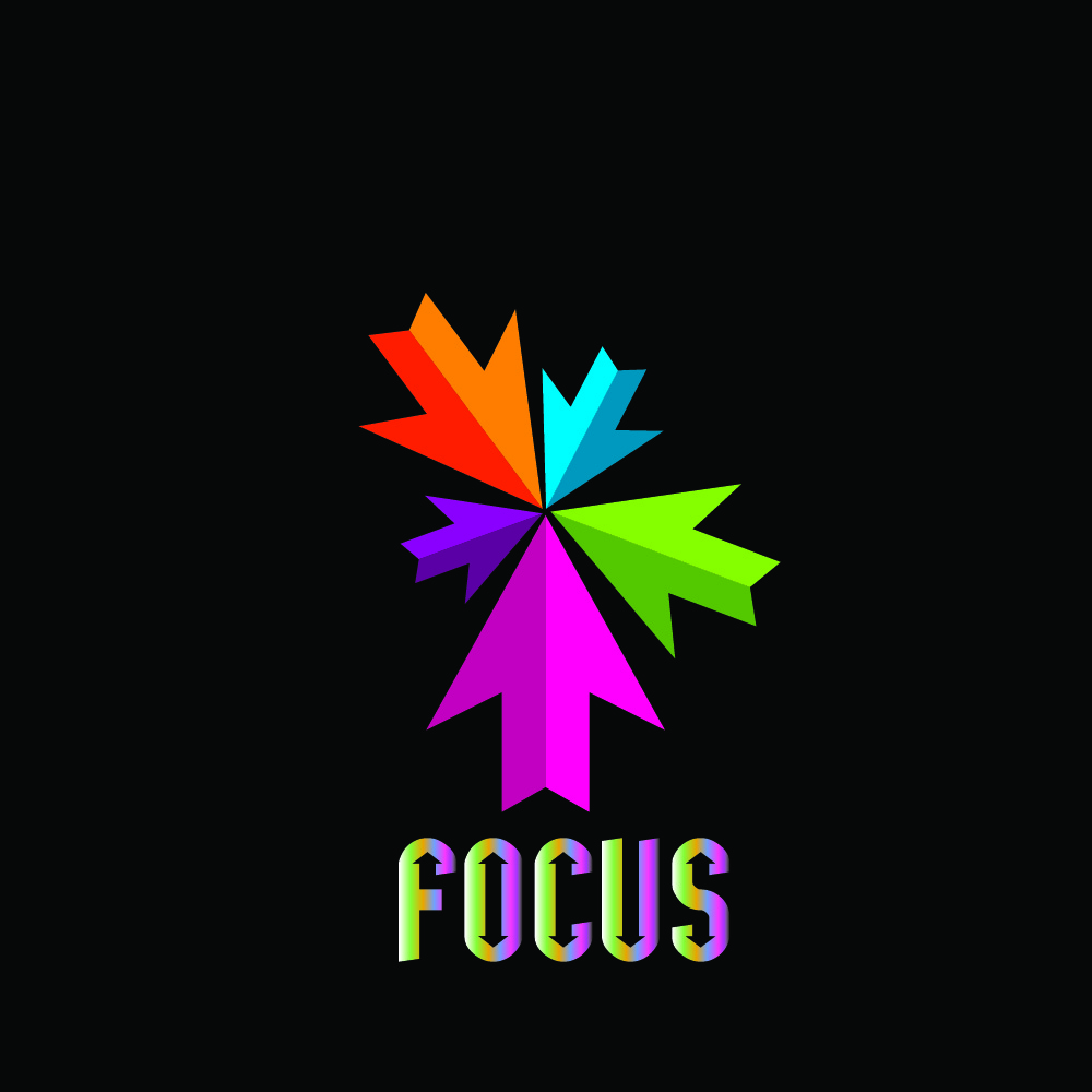
Middle: It says “FOCUS”, but the arrows are pointing in different directions. What gives?
Bottom: Is this whole thing a logo? How’d it look in black only? (This applies to all three.)
Damn. PrintDriver beat me to it.
In the real world it does not quite work that way.
Design no, 1: It’s mostly fine. Turn the purple star in the middle of the icon into negative space, incrrease the space between the icon and the wordmark and there will be little to complain about.
Design no, 2: Try to improve the wordmark by making it white and getting rid of the arrow heads, And again, increase the space between the wordmark and the icon.
Design no. 3: Use a sans-serif font. Try to make the tagline bolder and smaller.
OK. Your only part of the assignment was to use typography that complements the logos (or whatever they are).
Bright, non-printable RGB colors in logos are a bad idea for several reasons, but critiquing the logos isn’t what you asked about, nor was it something you controlled.
So with that said, I do like the typography on the first one. It’s just quirky enough to be interesting without being so unusual that it draws attention to itself.
The typeface used on the second one is OK, but I would not have colored it like you did or put the little arrows in it. Doing this makes the type way too busy and detailed. The typography should complement the logo, not compete with it for attention.
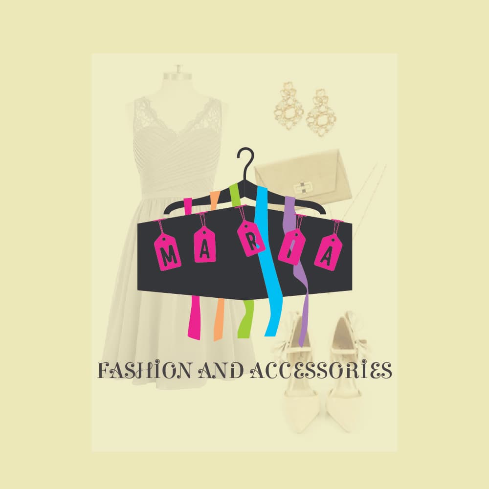
The typeface’s personality on the last one matches but is a little challenging to read with all the little flourishes. Typography that accompanies logos should be instantly readable. The readability problem is made worse by placing it over the images behind it. A more straightforward typeface might be preferable.
1 Like
Just-B — I always get a kick out of your comments. They are positive, insightful, very wise, and right on target every time! If anyone wants to know how to be the Leader of a forum board, all they have to do is follow your example. Bravo, Just-B! And I send you, Red, and the rest of the Staff at GraphicDesignForum my best wishes for a very Merry Christmas and a most prosperous New Year!
3 Likes
Same to you PopsD ![]()
On the other hand, I am cornering the market of the negative, biased, silly, and wrong. We all have our niches.
4 Likes

Eriskay, Good One! LMAO!
Hey, RedKittie—My earlier post applies to you as well! ![]() You are indeed the Rose among many Thorns! —(and you have to be a Saint to put up with this harry-legged bunch of braggarts.)
You are indeed the Rose among many Thorns! —(and you have to be a Saint to put up with this harry-legged bunch of braggarts.)
1 Like
Thank you ![]()
… and you’re saying I am one of the many Thorns? Why, you’re so kind!
Thanks, PopsD. ![]() I hope you have a very merry Christmas and a prosperous, happy, and healthy new year too.
I hope you have a very merry Christmas and a prosperous, happy, and healthy new year too.
I feel it does match, you are good to go
1st and 3rd design are matching and looking good but 2nd design need little bit improvement.
This is from December of last year. I’m sure the OP has figured it out by now ![]()