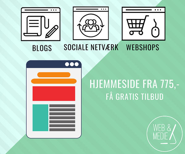
Do you have any feedback for this banner-add? What should I do to improve it?
Thank you!
Graphically, it looks nice. But I’d be tempted to reduce the opacity of the diagonal lines a bit. Tough to say much more without looking at an English version.
Side question: are the diagonal lines becoming a design trend? I’ve seen this treatment a few times and am wondering if it’s a coincidence or if it’s more wide spread.
I agree on taking down the density of the diagonals. Maybe even consider white beihnd the monitor things.
Oh, it’s a trend alright…
It’s the illegitimate offpring of the sunburst.
LOL.
I like the looks of it, but I agree that the diagonal stripes should be toned down some — perhaps doing away with them altogether behind the icons.
Just a small thing, but you seem to have an extra space between uforpligtende and tilbud.
Yeah, I’ve seen it a few times too ![]()
I will remove the extra space ![]()
I’ve created 3 new versions based on your feedback. Which one do you like the most?
Thank you
I don’t feel strongly about it (they’re all nice), but I’d probably go with the third one.
Another thing I’ll suggest is making the line weights on each of the icons the same, The one monitor, for example, has heavier lines than the other.
Definitely looks better with the stripes not being as prominent.
Just-B made a good call on the line weight.
- Sociale Netværk is a larger font than blogs and webshops and doesn’t quite seem bottom aligned to the other two.
- Make the icons consistently weighted as previously mentioned.
- The 3 icons are unequal and misaligned as far as tops/bottoms, overall size, etc.
- It bugs me that the WEB & MEDIE icon on the left is not center aligned vertically.
- Adding a white fill behind the icons (matching the icon shapes. Basically a white fill, will probably help them “pop” off the blue a little.
Nice work on the icons on that top version.
+1
That’s a nice improvement.
That is good to hear. Thank you ![]()
As always, there is still room for refinement. Make all 3 icons exactly the same size, then decide whether the corners will be square or rounded and make them all the same.
Is it important that the right and left green parts be readable? If so… maybe a darker green so the white parts will be easier to see.
Hey Benjamin!
I like your Header, you’ve done good work with the graphics on this one!
Are you also into making Logos? I am still looking for an experienced Designer for my new upcoming brand, i need social media and advertising Designs.
If you’re anyhow interested let me know!
Best Regards,
Thomas
Hey Thomas,
Yes, I do. I am a Danish designer who does graphic design and creates full website solutions. I would be glad to help you. Let’s talk about it on the phone, or maybe you have a written description?
Wite me at address-removed@gmail.com.
Regards
Benjamin
Benjamin, the forum rules prohibit signing up for the purpose of soliciting business from other forum members. If you’re just offering to help, great, but your post implies more than that. Sorry.
Yes the first one is really good! These icons look much better!
If i were you, I would make the two icons (middle and right) thinner, like the left side icon… I mean these 3 icons should be fixed in a same weight… I suggest you the thin weight


