Documents dimensions to scale?

Hi, this may be a very newbie question but it’s a topic ive never gotten a concrete answer…as they may not be one.

When designing something for large print IE: poster, vinyl, Wall collage, or building Banner, how do you guys set up your document (whether Photoshop or Illustrator). What I mean is, for instance, you’re making a design that will be vinyl on a wall that will be 20’x20’, Do you in the document put that to scale or scale down to a 1:4 scale 5’x5’ to keep the document size small and prevent crashes.

In the past done some mix of the two and it’s worked, but im wondering if there is a more efficient way. I made illustrator, and photoshop document to scale but the file size just increases chances for the program to crash…not similar to 3D programs when your working on an object with more than a million polygons.

In short, is it more efficient to make the document to scale THEN put it to resize when you export or work in scale from the jump. If this is too broad, im specifically working on a project in illustrator with the final size being 3’6" x 10’x2" h.

Thanks for any/all feedback replies.

With vector graphics (Illustrator), the file size does not get larger when you make the dimensions larger (embedded raster data can affect this). Vector graphics are similar to 3d artwork in the sense that they’re mathematical constructs rendered/rasterized at output (or on your computer display) rather than being built with individual pixels.

With raster graphics (Photoshop), as the dimensions increase, the file size does get larger unless you let the resolution drop. Luckily, the need for higher resolutions drops as the image gets larger. This is because the typical viewing distance increases. When designing something to be read at arm’s length or less, the rule-of-thumb formula is to keep the resolution at around 300 pixels per inch. A 5’x5’ image, however, is rarely viewed from arm’s length, so it doesn’t need to be as sharp up close.

Graphics software impose seemingly random maximum dimension limitations. If the dimensions of a large-format graphic exceed the application limitations, the image needs to be scaled to some ratio of the original and then output at the desired size. With raster graphics, creating something at, say, 50% means that the resolution needs to double so that when the graphic is printed out at the larger desired size, the resolution will decrease to the desired resolution. Again, resolution isn’t an issue with vector files.

Once you get up into larger sizes, like building graphics and billboards, print vendors typically have templates or instructions on how they’d like the art prepared in ways that match up with their workflow. It’s not at all uncommon for, say, a billboard file to be built at a 1:10 scale or 1 inch = 1 foot and built at very low resolutions (a billboard only needs to look sharp at the distance it’s meant to be seen).

That was a conceptual explanation lacking detail. The specifics of how to figure out when, where, and what needs to be done this or that way is another matter.

We have some forum members whose expertise is in large-format output work. I suspect they’ll chime in. Where are you @PrintDriver?

Opps, yes your right, vector graphics doesn’t affect file size as much as raster based. I forgot as my last project i was working on in Illustrator had linked photos and it tripled the file size.

But just in case people miss it as the dimensions im working on for this project is a flag banner that is: 3’6" x 10’x2" h.

@Just-B Ya again, your right, and i rather the way print shops do where its scaled-down file within a ratio. My question was if there is a standard or is it those things where it depends on the shop or individual.

I just dislike doing things to a scale that reaches a program’s maximum size IE: font size 250 or in 3D where pushing 1million polygons will typically crash the program no matter your CPU/GPU beefyness.

I remember doing something for a 20x20’ wall and learned of the .PSB file format. it worked but i’m not even sure if using that file format was necessary. over just decreasing the dpi to half then putting back to 300 when sending it to the printers.

There are more common ratios than others, but it’s really a matter of asking the printer. In the absence of doing that, it’s just a matter of them doing a bit of math to get things to the right output size (provided, of course, that the resolution of any raster data also scales to the appropriate output size).

You’ll never want to do what I think you just said. If you sample down a bitmapped/raster file to a smaller resolution, image data is irretrievably lost. If you sample the file back up to 300ppi (not dpi), the lost data will not magically return. You’ll just get a higher-resolution version of the blurrier lower-resolution image.

Hmm, i read womewhere long ago that working in half, 150dpi, to avoid slowdowns was okay. then putting it back to 300dpi when you export. If not what is a better way? resolution? it may have been for digital but not sure it was more than 10years ago i read this.

If you read that, it was wrong. As I mentioned, enlarging the 150-ppi file to 300 will just get you a higher-resolution version of the blurrier 150-ppi image. If it were possible to invent missing image data, we could walk outside, take a picture of the moon with our phones, then just keep enlarging it until we saw individual rocks on the surface. I think that sort of thing was possible in the old Bladerunner movie, but not in real life. Sampling down to the right size is fine and good. Sampling up to the right size is usually pointless.

There’s not really a workaround for working with a raster image at the right resolution. Remember what I said about viewing distance, Typical resolutions for large-dimension images can be correspondingly lower depending on the intended viewing distance.

I’ve never run into images large enough to max out my computer since, probably, the early ‘90s. I have a feeling you’ve been working at unnecessarily high resolutions, as in keeping a 5’x5’ image at 300 ppi. Either that or you need a new computer with more memory and more scratch disc space.

All kinds of stuff here.
Rule of thumb, if it fits on the art board, work in full scale. Full stop.

There is no real scaling standard in large format. As a printer, we just ask that you tell us what it is and make it a nice round number. Don’t work in 1/3 scale for instance. When doing larger format I tend to work in 1:10 scale cuz I hate doing math. 120" becomes 12" or 224.75 becomes 22.475 and so on.

The only caveat being, some rips and output devices can’t handle more than a 400% output percentage. So work with your printer. You can work in 1:10 to make it easier, then on handoff bring it up to a reasonable scale that still fits on the artboard. From 1:10, quarter scale would be 250%. Half scale would be 500%

The other thing you have to be careful of is your Raster Effects in Illustrator. You have to set your Raster Effects setting to match your output resolution in scale. And, LOL, remember to reset it before you resize larger. Just last week I was working in 1:10 at 1500ppi raster effects then tried to enlarge it. Ha, killed my computer - as in hard restart. (there was a reason to be doing that high of a resolution…but then again, not so much. It was a learning experiment that we were doing.)

The question about halving the image resolution is an interesting once cuz I deal with that a lot too (less so now with the more powerful laptops out there). But the trick to halving your resolution is to start with say, a 300ppi image and making an FPO image from it and saving under another name. Then LINK it and make no changes to it. Then when you go to do your final pass, you can RELINK the higher resolution image. There are some things that will screw this up but generally with simple images you can do this.

As to your banner at 42" x 122", work in full scale @ 150ppi for up close viewing and 75-100 at farther distances. Indesign is a better choice most times for large format work as it handles images (and color) better than Illustrator. InD uses a placeholder image so you aren’t working with the full rez file all the time like you are in Illustrator.
DO NOT FORGET YOUR BLEEDS.

If your computer is not handling this, first check available scratch space. Then consider your ram. Those two things are deal killers in Photoshop especially, but Illustrator will struggle too. InD has a different architecture that works in placeholder so not so much an issue.

.psb files…Just. Don’t. (we call em Photoshop Bloated files.) If you run into a .psb-only option you are probably doing something very wrong, file-size-wise. I regularly do 40’ x 16’ drops actually designed in Photoshop and never even come close. Those things are 30ppi final size (25ppi and blurred for broadcast.) Resolution needs decrease as size increases. You aren’t going to take in a whole 40x16 from arm’s length…

Working too large wastes billable time. And there comes a point on output of diminishing returns. An image that exceeds the optimal output of the machine is wasted rip time.
1 Like

I wrote that fast with loud music playing in the background. Hope it made sense

@PrintDriver To summarize your knowledge, let me know if im off, if a a printshop receives a document A) atleast let you know the scale it’s in 1:4, 1:10 (optimal). If not full Scale is fine for vector graphics. Good to know, right now anything for print that i scale down I inform them in the email as well as in the document outside the artboard whether its half full size or 1:4 i typically use. But i also get why you use 1:10 (ez math).

150ppi/dpi is fine to work. I thought for print the default was 300?

You may be right about using InDesign>illustrator, i will be crossing that bridge once i know what im designing.

Computer power wise im fine, Intel i7 3.3GHz, with 32gigs RAM.
I’ve had crashes in illustrator only when exporting to PDF a file with lots of linked images. In PS it was working with a large file dimension in 300dpi then running a filter that usually milks all your memory.

Your saying PSB file res is at 30ppi(25ppi)?

There is no “default”. The 300 ppi value has been oversold as a rule of thumb, but it’s really more of a catch-all propagated by printers who got fed up with pixel-short, client-supplied images. It was based on their typical maximum line screen (150 lpi) x2. I’d go so far as to say that the majority of printed output doesn’t require 300 ppi in order to produce an acceptable result.

In the end, it creates as many problems as it solves anyway, making people think they have to up-sample images destructively, when the density they had would have been adequate.

That’s not what he wrote.

Default, rule of thumb, im using these interchangeably. It’s something you see people say to use for print whether it’s tutorial or even print shops request. But good to know 150dpi is enough. And i understand the reason. I’ve had clients send over photos for a newsletter and find out they did a screen cap from their website on their phone…or even from Instagram.

.

Terminology is more important than that, especially if teaching and learning are to happen. You’re also wrongly applying “dpi,” where you mean ppi, but I can’t force you to care.

Not unlike the 300 ppi rule of thumb, you’re oversimplifying it. 150 ppi may be enough, depending on the nature of the image, the quality of the original image capture, the number and magnitude of destructive operations applied, the printing method, the substrate, and the viewing distance.

1 Like

No, you’re misinterpreting. Conceptually it can be difficult to understand as well as difficult to explain. I’ll phrase it as simply as possible.

300 ppi resolution is a rule of thumb for something to be seen from a typical reading distance, as in holding up a magazine and reading it. You can probably head down to around 250 ppi and be just fine, or even lower in certain situations with some kinds of photos.

With something larger, like a 2’x3’ poster meant to be hung on a wall and viewed from several feet away, 150 ppi could work out great.

For a billboard or building graphic meant to be viewed from a distance, you can use even lower resolutions.

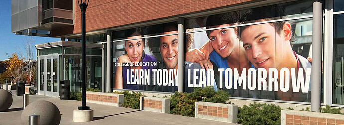
The following is a photo of a window graphic I designed last year. The photo is a raster file that was 15 ppi (yes, 15 ppi). It worked out just fine since it was meant to be viewed from a distance. Up close, the image was blurry, but from the parking lot, it looked fine. Even walking by from about ten feet away, it didn’t look too bad.

I wish the resolution could have been upwards of 30 ppi, but photos typically aren’t available with enough pixels in them to allow ppi resolutions that high at that size without upsampling them, which does no good.

For example, if a photo is 300ppi at 10"x10" and you double the dimensions of the photo to 20"x20", the resolution will decrease by half to 150ppi. It will do no go whatsoever, to upsample the photo to 300ppi.

Finally, you need to know the difference between ppi and dpi. You keep using the wrong terminology. It’s a very common mistake, but it’s a mistake that can cause confusion since they’re two separate things.

The 300 dpi printing rule only exists for litho printing where the Lines Per Inch on the output device is set to 200LPI.

It’s all about ink coverage and saturation.

Newspapers have a pourous substrate (light paper) - it absorbs more ink.
For Newspapers it can be as low as 80 LPI.
The actual LPI calculation is x1.44 - not x2
But even 80x2 is 160 dpi for paper

For magazines the LPI can be set at 120 to 150 LPI output device
So it’s 1.5x120 - gives 180dpi
And 1.5 x 150 - gives 225 dpi

Way off the figure quoted around at 300 dpi for print.

It really be high-end magazines/coffee table books/art books etc. that have high end substrates and output LPI of 200

That would give you the 300 for this type of publication.

And it really is a mathematical equation for Litho or similar printing method -
for books or magazines

====================
It doesn’t apply to large format which works off a different formula for calculating the dpi for images.

============

Typically for large format I work at 1/10th the scale
With 300 PPI images

That gives me a final output at wanted size - with images output at 30ppi

Which is fine for a lot of large format.

You may at times want a larger image size for closer viewing distances.

Using the term large format to include billboards and science museum info graphics under the same umbrella is as bad as using dpi for ppi.

Sure, they are both “large” prints in their respective environments. But every large format use has to take into account its viewing distance.
30ppi is fine, for anything meant to be viewed from over 15 FEET away.

But large format optimization for arm’s length viewing tends to run between 100 and 200ppi.
Especially as the type gets smaller (though ADA rules for exhibits tend to save most situations as long as the designer is aware of those requirements.)

So if you are doing an image heavy info graphic with text to describe the creature behind the glass in the science museum, you want to push 150-200ppi on your imagery.

If you are doing a dye-sub wrapped mural with large text leading to the next creature behind glass, you can drop to 50-75ppi if you have a large overall image, but again, if it is a bunch of smaller images with detail, you may want to push 100-150 (dot gain can be a thing in dye sub, anything over 150 is overkill no matter how small the image.)

If you are doing a high end art exhibit and a well known photographer wants their imagery blown up to large proportions they may use a photo imager. This is the one case where there truly is RGB printing and the apparent resolution on the print can approach 3000ppi, BUT the machine optimizes at about 400ppi, over that there is no apparent gain in image quality. Around 200ppi will get you what you need in less demanding situations. (There would also be an upcharge on such a thing to pay for the rip time on a large image with more than the usual resolution.)

Adding pixels through interpolation (rezzing up) gets you absolutely no where from two different directions. You’d be adding pixels that the software is only guessing at, and usually poorly. And you’d only be wasting billable time working on an image with too many pixels for no good reason.

Finally, most printers will “optimize” your file for you on receipt. You know how you can’t place .psbloated files into other software? Yeah, they don’t play well with rips either sometimes when tiling over several panels (though that has been changing over the years too.)

1 Like

I did conclude with a larger dpi for closer viewing distances.

And why would text be rasterised for a display? Keep text live or at least outlined.

Every situation is different - that’s why it’s important to speak with the print vendor before starting any project.

Always think finishing at the beginning.

I saw your caveat at the end. A lot of designers who are doing big stuff like banners where ppi can be as low as 30 most times, aren’t always doing the higher rez display stuff. I deal in a LOT of large format environmental (experiential) display type stuff where that is definitely not the rule even though the graphics are large.

I didn’t say the text was rasterized.
It isn’t.
But if you have to get close enough to a large format graphic to read small text, you need to use a higher image resolution in your imagery. The ADA statement was because body text is somewhere around 18-24 pts so that makes life a bit easier and resolution can sometimes drop to a little under 100ppi and still look good at “reading distance.”

Thanks all for the detailed explanations.