This is just one person’s opinion but I think a spelled-out name is optional. I would probably say the opposite to most clients who are a bit clueless about the subtlties of visual branding. However, a good designer ought to be able to navigate the problem of making sure the stand-alone logo is visually associated with the designer’s business.
My 8-year old granddaughter who drew the squirrel is a College Senior at Georgia State, so I figured she’s had enough self-promotion credits by now. (LOL) I still like squirrels though! … I just figured it’s time for me to act my age! (LMAO)
And Steve, it’s like Eor said in Winnie The Pooh, “Thanks fer noticin!”
No. My take … In many ways, over time, you fill your logo with value whatever it depicts. There a lot of famous logos that does exactly that. Where the logo itself says “nothing” about the name at all and still everyone knows it. Nike’s swoosh, Pepsi, a lot of car brands and so on.
Still, you might get a slightly head start with a readable logo if you’re new in business in first meetings with potential new clients. No big deal though, probably your reputation has preceded your logo
The likelihood of any one individual freelance designer, swimming in the vast sea of all the graphic designers out there, gaining the brand recognition of Nike or Pepsi is pretty near slim to none.
My own opinion on this is if your brand logo bug has no former association to the name you filed your business under, what’s to differentiate it from the landscaper down the street, other than the landscaper will probably have the company name attached to their logo. Why make it hard for potential clients to find you? It reminds me of doing image acquisition where my top end clients require true signatures on their usage contracts. They want a specific image but the only reference is a stock alias of DogVomit or something similar, that they are NOT going to roll in their credits. If I can’t find you, I won’t hire you.
Monogram logos are fine, but what’s preventing another designer with a “B” name from doing something similar? I agree with @PrintDriver that a freelancer’s logo for their design business is likely not as important or as memorable as their business relationship with their client.
If I were designing a logo today for a freelance business, I would avoid using any names or letters and stick to an icon. No matter how you present, you’ll likely be writing your name next to your logo anyway. Why not do something quirky or non-related to design to stand out? Your logo will rarely, if ever, be shown away from your work anyway (maybe a business card or website, but those can include your name).
Thanks, yes this is pretty much what I’m thinking.
My logo will almost always be shown along with my name on there somewhere so it shouldnt take a genius to be able to work out what my name is… thats my hope anyway, lol
Your logo doesn’t necessarily require your name. Logos can be symbol-based or include abstract designs that represent your brand’s identity, values, and offerings without explicitly featuring the company name.
We can argue this forever. A freelance designer who doesn’t associate some kind of business NAME with a logo is going to be very hard to find in the vast sea of designers out there. It doesn’t have to be your given name, but some kind of company name should be there. If I saw just a lightbulb as a logo, I wouldn’t know if it was an electrician, a lighting store, a silly sign, or a graphic designer (in that order,) and wouldn’t even begin to know where to find them online.
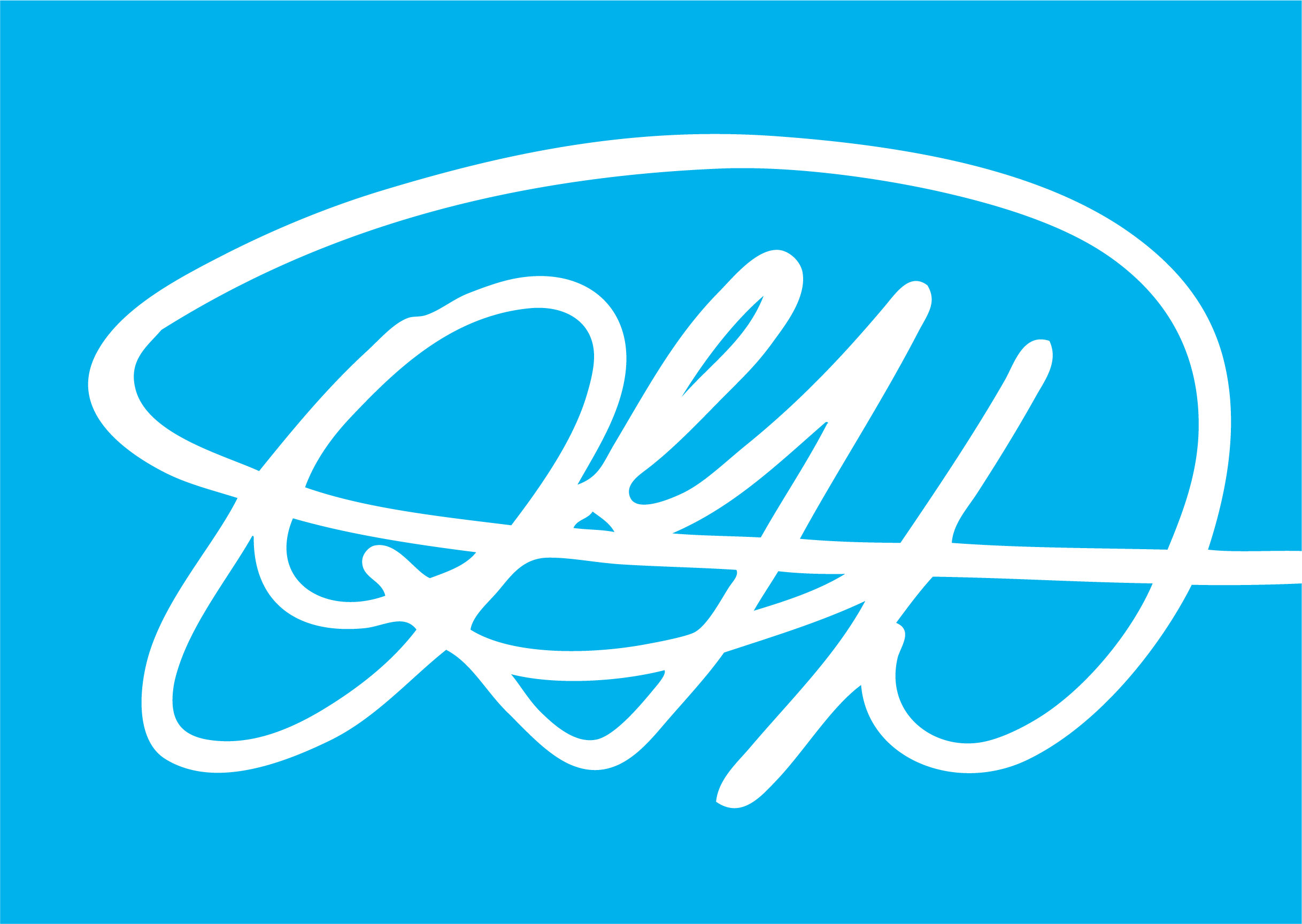
Or perhaps we are arguing the difference between a logo and a logo “Bug” ?
I think ill-defined terminology gets in the way. I have no strong opinions on the definitions, but here’s how I’ve usually viewed it.
A logo is the symbol, icon, or bug.
A logotype or wordmark is a stylized name composed primarily of typography.
A lockup is where the name of the organization is positioned adjacent to the logo and written out in a standardized font. This standardized typographical treatment of the name is different from the logo and can often be positioned in various ways adjacent to the logo (different lockups) or omitted altogether as the situation requires.
Of course, there are instances that don’t fit these definitions — for example, logos that also combine the name of the organization into the logo. I’ve always avoided these since it usually (but not always) adds up to clutter.
How long have you been using the term lockup? I only started seeing it hmmm maybe about 6 years ago or so. To us, the logo is the entire “lockup” whether it is a wordmark or a bug/word combination. Which version of the logo gets kind of important too.