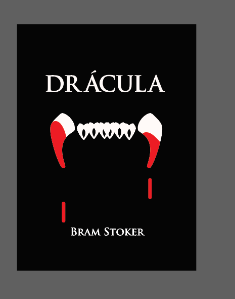
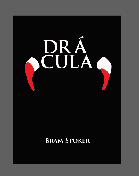
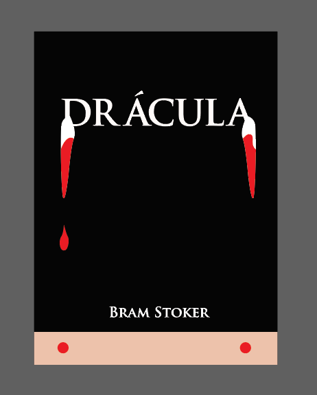
…also, your choice of font – unless you create a custom RA ligature – means that it reads, Dr Ácula. Even putting that aside, the kerning is pretty poor (AC is particularly bad). If you are doing a typographic assignment, the typography has to be sharp.
Repeating what @Smurf2 said, if the assignment forbids using images or symbols, don’t use them if you want a good grade. And repeating what @sprout said, use a different typeface that doesn’t have the horrendous spacing issue between the R and the A.
Here are some hints. You already have two pointed letters in the word. Tipped upside down and exaggerated, they could look like fangs. The acute diacritic you’ve used on one of those letters could easily double as a drop of blood.
Think outside the box. Have more fun with the typography. You don’t have to simply type out whatever fonts you might have access too. Better yet, bust out some paper and a pencil and have at some hand drawn ideas. Something a little more organic and interesting.
(bearing in mind I and my cohorts in crime got into a lot of trouble twisting class briefs until barely recognizable, but if you can justify it in an argument wellll… )
I guess the question to go along with this assignment is, “Does the solution have to be good enough to make me want to pick up the book?”
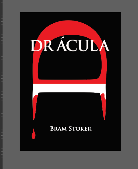
Even the clever ones B posted are … Boring.
Yeah, unrealistic scenarios are a hallmark of design school assignments. In the real world, it’s a rare situation when it’s possible to separate a design problem from the other practical realities surrounding it.
I suppose these kinds of school assignments have their place in teaching design skills — especially to beginning students. However, the senior year ought to focus on real-world problems that consider the bigger picture, including all the nuisance compromises that must be made for various reasons.
Like when the annual report is due to go to the printers and has to be there in 1 hour or else you miss the entire slot for the print run and the client is crying on the phone saying that they made a mistake and sent you the wrong font and that you HAVE to fix it or they’ll be in trouble - then in the background a clock ticks down by 1 hour while you scramble to fix the horrendous mistake and not miss the slot for printing so that they can get the annual report, but it turns out they didn’t need it until next week.
Hey OP I think maybe you aren’t thinking about the letter forms themselves and how much you can do with them. That looks like a fun assignment to me! It isn’t like there are right answers.
I had to do an assignments very much like this when I was going to night-school. By that time I was already working full-time at an agency. I thought it was a hell of a lot of fun to be free from the mundane constraints for a bit. I figured it was about learning to appreciate the graphic potential symbols have in the abstract. I don’t know if I said that exactly right. Anyway, I guess I’m saying that fostering some real appreciation for type is maybe just as important.