Happy Friday my fellow designers. Hope this message finds you well.
I’m currently working for a small marketing agency with a handful of clients that require monthly eblasts designed with their branded flavor. We have come across an issue when viewed in dark mode that will change the brand colors within the design all depending on the users email client/browser.
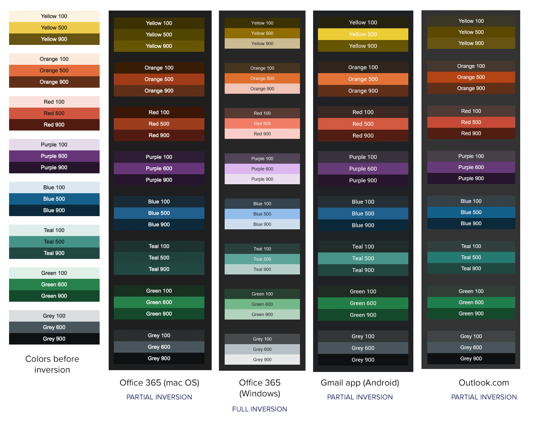
Am I alone in this predicament or is there a way to control this behavior that I’m not smart enough to discover. I’ve searched for hours with no great solution—only a color testing chart attached.
I’ve handled it as separate stylesheets with different values of the brand colors. Of course, CSS styles are problematic in HTML email, so sometimes it’s necessary to come up with something halfway in between that works in both light and dark modes and, when needed, restricting the color palette to a few base colors. HTML email always involves catering to the lowest common denominator and using no code that won’t degrade gracefully for those using less-than-modern email clients.
Some companies and designers view brand colors as rigid directives to adhere to. I’ve always seen them as suggested basis colors for an overall color personality that are open to adjustment as needed within the context of how they’re used.
For example, a dark mode obviously requires adjusting the brand colors to achieve the best possible contrast in the overall color scheme. Lightening the brand colors to achieve the needed contrast solves the problem while also preserving the general personality that the brand colors create.
That it does indeed, which I am now finding out the hard way. It is very limiting in how far emails can be designed.
Agreed, some adjustments are always necessary. I am by no means a stickler when it comes to web color. I use the phrase “close enough for government work” often in those situations.
I guess if I were more specific you would know that my issues are with reds and yellows. As you can see in the chart most of the “500/600” colors stay mostly in the same realm except for the said red and yellow. They turn into straight rust and contaminated mustard brown, which for me is a big stink.
I fixed the red problem by going 100% #ff0000. That seems to keep it consistent throughout. As for yellow, that may be a headache not worth ruining a good Friday.