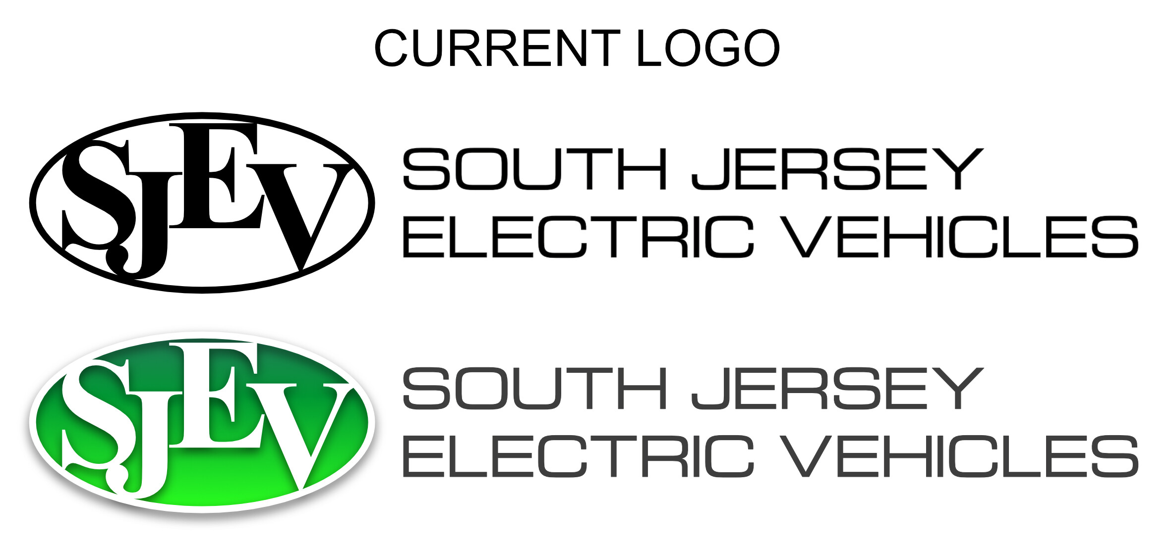
I work for South Jersey Electric Vehicles. We sell, service, and rent electric golf carts and low-speed vehicles. I’ve been working on updating the company logo. The logo is currently used across multiple mediums: digital and print. The goal of my update was to keep the logo format similar but hopefully improve it. Let me know if the updated logo actually makes any improvements over the current logo. Thank you for your time and input.
I don’t think there’s any question that the new design is better and more professional-looking than the old logo while retaining most of its brand equity.
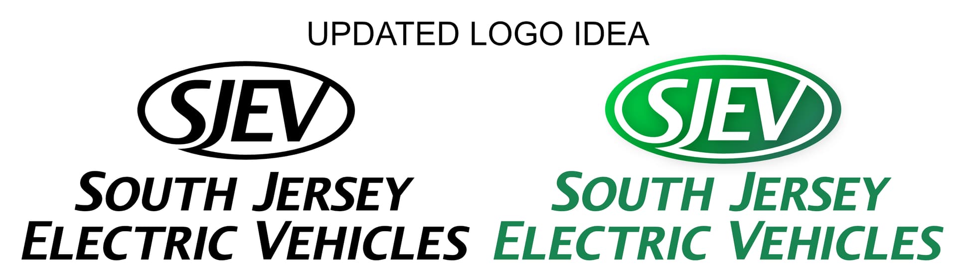
I’m wondering why the B&W version differs from the green one. I’m not a huge fan of the type style you’ve chosen for the name of the company beneath the logo, but that could just be a personal opinion.
I agree with @Just-B, the mark itself is a big improvement. The type needs additional exploration.
1 Like
To me, it looks like the font in which the company name was written was the basis for the SJEV lettering. This may be the reason why it was chosen.
I would emphasize “South Jersey” as the brand name and defer “Electric Vehicles” as the claim.
If it just operates there this is probably not a good idea and the naming of the brand would be a separate challenge since all parts seem generic to me.
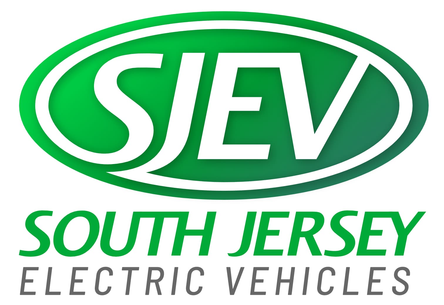
As others have said, a vast improvement, but what jars for me is the small caps. I see why you have done it to emphasise the SJEV. However, it creates disharmony. I don’t think you need to do it, as it is not a great leap of logic to see where the acronym comes from and you risk patronising your audience.
The type just needs a lot of tidying up, small caps aside. Kerning needs addressing.
Not a fan of the gradient either. They always feel gratuitous.
Overall though; a huge improvement.
1 Like
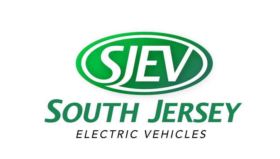
Yes, me too, The typeface is fine, but the italic font, the small caps, and the symmetrical arrangement with the space between the words cutting the composition into halves are awkward. There’s also the lack of visual hierarchy between the mark and the type.
Joe’s solution addresses the visual hierarchy problem, but I’m guessing the entirety of the name is important in a way that makes subordinating the words “Electric Vehicles” inappropriate.
There are certainly places for small caps and italics, but using them for stand-alone words in a logo isn’t one of them — especially since there’s nothing about the subject matter that suggests the qualities that those styles impart. This might be my personal bias, though.
I haven’t played around with it, but I’d probably set the type flush left in Roman (upright instead of italics) in either uppercase or initial caps and treat it as a separate and subordinate composition from the mark — one that could be positioned out to the side or beneath in whatever way was most suitable for the situation at hand.
Thank you all for the feedback. It’s greatly appreciated. I’ve been working on the text in the logo based on your feedback. Is it OK to show a 2nd version for feedback?
When you’re using two different italic fonts, make damned sure they both slant at the (more or less) same angle.
Attached characters are not always a good idea. It looks S-O-U-M-H to me.
1 Like
This topic was automatically closed 365 days after the last reply. New replies are no longer allowed.