Hi! I’m going to design a business card that includes embossing, and I’ll be working in Adobe Illustrator. How should I prepare the file so the printer clearly understands which areas need to be embossed? Any additional advice would be greatly appreciated.
Another question: Is the file setup for debossing the same as for embossing?
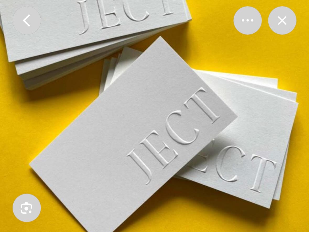
Also, do I understand correctly that embossing will create a dent on the back of the card, so I should avoid placing any important graphics in that area? And with debossing, the back stays mostly flat, so it’s safe to place graphics or important elements there?
Thanks!
I’m attaching an example I found online (not my design—I haven’t started yet).
Make a spot colour and name it Embossing. Set it to overprint.
Create your emboss design using that spot colour and keep it on top of the artwork. You do not strictly have to put it on top, but since it is overprinting it is simply good housekeeping.
Check with your printer because every shop has its own way of doing things. Some want the emboss as a separate file. If that is the case, export your artwork with the emboss layer turned off, then export again with only the emboss layer turned on using the same settings.
Others are fine with everything in one file or sometimes they ask for separate pages. It really depends on their workflow.
If you are embossing specific elements on the page, the emboss layer must be an exact copy of those elements placed on top, coloured with the Embossing spot at 100 percent and set to overprint.
Yes, but it will be more than a dent; the back will, in essence, be a debossed version of the embossed front.
Why do you think that? When something is debossed, the reverse side is essentially embossed. There is one important exception, though. When very thick and rigid paper stock is used, the stock can sometimes absorb the entire indentation without it appearing on the reverse side.
I’m not following you. The die layer doesn’t print at all. It’s only used to make and position the metal die, which is an entirely different process from whatever printing is applied to the card. Setting the art on the die layer to overprint won’t hurt anything, but it seems unnecessary since it’s neither going to overprint nor knock anything out. It’s a minor point, though, and I was just wondering.
Then again, I’m thinking of traditional embossing, stamping, and engraving, where the entire die process is typically handled by a printing company specializing in dies. There are new processes, where what you said might apply. I’m much less familiar with them and those techniques.
Just B, I was being a bit meh because I was tight on time, still am, but want a reprieve… but let me back and explain what I mean.
Yeah, the die layer itself is never going to print. We all know that. The overprint setting is not about the die physically overprinting ink on press. It is simply a safeguard inside the artwork so that nothing underneath ever gets knocked out by mistake.
If that layer is set to knock out, Illustrator or the RIP can treat it as actual artwork and remove the underlying ink where the die shape sits. Most of the time it will be fine, but all it takes is one odd transparency setting or a flattening quirk and suddenly you have a ghosted shape knocked out of the print layer.
So setting the spot to overprint makes the die layer harmless. It cannot knock anything out, no matter where it sits in the stack.
It is just good housekeeping. Same way you would treat dielines, keylines, braille dots, varnish plates, tech marks and all that non printing info. Keep it on a top layer, name it clearly, set it to overprint, and you avoid any surprises.
Is it absolutely essential? Probably not. But it is a smart habit and it saves you from that one nasty job where the RIP does something weird.
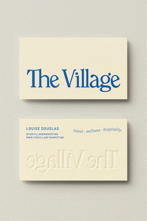
Thank you @Smurf2 and @Just-B for the insights! I was caught up with some urgent work, so I’m only able to get back to this now. Sorry, but I have another question: what if I want to add color to the embossed area? (I’ve attached a reference.) How should I prepare the print file for that?
You probably want foil embossing, which uses the same die at the same time as the embossing. With foil, however, you’ll need to pick the color from the foil the printer offers. You can’t usually specify it with a Pantone color.
It’s possible to print the image on the paper stock before embossing, but there are significant registration issues because both processes take place on separate presses at different times.
My comments refer to how foil embossing or blind embossing is traditionally done and handled by specialists. You might find an online printer that’s developed another way to do it, but I’d be very careful going that route without seeing samples.
For foil embossing artwork preparation, nothing extra is needed beyond what would be done for blind embossing. You just need to clearly communicate to the printer what you have in mind. Be prepared to pay a bit of a premium for all this, though.
Also consider using cotton stock, as it’s the most resistant to cracking during embossing due to its longer, stronger fibers. I’d probably avoid recycled papers. I’ve always used Crane stationery paper for this sort of thing, but there are others.
You should definitely talk through your embossing options with the printer because every shop has its own preferred setup and some processes suit short runs better than others.
If you want colour under the raised area, that is no problem. Print the colour normally, then duplicate that artwork on a separate layer and colour it with an Embossing spot. Set that spot to overprint so it cannot accidentally knock out the printed artwork underneath. You can also supply it as a separate page or file in the same position if the printer prefers. The goal is simply to give them a clean plate shape.
There are other ways to get a raised effect too. Thermography is one, where the ink is printed, powdered while still wet, then heated so it forms a raised surface. It gives that tactile feel without needing a metal die, although it has a different look and is not as crisp as true embossing.
Embossing with a die can be pricey on very short runs, so it is worth getting a quote before you go too far. And yes, foil embossing is another option if you want both a raised effect and a metallic surface.
Keep the back of the card in mind too. Embossing usually creates a noticeable impression on the reverse side, so it’s important not to have anything important on the reverse of the card that might be interferred with.
(there are other options in digital printing for emobssed efffects - like Scodix - which might be an option)