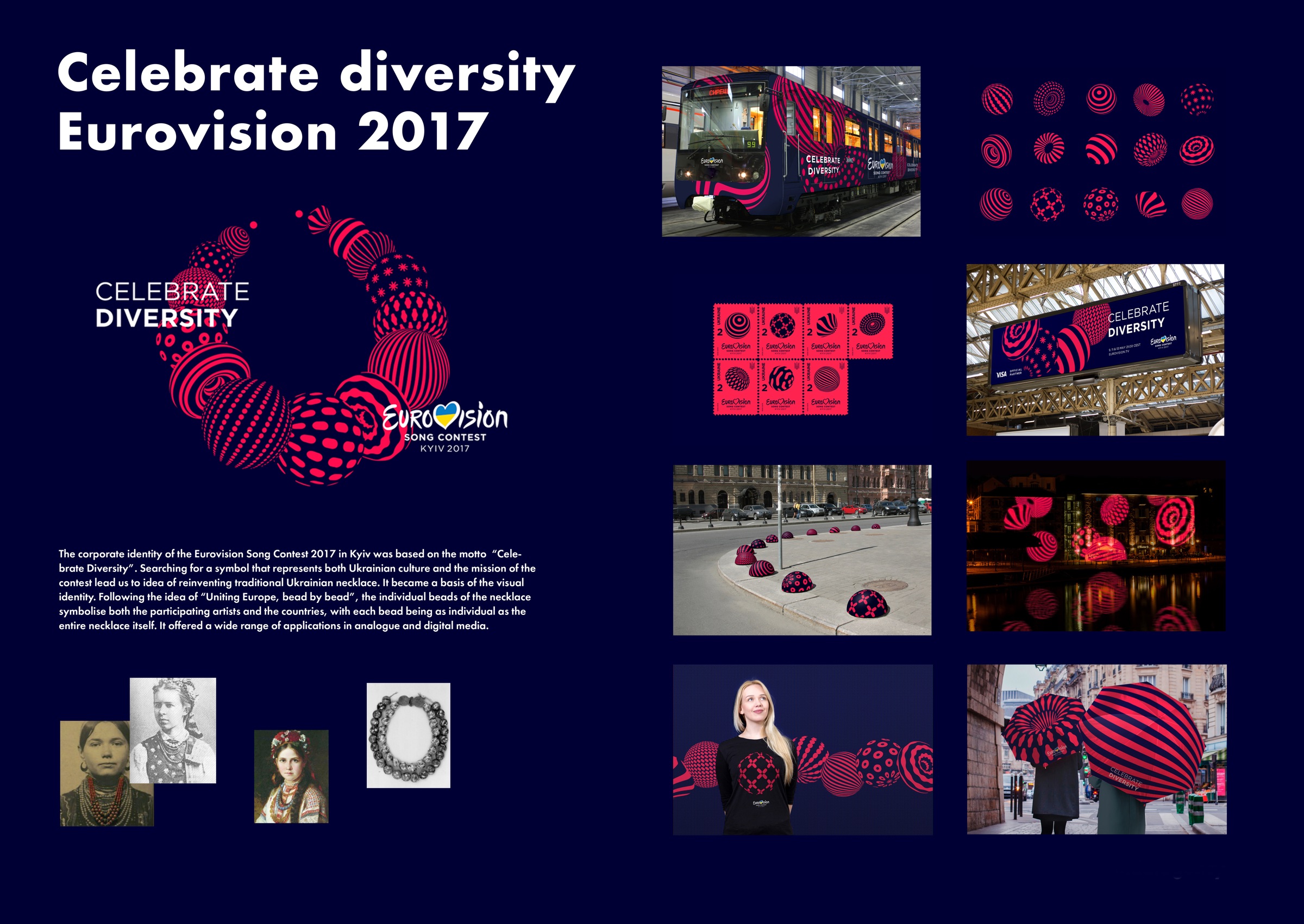
The corporate identity of the Eurovision Song Contest 2017 in Kyiv was based on the motto of “Celebrate Diversity”. The identity aimed at epitomising the values of the contest, which invites participants from all European countries and beyond to gather in a celebration of cultural similarities and differences by enjoying great music. The search for a symbol that could simultaneously represent the Ukrainian culture and the mission of the contest lead to choosing the traditional Ukrainian necklace and reinterpreting it in a modern way to form the basis for the visual identity. Following the idea of “Uniting Europe, bead by bead”, the individual beads of the necklace symbolise both the participating artists and the countries, with each bead being as individual as the entire piece of jewellery itself. Bead for bead, they feature a unique appearance based on stripes, stars, crosses or dots in different sizes, and yet they are unmistakable as belonging together and forming a unity. In addition, they offered a wide range of playful applications in both analogue and digital media.
The idea of basing the corporate design for the Eurovision Song Contest 2017 in Kyiv on the appearance of a traditional Ukrainian necklace is both powerful and outstanding. The distinctive look of the beads stands for the individuality of each participating country and artist and works convincingly across all media. Whether used in animation or printed on an umbrella or T-shirt, it succeeds in conveying the joy that this competition delivers.
