Question for the group. I designed a logo for a client who now wants to “expand” the logo symbol. To give you an idea, imagine a logo symbol that is a stylized illustration of a bear head; this is next to the logotype of the company’s name. The client now wants to create a new version of the logo that includes the rest of the bear’s body. My instinct is to tell the client this would be a really bad idea, branding/identitywise, but it got me wondering: are there any major companies that use “expanded” versions of their logo symbols, for different purposes?
I think it can work if done well and done for the right reasons. Done for the wrong reasons, done poorly, or done for an obscure organization, two versions of a logo can dilute the branding.
Movie production companies, for example, are all about motion, so they need static and moving logos. For example:

We had a client request something like that several years ago, so we hired a freelancer (Chris Le) to create a real animal animated version of their logo for a several-second intro to their YouTube videos.

These aren’t exactly what you’re referring to, but I still think they are examples of static logos that are used the create a fuller, expanded version of a logo for an identifiable purpose that makes logical and contextual sense.
On the other hand, if the client you’re referring to wants a full-bear version of his logo just because he thinks it would be cool that’s probably not a very good reason. It’ll just dilute the recognizability of the logo.
1 Like
If the client wants their logo to morph into an ice cream then go for it. Do it well. Pocket the cash. Easy money.
2 Likes
It’s funny how I was thinking just do it and - all good go ahead and redo the logo with a full bear.
But as I puzzle over this - I am just thinking that logo evolution is done by simplifying not getting more complex.
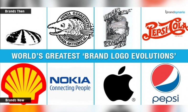
The branding gets simpler and simpler.
Perhaps the Shell corporation is different - it’s still a shell but looks more like an iconic shell now.
Nokia didn’t go with a full fish.
The only that sticks out here is the Xerox one.
I don’t think there’s any rules, if they want the full bear go with the full bear. In a few years you’ll be hired back to simplify it and reduce it back to what it was before.
I still don’t have any reservations on doing this task for them.
1 Like
for how long and intense was the non expanded logo used?
could there be benefits to a expanded version?
like recognizability or differentiation
should the expanded version completely replace the existing logo or only be used for certain use cases?
what is the clients motivation?
The only “expanded” versions that come to my mind are from just symbols to symbols with name to symbols with name and claim to symbols with name claim and slogan.
Some brands have multiple signature visuals like coke sometimes presents its logo with a wave ore bottle but: the smaller the company, the less you are allowed to water down the soup before recognizability is too low and therefore communication costs become inefficient/expensive.
1 Like
I think it’s sounds fun. One of the best things is when you get an opportunity to design something that might just delight someone. When I hear “oh, cool”… that’s pure magic to me.
I totally agree that brand strategy is about beating a drum and creating a familiar mark that consumers recognize instantly. That thinking even extends to consistent use of trade dress.
BUT, it’s an awful lot of fun to break some rules and extend a system. An extended logo just might need specific use case rules spelled out in the style guide or something. I’d also concur with everyone that overuse of this kind of thing would probably be very bad for brand recognition.
1 Like
Heineken do it too
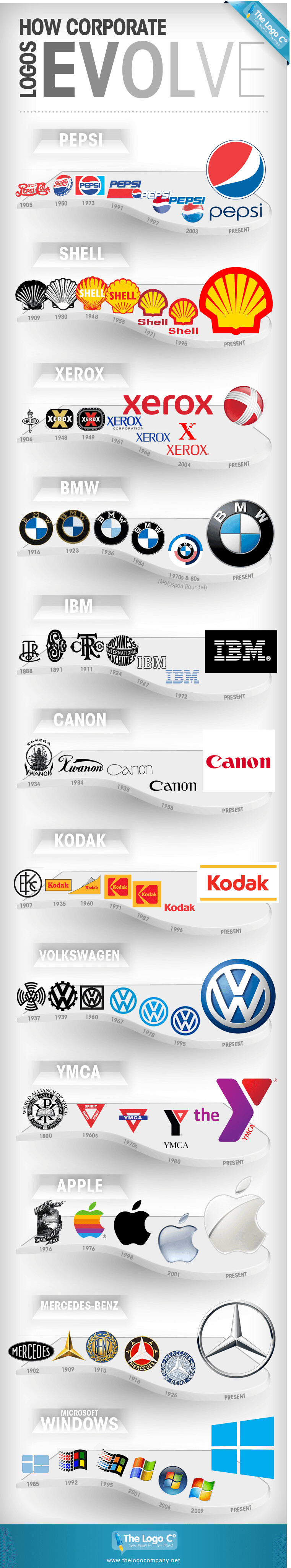
Found this site with an interesting take on logo responsiveness.
Shows how logos reduce/expand depending on usage.
3 Likes
The motivation seems to be, “we have to put the logo in our tall office window, so we want it to fill more of the area.”
Good point — maybe just a stacked version of the current logo would work.
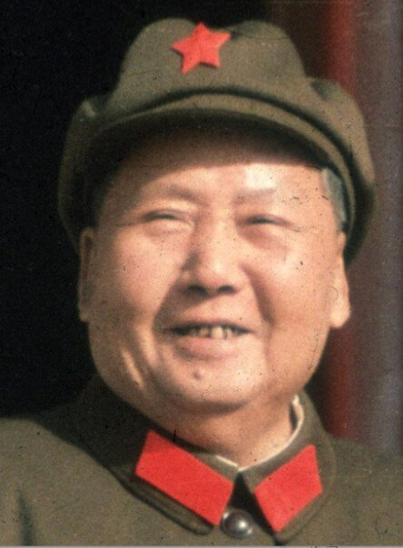
(does anyone else think that simplified Heineken star just turned into a Communist symbol?)
No don’t see it
I try not to let my enthusiasm for a project depend on my clients motivations if that were the case I’d be miserable.
1 Like
I wondered why the Adobe Illustrator 5point star bothered me… ![]()
1 Like
It sounds like he wants the bear to be the company mascot in addition to its logo. If that’s the case, the bear needs to be consistently used in various situations to establish it as a branding element and not just a one-off special logo for use in a vertical window.
1 Like
There’s also a French football club called red star. There logo is a red star.
I just looked that up, and their logo
reminded me of this:
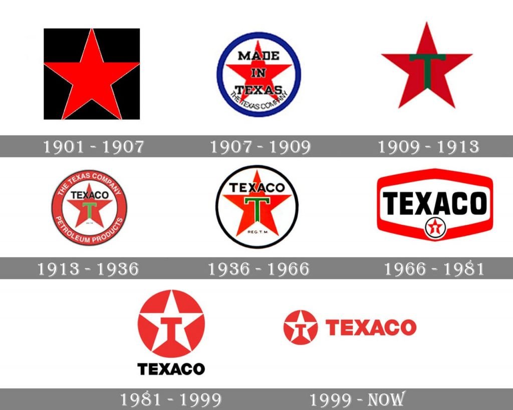
From the company website (which has slightly different dates than the graphic): “The first Texaco star arrived in 1903, when a 19-year-old Italian refinery worker suggested we embrace the five-pointed symbol of Texas. He later added a green “T” - a color scheme he probably picked up from the Italian flag.”
It looks like the red Texaco star logo was actually created before the Communist red star. ETA: possibly the football club’s logo was before both; I’ll have to look into that.
1 Like
The Texaco star is different. See the ‘arms’ are straight across? The Communist star has sloped shoulders.
I guess it depends on which one. I see just what you mean in the Chinese uniform photo, but some of the Soviet emblems (scroll down this page to see) seem to use the straight-across ones.
General update: I realized that customers of this company who saw the “exanded” version of the logo might be subconsciously confused by it, because it would be a different shape than the standard. Since the company is fairly new, it seemed like a brand dilution that would be more negative than positive. I suggested a stacked version of the logo to the client (which I thought of after reviewing the answers here) as an alternative, but in the end they decided to stick with the original. Thanks very much for all the responses; they helped me work out the problem.
And they still get billed for your time. Don’t forget, you don’t work for free.
1 Like