Just my 2 cents.
The logo is conservative and breaks no new ground, but that’s OK and probably deliberate. It suggests stability, confidence, unity, pragmatism and common sense, which when contrasted with the opponent, is probably just what it should suggest.
The older I get the more jaded I get.
Campaign logos mean nothing to me. It’s two names on a sticker no matter what the huge, often inflated rationale might be behind them.
Yep, all it needs is legibility. And of course, a parade of “experts” to talk about it in an effort to justify the relevance of their expert status.
[/cynical]
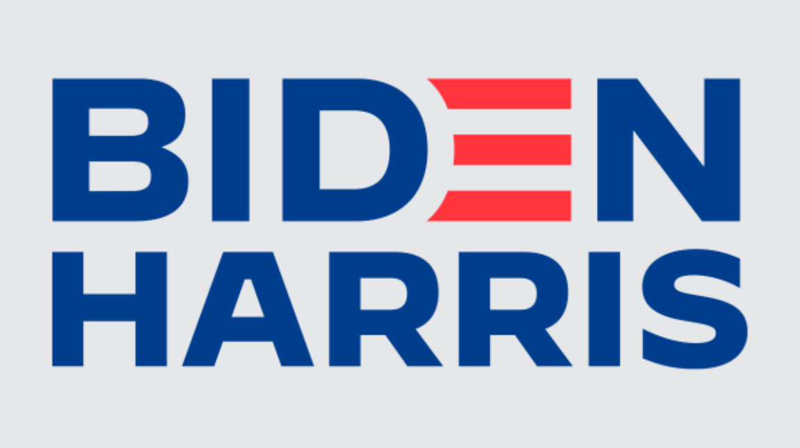
The E just feels very jarring to me. The color contrast really breaks the unity of the word.
I see the DE combo as a nod to the US flag with it’s blue square and red stripes.
wrong color red and blue for the flag.
I see a frown and red hair standing on end - if I think really too hard about it.
It’s two names on a sticker.
Without reading the article attached to it, the tiny logo in the link box has the names crowded by wishy-washy stripes filled with static (though guessing those are the letters from the names tossed in there like alphabet soup.)
Not a good look.
" It spurred conversations about “good” design versus “effective” design, and in 2020, some experts wonder whether that distinction even matters anymore."
THIS
What happens when it is neither, and no one can tell the difference?
Red Color Disturb me
I don’t think the colors are the true US Flag nor do i know the rules about depicting my countries flag in the D & E
To me the contrast between the bright red and navier blue suggest stability which is what they want to exert but it falls flat to me as the viewer because i see them as more of the same (politician, but they probably know what they are doing.
Which is probably reinforced in the rectangle design.
His style guide says their official red is 6-98-100-1, which is much a deeper red.
The blue in this is off too. They say the official color should be 100-84-12-4.
Which are both over the optimum 200 on ink limits (at least in my world)
The blue is actually fairly close.
That red is way way off.
Good use of colors because blue represents security, integrity, peace and red represents love, ambition, determination! So overall nice logo ![]()
Here red is aggressive, angry and used as an alert.
Best one I’ve seen said “Byedon”
I see what they did there.
Ima gonna write in Romney. Both sides hate him. ![]()
Seems like the majority of Experts either ripped this to shreds or else tried to say “who really cares about logos these days???” Not to sound overly negative but this article comes across as a huge waste of time.
All articles that have to take paragraphs to explain a logo are a waste of time. If it takes too many words to explain, perhaps the logo is not successful. Or far too much effort is being put forth to justify it.
But nowadays, even bad press is still press.