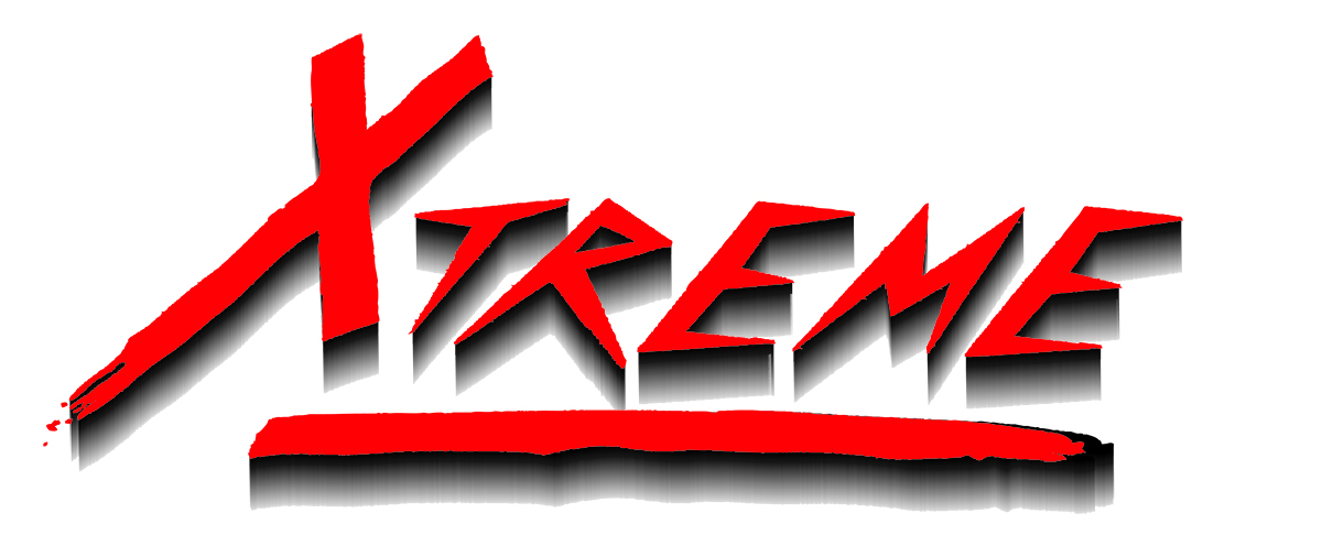
I need to re-create this label and the logo looks like it might, maybe, possibly optimistically, be a font. Any clues?
Hmm. The pattern on the face and the extruded area on the two Es are not the same. That makes me think some of the effects were custom applied. How close of a march are they looking for? Good luck with this.
It’s one of the model names of Gabriel Shocks so it needs to match. Not like anybody is crawling under a truck to see if the logo is perfect, but…
when you’re a perfectionist like I lean to be, I’d like to say I got it right.
As Steve mentioned, the letters themselves are likely from a font, but the shadows and the line beneath were not part of a font, and were created in some other way.
If it were me, I’d just redraw the letters since it would likely take less time than searching a bunch of free font sites. The shadows, though, are another matter — you’ll never get the grungy highlight patterns in them to match perfectly.
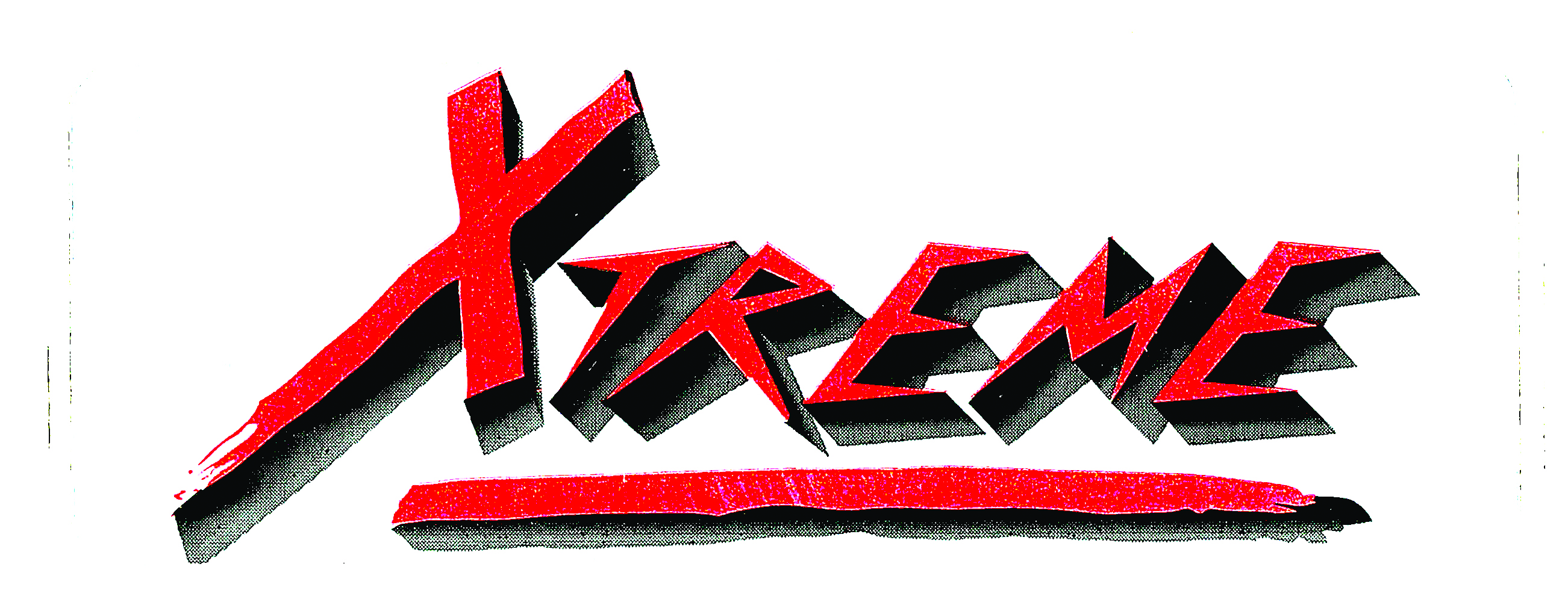
Thanks, guys. The shadows are really the least of my worries. I can get that resolved. Just seems I’d seen that font somewhere. I’ll post my finished fonts for pats on the back when done! ![]()
To redraw the actual characters would not take long at all, as you have a fairly decent copy to work from. Easiest way, to my mind, rather than spending ages trying to find it.
I thought it was similar to Killer Klowns from Outer Space but it’s not quite it. Nearest I can offer is Psychomonster
You might need to re-draw it ![]()