E-commerce product image ad designs for shoulder brace.
Looking for valuable feedback from the expert.
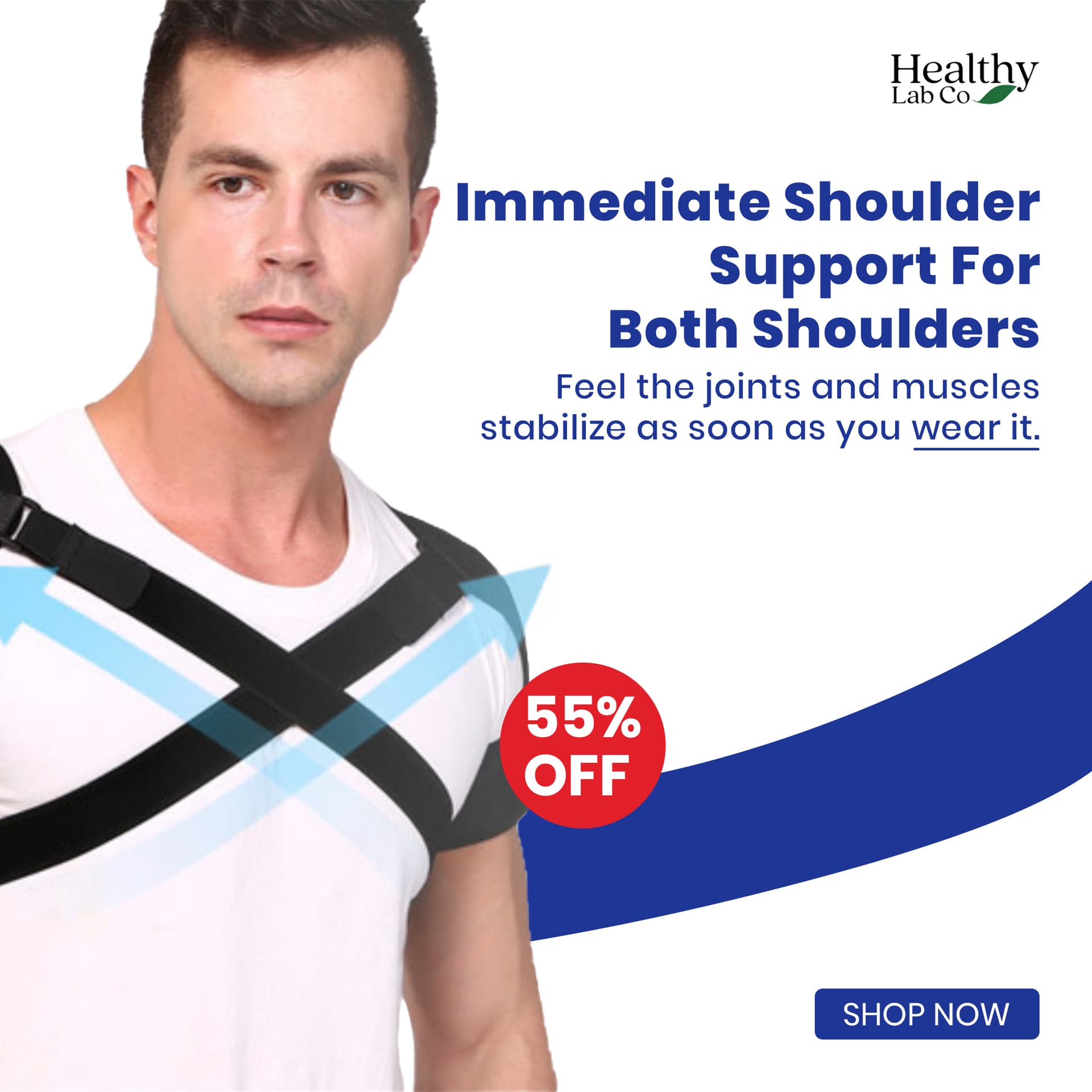
For me - the logo position shouldn’t change - it should be consistent in the same area.
2 of the adverts don’t show the product.
Are the product names given?
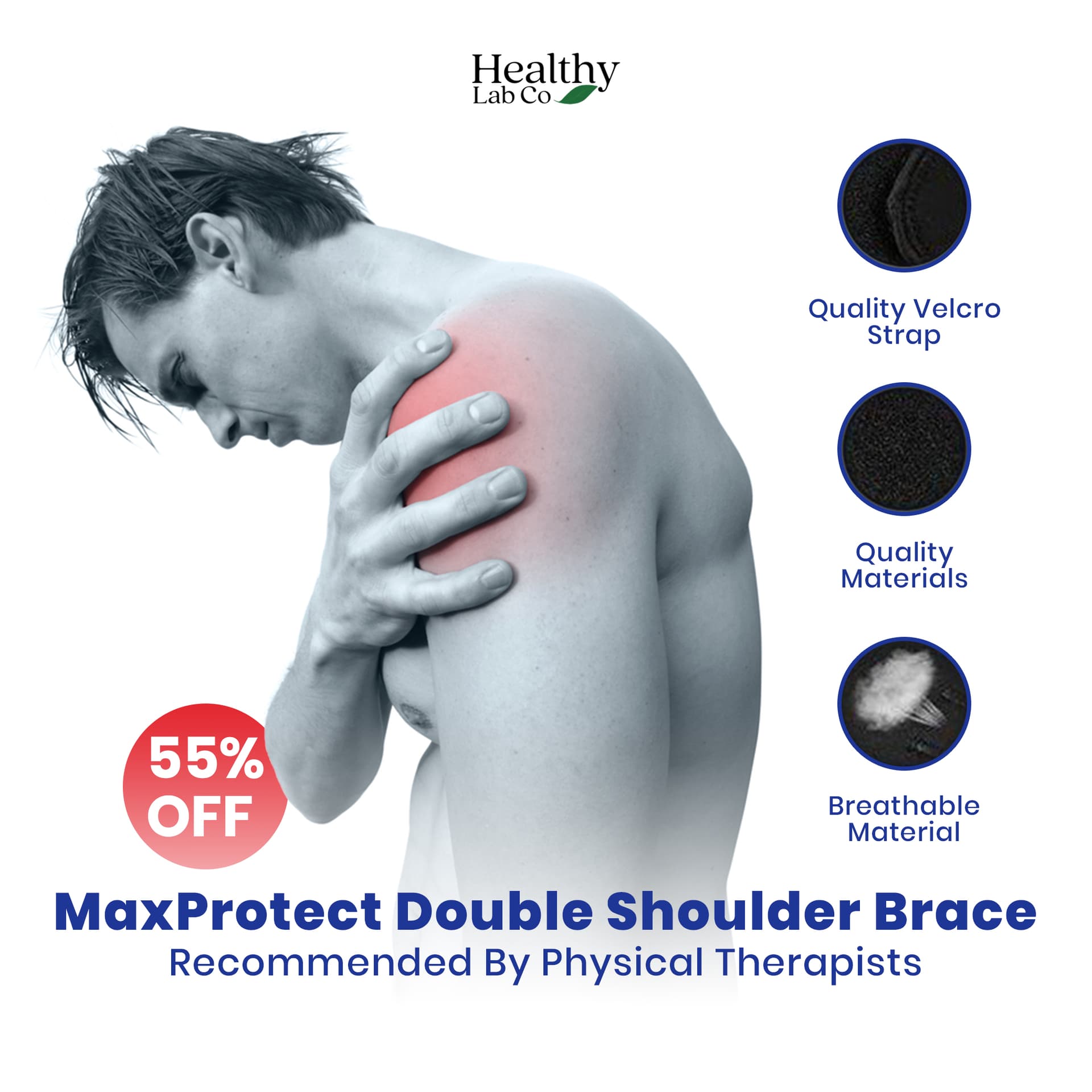
Pretty sure the first one is called 'MaxProtect Double-Shoulder Brace" as you have on 2nd image.
Pretty weird to highlight ‘wear it’ - surely the only way it works if you wear it.
2nd one I cannot make out the dark images in the circles.
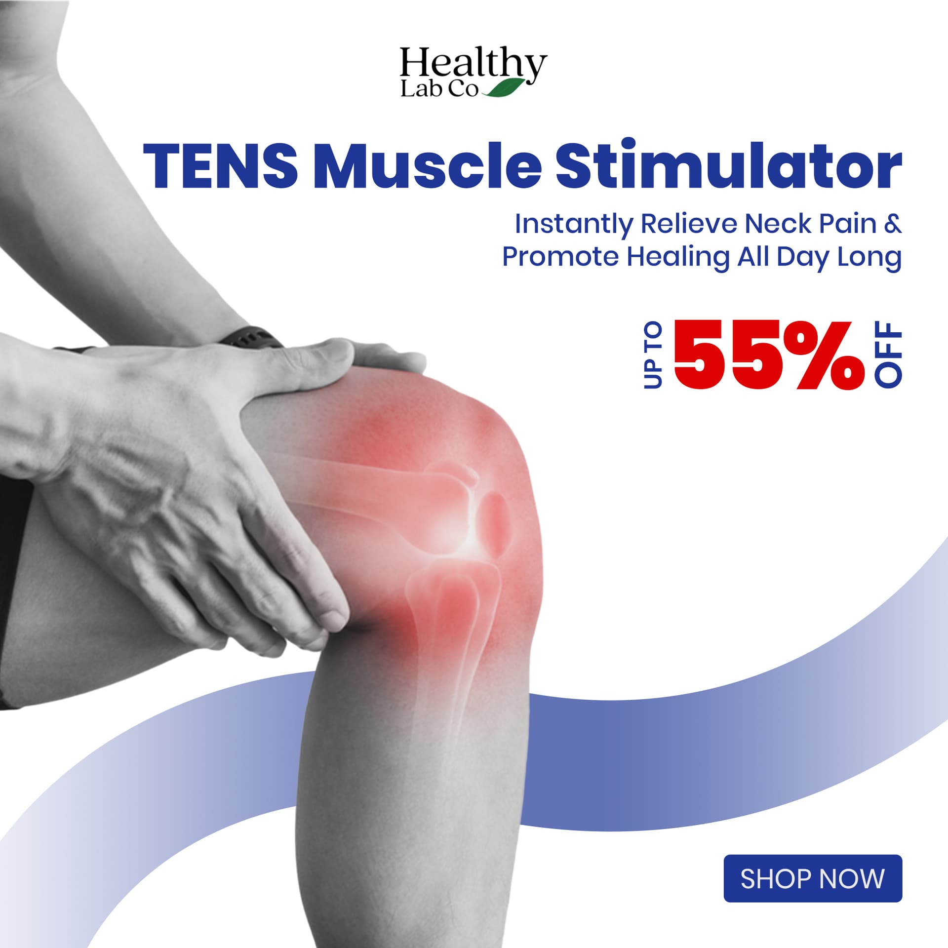
Is the promotion “55% off” or “up to 55% off”?
One of the curved lines is faded and the other isn’t.
Consistency of placement of text- hierarchy is important - there are inconsistencies across them all.
1 Like
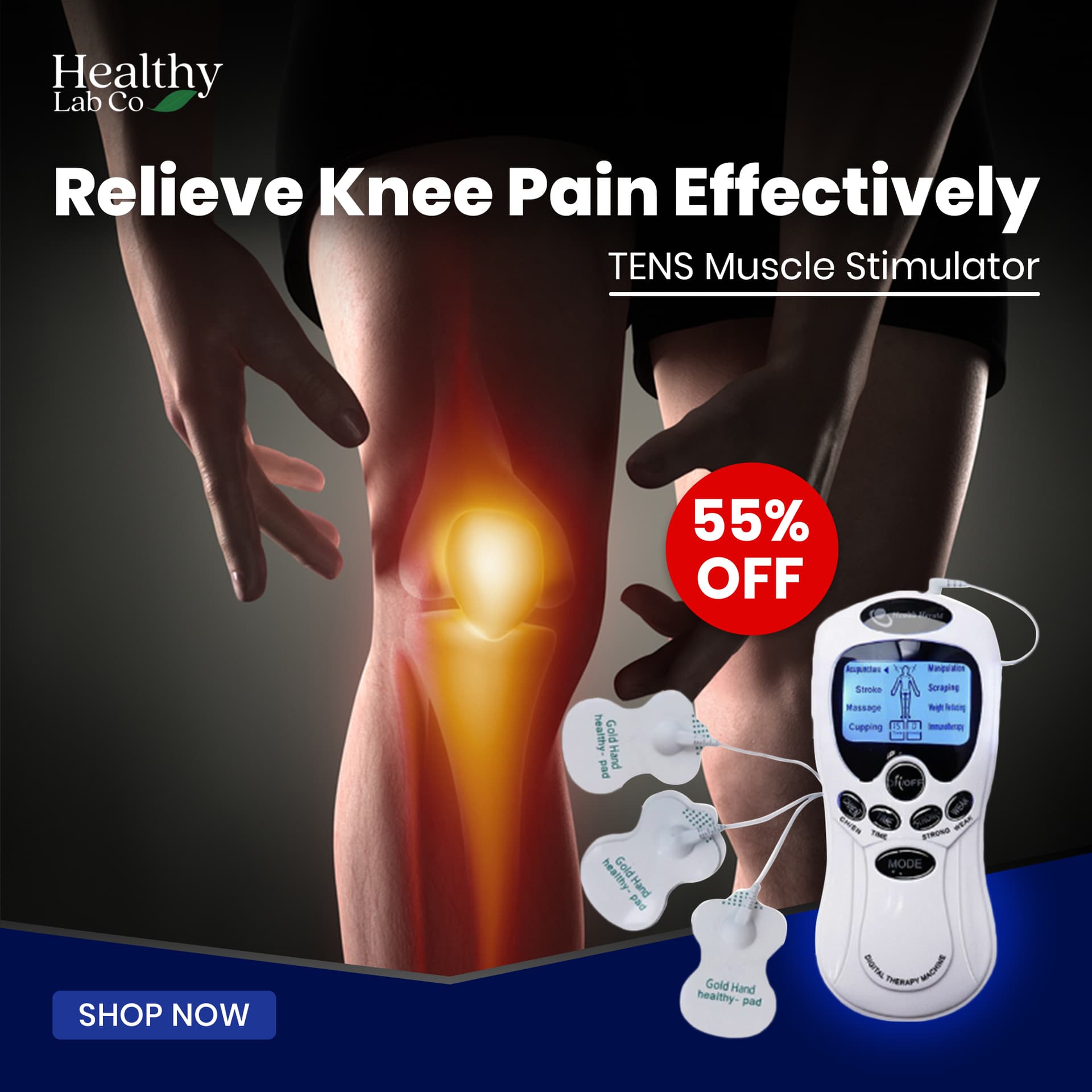
I’m unfamiliar with these products, but I probably wouldn’t use a photo of a knee when the copy is about relieving neck pain.
3 Likes
Thanks for the direction about logo.
Actually different kind of design, different types of targets and problems with the same product.
Dark images are “zoom view of the product”
And thanks for giving up all the design critic . It means a lot.
That’s a mistake of word “knee” in the copy , Sorry -_-
The product was “knee pain” problem solver.
It could be a language barrier or translation, but I think the word you’re looking for is “tense” not “tens.”
We were just talking the other day about tweaking the leading of headlines. The first ad is a good example of when this should be done. Due to the way the ascenders and decenders line up, it looks like there is more space between the first line and second line than there is between the second line and third line.
On the first and fourth ad, the headline type is running too close to the photo. I’d suggest you look at putting a line break after Immediate on the first ad and after Muscle on the fourth ad. Of course, this change will require tweaking the layout of everything below the headline to avoid similar problems.
1 Like
Nah, it’s an acronym; TENS = Transcutaneous Electrical Nerve Stimulation
Otherwise, I’d also want to mention the copy, as I find it kind of weak. “Feel the joints and muscles stabilize as soon as you wear it” could be much better. Why is “wear it” underlined?
Is the shoulder brace strap fastening actually Velcro brand? I’d check that before I included the brand name. If it’s valid, it might also call for a ® symbol and trademark attribution statement.
1 Like
Okay. I will check that. I didn’t know even deeply about that brand ![]()
Steve_O, Tens is the name of the product. So “Tens” is correct. My wife and I use our Tens device for arthritic shoulders. It’s a great product, by the way.
1 Like
This topic was automatically closed 365 days after the last reply. New replies are no longer allowed.