Fake brief on an unpleasant design poster


Hi,
I’ve tried to make this poster as an exercise, but I’m not sure if it works. I would be really grateful to any of you who could help me, thanks.
This is a fake brief from chatgpt:
Brief for the Creation of a Poster on Hostile Architecture

Client: UrbanEyes - Association for Improving Urban Livability

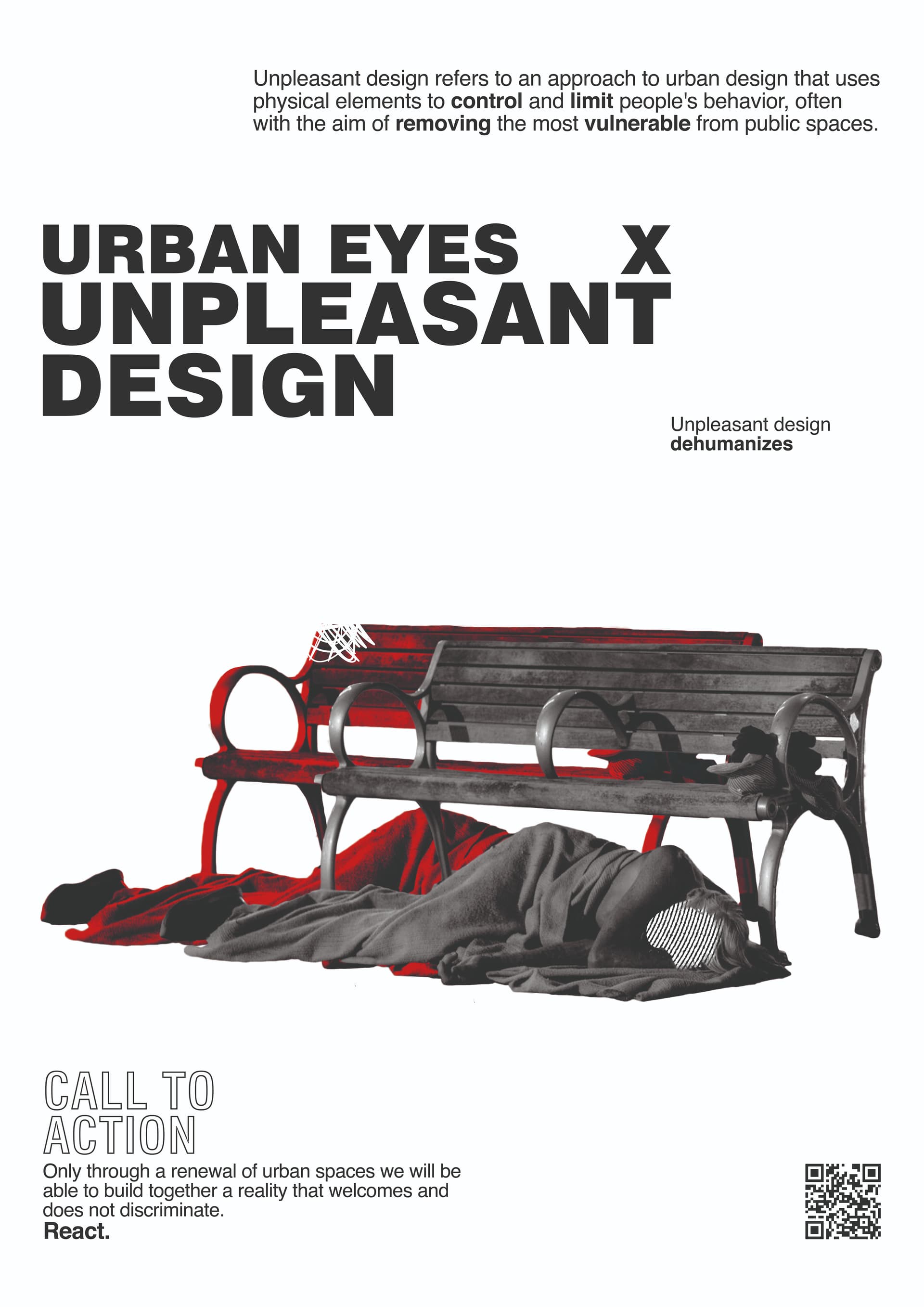
Context: UrbanEyes is a non-profit organization dedicated to raising public awareness on urban livability and architectural issues. One of our recent campaigns focuses on hostile architecture, a phenomenon increasingly present in modern cities. Hostile architecture refers to design and architectural solutions that discourage undesirable behaviors, such as loitering, but often end up further excluding and marginalizing vulnerable people, such as the homeless.

Objective: Create an informative and awareness-raising poster that highlights the phenomenon of hostile architecture. The poster should be visually impactful, informative, and capable of stimulating public reflection and debate. The goal is to educate the public on what hostile architecture is, how to recognize it, and its social implications.

Target Audience: The poster is aimed at a broad audience, including ordinary citizens, students, architects, urban planners, policymakers, and social activists. It should be understandable and engaging for people with varying levels of knowledge on the subject.

Key Content:

  1. Definition of Hostile Architecture: A brief description of the concept and its stated objectives.
  2. Visual Examples: Images or illustrations of concrete examples of hostile architecture (e.g., benches with dividers, anti-loitering spikes, sloped surfaces under bridges).
  3. Social Implications: Text explaining how these solutions negatively affect vulnerable people and social cohesion.
  4. Positive Alternatives: A brief section proposing more inclusive and humane design solutions.
  5. Call to Action: An invitation for the public to reflect on the topic and participate in public discussions or support initiatives for a more inclusive city.

Style and Tone:

  • Visual: Modern, clean, and professional, with a balanced use of images and text.
  • Color: Use a color palette that draws attention while maintaining a serious and reflective tone.
  • Typography: Readable and modern fonts, with emphasis on titles and key sections.

Technical Specifications:

  • Poster Size: A2 (420 x 594 mm)
  • File Format: High-resolution PDF, minimum 300 dpi
  • Color: CMYK for printing

Timeline:

  • Draft Deadline: August 15, 2024
  • Client Feedback: August 20, 2024
  • Final Delivery: August 30, 2024

Budget: The budget for this project is €1,000, inclusive of all revisions and usage rights.

Additional Notes:

  • The poster will be displayed in public spaces, schools, universities, and distributed via digital channels.
  • Consider including a QR code linking to a webpage with further information and resources.

Contact:

  • Contact Person: *****
  • Email: *****
  • Phone: *****

We are available for further clarifications and are excited to collaborate with you on this important project.

You have posted this in the student section, so I assume it’s for a class or self-initiated project. However, I want to answer it from the perspective of a longtime designer and art director.

To be effective, posters must catch people’s attention and communicate a message within two or three seconds before the passers-by move on to the next shiny thing that captures their attention.

Your poster has a far too complicated message to communicate without a concerted effort to understand what the poster is about.

I had never heard the term “unpleasant design” until now, although I was aware of urban design measures to discourage the presence of homeless people, such as making benches uncomfortable to lie on or putting spikes on ledges to discourage sitting on them. I could be wrong, but I doubt the vast majority of the target audience is familiar with the term “unpleasant design” either. You’ve even tacitly acknowledged this in the poster by including small explanatory text. When understanding what the poster is about necessitates reading the fine print, the poster becomes largely ineffective.

You have attempted to explain “unpleasant design” visually by showing a homeless person lying in front of a bench instead of on an uncomfortable bench. However, you’ve repeated the same image in red in a way that doesn’t correspond to reality. This visual complexity inhibits rapid understanding of the imagery being an immediate representation of unpleasant design. In addition, it’s compositionally a bit strange.

Why remove the face of the supposed homeless person? Protecting privacy is great, but it might be better to choose or commission a photo where removing the face wasn’t necessary. People are drawn to faces, and hiding the face of the homeless person dehumanizes them further, which certainly isn’t consistent with the poster’s purpose.

What is the scribble on the back bench? What purpose does it serve?

the headline “URBAN EYES X UNPLEASANT DESIGN” makes no sense. I still can’t figure out what it means. When headlines don’t immediately communicate, you’ve already lost the majority of the target audience.

The premise of the call to action is arguable. Many people would disagree that urban environments should be designed to accommodate the homeless and argue that addressing the root causes of homelessness is a better way to help than redesigning urban spaces to incorporate them. In other words, you’re introducing an assumption that elicits controversy rather than making a more generally agreed-upon statement. It might be better to word the call to action in less divisive and presumptuous language. This might be especially relevant considering that the poster is aimed at “a broad audience, including ordinary citizens” and not exclusively to those who already agree with the premise of the statement.

1 Like

Well if the city is putting in benches like that to discourage people sleeping on benches then they should putting in shelters for people who need somewhere to sleep at night.

1 Like

Thank you for your reply. You’re right, I’m a first year design student but my teachers don’t really help me with composition or effective design, do you have any advice on how I could do to improve? What is the process I have to follow to design a good poster? There is any book, course or exercise you would recomand me?

Bob—Never forget this part of Just-B’s response to you. It is a primary principle that all professional designers follow.

1 Like

I would start by looking for an image that reads well in silhouette. If a viewer can determine the subject of a photo by looking at the silhouette, then it’s an image that reads well (generally) and that helps your message get across quickly, which is essential for this type of design approach.

You added elements that confuse the readability of the silhouette. It took me a minute to accurately read the image. Is that 2 people under there? Why is one person in red? That’s an awkward way for the second person to sleep. What’s that stuff on the bench? What’s that scribble about? Is that supposed to be graffitti? Why is the face removed? I shouldn’t assume this is a person, it could be a pile of rags… You raised a lot of unneccesary question in me, and that delayed me in understanding your message. IRL people don’t give posters that much time to get a message across. You have to simplify so people don’t waste time asking themselves extraneous questions.

I used to teach graduate courses. If you were in my class I would say this is a good start, a good proof 1. On proof 2, forget about the text temporarily, and address ways you can make it easier for the audience to quickly read this image. Give me multiple treatments if neccesary. If you can’t find a way to do that then you’ll need to find a different image to communicate your point on proof 3.

1 Like

Overall Composition:
I think it’s a good use of minimalism.
Strong focus on text and a single image that’s symbolic.

The text is clear and concise with a flow from top to bottom.
The image is powerful.

I’m guessing the use of ‘X’ is to create a sense of conflict or opposition???

The subhead of ‘Unpleasant design dehumanises’ links the imagery with the header.

This is a good message:
“Only through a renewal of urban spaces we will be able to build together a reality that welcomes and does not discriminate.”

Critique: Too wordy

  • Rebuild cities, rebuild equality.
  • Inclusive cities, inclusive future.
  • Transform spaces, transform lives.
  • Dismantle barriers, build community.

Provides a clear call to action, urging viewers to challenge and change current urban design practices.

The use of black and white creates a stark/sobering atmosphere.

The text is arranged in a clear and organised manner, with ample white space to enhance readability.

However, I feel the hierarchy and the flow could be better.
It’s far too wordy for a poster - you should reduce the amount of words to increase the impact.
Increase the flow from top to bottom by addressing the hierarchy and the systematic reading order.


Strengths

Strong Message
Effective Use of Imagery
Clear Call to Action

Visually
The image is effective, but it might lack an emotional punch needed.
Rain/Snow might add an extra level of compassion.

Here’s the kicker - I don’t think homeless people get to a bench and decide they can’t sleep on it so they just fall asleep beside it.
I think the image should be the bench to be as it is. A good bench image with the problem showing.
But maybe a homeless person, at night, walking away from it - at night - in the rain/snow -

The typography is clean, I think it can be more impactful.
The hierarchy for me is not working.

I don’t like the footer
Call to action is weak
The tagline is too long (see earlier)
The ‘React.’ text is good - it emphasises an urgency.
The QR code is disconnected from the call to action

The black and white palette is effective, but I think it needs a bit of a pop of colour to draw attention to specific elements or to create a stronger emotional response.

Additional Suggestions:
Experiment with layout:
Try different arrangements of text and image to see if it improves the overall impact.

Consider additional elements
Adding a small graphic or symbol related to urban design could enhance the visual interest.