What are your favorite sans serif fonts right now that don’t break the bank? I need some new ones and I feel like I have all the free ones!
I don’t have favorites. The typeface used for any given job is the one most suited to communicating the message.
Having been around the block a few times, free fonts can be so much of a headache they are not worth what you pay for them. About 20-25% of them don’t rip/print properly.
The sans serif I see most often in design stuff crossing my desk is good old Frutiger.
1 Like
I don’t really jump around based on favorites that change all that often. I have a handful of go-to typefaces that I’ve used for years. They’re premium fonts that work well and that I’ve come to rely on because I know their personalities and when they’ll work for the job at hand. It’s not all that different from investing in other software and equipment.
When a job comes along that requires something different, I’ll find it and use it when there’s a budget for it. I generally stay away from free fonts since they’re prone to sloppiness, having glitches and dubious origins. Sometimes I’ll use Google fonts, but only for display type or as web fonts. What I won’t do is rent fonts from places like Typekit.
——————
Just an afterthought in response to your question.
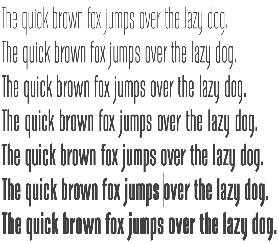
I wouldn’t call it a favorite, but I’m working on a signage system project right now for a nature preserve where I’ve selected the free Google font called Barlow Condensed. I doubt I’ll be using it for much of anything else, but it’s distinctive and a bit counterintuitive, which make it just right for this project. I’m unsure at this point, though, whether the client will feel the same way (they originally suggested Papyrus, which made me noticably cringe).

1 Like
I used to do a ton of work for a client that had Frutiger as their corporate face. I got really tired of Frutiger – which is a shame – but I’m coming back to it. It’s a very nice typeface. Also a fan of Avenir which, interestingly enough, was also designed by Adrian Frutiger.
1 Like
I’ve always been a big fan of Frutiger. It’s been a go-to face of mine for as long as I can remember. Another face of Adrian Frutiger’s that I’ve always loved is the serif face, Meridien.
2 Likes
Agreed. Though I have had good luck with Tofino Pro and the serif typeface Mort Modern.
Guess I’m going to have to get Frutiger!
Adobe CS software came with Myriad Pro, which is very similar to Frutiger. For that matter, I’ve always regarded it as a very well-made rip-off of Frutiger. I’m just mentioning this is case you already have a copy of Myriad Pro.
1 Like
Yes I have myriad pro. I haven’t played with it much. I prefer taller condensed fonts for the most part (the things I design don’t usually include bodies of text), but it’s probably worth a little exploration.
As B already mentioned, design isn’t about what you prefer…
Just sayin’…
I’ve been using Myriad Pro, Open Sans, and Raleway lately, depending on the project and the look it needs.
Eye roll typical designer - a know-it-all response. I’m not a gnoob, thank you very much.