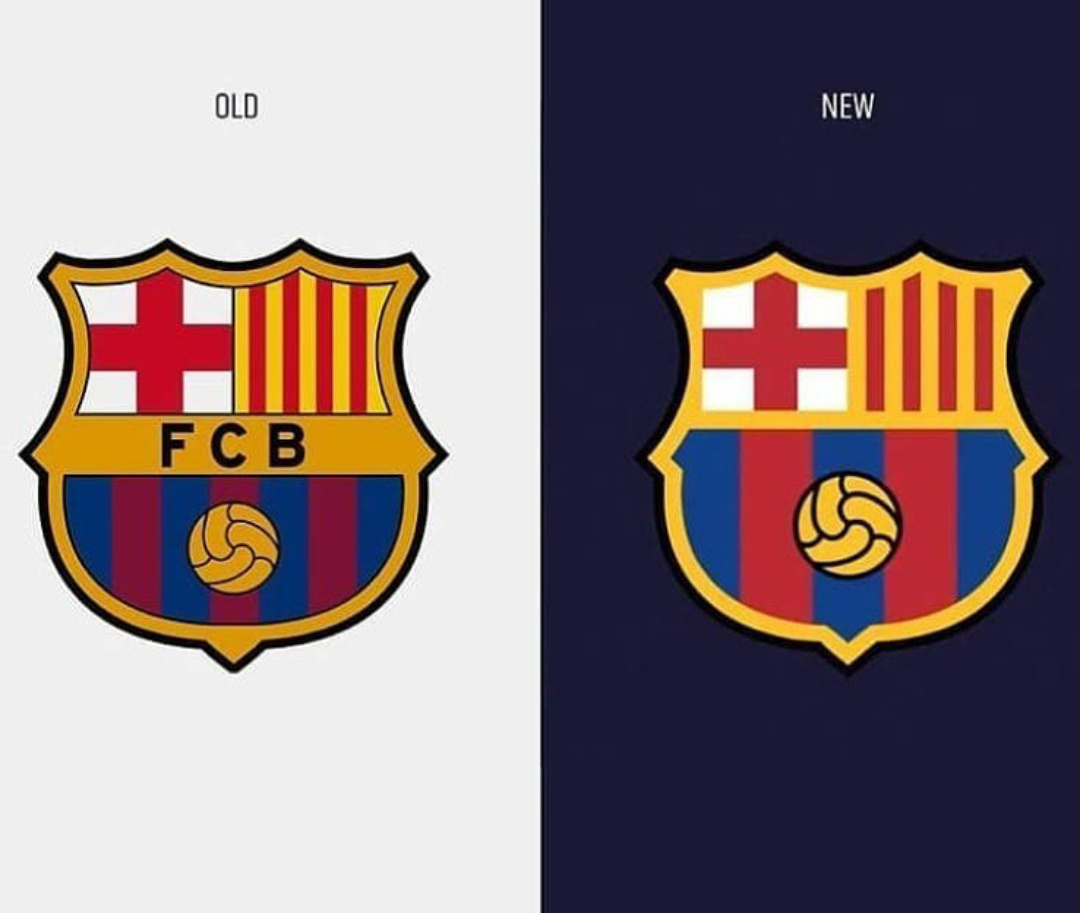
The club has re-designed its shield (logo), they made changes to the style and colors, the most notorious is that they removed the stroke on the inside. In my opinion this is a step forward because It adapts to the design style of this moment.
What do you think? I want to know your opinion on this!
I think the new one’s better. Getting rid of the thin, black outlines was a good move. Creating more value definition between the blue and red stripes was good too, as was making the ball stand out more prominently. It also retains the brand equity of the original through simply being a refinement rather than a complete overhaul.
I’m thinking that if it were on a white background, though, it wouldn’t work well with that yellow shield outline — a thick black outline around it, like on the previous logo, might be needed to create an edge with enough contrast to separate the yellow from the white background.
You’re right. I had to enlarge it on my desktop monitor to see that. In addition, the colors are a bit different from the version on the website Steve pointed to. Maybe their brand standards haven’t been clearly communicated or enforced yet. From experience, coming up with brand standards is one thing. Getting people to use them consistently is another.
The new logo is an improvement. I’m tempted to see what it would look like without black, by removing the outline and turning the lines in the ball to white. It is already so busy, I’m compelled to strip it down even more.
For some reason, sports team logos are usually busy and cluttered. I’m not sure why they’re that way, but it seems they fall into their own separate category of logo design.
I think in this case they don’t need any ant letter to recognize people this is FCB, their logo is trade marked so people can easily know where Lionel Messi can be play. And new design of the logo is not bad, nice touch without text.