Hello Everyone,
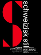
I’m new here and this is my first post which is about advertisement poster following Swiss style movement.
I highly appreciate your feedback please.
Thank you!
Hello Everyone,
I’m new here and this is my first post which is about advertisement poster following Swiss style movement.
I highly appreciate your feedback please.
Thank you!
Welcome to the forum. For the future, you’ll want to post designs that require feedback into our Crit Pit section.
This design has a good start, but there are many issues. I’ll list them:
If by Swiss you’re referring to the International Style (more or less goes by either name), this really is not Swiss.
That style would likely not have the unusual treatment of the S and p. Why did you treat those letters like that — especially the S? Perhaps you found the following, which is not an especially good example of Swiss design:
You horizontally squished the word CLEARANCE, which compromises the typeface’s design. A far better alternative would be to choose a condensed typeface. As an almost universal rule of thumb, don’t artificially condense or stretch typefaces.
You won’t find many Swiss posters with serif typefaces in them.
The Swiss style relies heavily on aligning objects to underlying grids, which are not obvious in your poster.
Here are Google search results for Swiss posters: Google Search
yeah, we have a whole classroom full of Not Enough Research here.