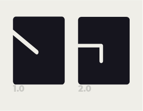
Feedback for a fictional personal brand logo.

Hey, before we start I just want to say sorry about my amateurish english. It is not my first language.

So I’ve been assigned last Wednesday to make myself a personal brand. It doesn’t affect much my grade but I’d really like to do a good and satisfactory work. I asked my peers how they percieved me, as a “first field search” to see what vibes I give off and mostly the answers were: funny, stylish and and japanese (Yes, that’s how many of them described me, smh).

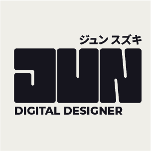
As you can see I’m going for a boldy look, using my name as it’s main focus (as it should). I think it should have more of a neutral feeling because as the teacher explained, maybe we’d put them logos on our essays and homeworks, so I went with a “gray area” logo so that It’d fit with whatever the theme of the assignments are, such as a more serious one or a more funny/young one.

I think it’s a solid 5/6, and have much room for improvements. So I ask you guys: any suggestions?

Overall, I like what you have done – legant minimalism is always my preferred aeasthetic anyway. The main part of it needs some tweaks typographically, but they are subtle and something you are not likely to see until you’ve been playing with type for another 20 years or so. In knit-picking here.

The main issues are with relative sixes. Reduce it to the smallest size or would ever be printed, or imagine it embroidered on a cap. Some of the thin lines may disappear. In and of itself, that fairly easily fixable. Logos like this often have a second drawn version for small sixes where the fine negative and positive details are beefed up a bit to accommodate both visual and actual (ink spread) filling in.

The relative size of the type top and bottom may also need addressing at small sizes. Again, easily remedied by drawing a second small size version.

I can’t speak for the Japanese text, but the kerning on the English could be looked at and tidied up. Mostly the TA of digital and the DE and NE of designer. The alignment could also do with looking at. I would adjust the size of the top and bottom type slightly to align with logical parts of the main word, ie the top text to align with the left edge of the U and the bottom to align with the first diagonal of the N. you could even do this by just using a lighter weight of the font. This would also help with creating more contrast with the extreme boldness of the main part.

Again small stuff, but the details make the difference.

Overall, good job. I like it.

1 Like

Didn’t have to read the description, didn’t have to know the other language. Immediately looked at it and go it. Then I read the intro and got it even more.

Instantly, it works. That’s good design. Well done.

1 Like

I didn’t realize the three blocks were meant to spell your name. I could tell the last two were letters, but the first block didn’t strike me as a J, and still doesn’t look like a J to me, even though I know it’s supposed to be one.

1 Like

What bothers me, I think, is the negative spaces of the three blocks. The different angles are distracting.

Letter/block space also needs fine-tuning.

1 Like

First of all: thank you all for your feedbacks! Means a lot! Specially given how clear and friendly they were! I am going to answer all the replies in one go so it gets more dynamic and easily understandable.

Ok, here we go.
Based on you guys commentaries I tried to make a few tweaks, hope you’ll like it!
Logo Updated:

personalbrandtest1_1

1st Feedback ( @sprout ):
For your feedback I got more involved with kerning, allignment & sizes.
So for the kerning we have the changes on spacing between the pairs you pointed to leaving the comparation of the two versions as it follows:

KerningComparation

About the allignment I used the half of the value of the negative spaces inside the letters to separate the letters (J-U-N) so it would have this progressive kind of spacing.

And lastly for the sizing, well, you’ve seen it already. The image on the forum is 75%, but I pretty much reduced the size of the logo by 1/3 of it’s original self.

2nd Feedback ( @Just-B ):
By the time I’ve read this one I immeadiatly noticed how abstract it looked and how hard would it be to see the logo for the first time, without my using my name as a context. So, I did as you suggested.

JComparation

It’s still not 100% certain you’ll figure it’s a J first-look. But it’s way easier and doesn’t run from the base aesthetic that I was looking for.

3rd Feedback ( @Eriskay ):
This feedback really got into me, got me puzzled for a while. But still, as you can see, I’ve managed to try and make the negative spaces inside the letters “uniform”. I’ve made the J less angled and more rigid to keep up with the U. But as for the N, I couldn’t managed to make it straight. I found it taking way too much space and making the straight lines in N way too thin, breaking the pattern. So I had to keep it angled. At least less angled, It only moves about 5º to the right, making it less noticible but still keeping the proportions right.

Last note:
I’ve also made a more roundish version, taking those sharp edges and making them the same value as the borders of each letter. I think it looks fine, but gives a way friendlier message. But contrasts too much with the sharp typography for the subtexts, for better or for worse.

personalbrandtest1_2

I’m afraid, for me, it’s now lost some of its minimal elegance. The change to the J makes sense for legibility, but it now feels clunkier, especially now you have rounded it all off. It is feeling a bit ‘normal’ now, whereas as before. I feel the tweaks you needed to make were far more subtle.

[As an aside, I read something the other day, which made me smile: ‘Whoever put the b in subtle was a genius’]

Anyway, I digress … if you are goi go to stick with the new J, the line position needs changing. Think of an actual ultra bold J and where the weights and stresses are. This would make a very clunky J. You need to retain that kind of minimal elegance that looks natural and instinctive, but in reality, usually involves many hours of refinement.

The kerning on the bottom text is still not quite right. Moist people turn text upside down to expose the holes in it. Another trick, I use is to see it in threes, so, treat dig as a three letter word that needs even visual space, then igi, then git, etc. This may not work for you. It’s just something I devised for myself that works for me. The go back and see the word as a whole.

IT is now too tight. TA still too loose. DE is better. SI now too tight. Me better, but GN now feels like it’s opened up a bit. Unfortunately, it takes years to get kerning. It’s not an exact science and each designer will probably do it slightly differently, but the end result will be even with no visual interruptions.

The was a great app called typespace. I just went to get the link and it seems to have disappeared from the AppStore. It was a sort of game whereby you had to kern words in different fonts and up it would tell you how far out you are. I didn’t always agree with some of their ‘correct’ solutions, but I wish I’d had it when I was learning how to.

Found it. It’s no longer an app, but there is a website: kerntype. Give it a go. You’ll lose whole chunks of your life to it!
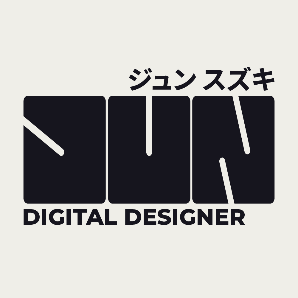
I still see the first letter as a “S”, not a “J” even though you changed it. To me, the first letter still needs work to look like a “J.”

1 Like