Feedback for a student logo

Hello everyone,

I’m new here and I would ask for a professional opinion regarding my logo for a small brewery.
As you may assume the target is 18+ and the idea is to run away from corporate style looking.
They produce new beers every few months with different flavours mostly for local “art pubs”.
It should be spelled “kazan artizan”

Is this a student assignment or work for a real client?

It looks like a beer coaster.
Maybe the centre part is sufficient and it doesn’t need a circular shape.

The initial letter of artizan could perhaps be clearer or freer to improve the reading flow.

3 Likes

It’s a student assignment for a real client (last year, internship).
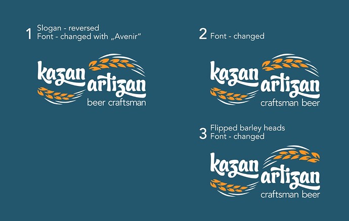
While doing it I was thinking for a label here is edited variant following your suggestions.
What you think?

1 Like

I like your second version much better. It’s simpler and highlights what’s right about the logo instead of obfuscating it with unneeded decoration. I like the heads of barley. The typeface you chose is unusual, but I think it works on the second logo…

As @Joe said, the top one looks like a coaster. In addition, “Craftsman brewer” is redundant since the logo’s tagline is already “Craftsman beer,” and “Freshly brewed in Munich” is something of a throwaway statement since all beer is fresh when it’s brewed.

4 Likes

Thank you, once approved I can use it for my graduation exam and creating brand identity.

2 Likes

The letter “Z” is completely unrecognizable. It looks like a “3”, a “5”, or an “S”.

To avoid any confusion, it would be best to remove the loop altogether and use a diagonal line.

Actually I llike the “z” letter. It gives character and I didn’t find it difficult to read (I am Greek).
What I am a bit sceptical about is that “Craftsman beer” seem a bit to close to the logo and the area there looks a bit cluttered. Also you could try another more clean/simple typeface for it.
Considering that this is a student project, this is quite nice, well done (I mean the second version, the circle is quite redindant) . Be a bit bolder and try different backgrounds instead of black (even if black works fine).
Have you tried to flip the barley heads and see how it looks? (just a thought).

I didn’t have any problem reading the z. It’s closely based on a cursive z,

Cursive writing isn’t taught as much as in the past, and mixing a cursive z with non-cursive letters is a little odd. Even so, I read it without even noticing. I think it works fine. Of course, I have a U.S. perspective. I know very little about cursive in Poland or Bavaria.

1 Like

I agree! It is really nice (the second one). My only suggestion would be to reverse the words Craftsman Beer so it reads “Beer Craftsmen”

Or better yet, change it to ‘craft beer’, which is a mor recognisable term. It also means that it’s relative size to the name can increase, which is beneficial for smaller size reproduction.

Is it just me or does the upper/lowercase thing bother anyone else?
Maybe the C in craftsman and the F in freshly brewed should be lowercase?

Or brewery and brewed should be uppercase?
I think that fits better

Should the wheat on under Kazan be flipped horizontally?

It’s pretty close to another product - or is it the same and just a revamp?
image

Thank you everyone, as “Smurf2” pointed out I’m trying to redesign on my own and use it for master thesis exam, even if the brewery don’t like the logo, but that’s not important.
The first variant (with the green circle) dropped off, probably I had to mention that the target for the brand is limited to people using cyrillic alphabet and that’s the key for using cursive “z” instead of regular “z”. I did some little editing according to your suggestions. The background color is not part of the brand :slight_smile:

A few questions:

What’s an “art pub”?

What does Kazan mean?

Is this a craft beer brand?

When you say they want to run away from a corporate-style, what do corporate-style beer brands look like to you?

1 Like

I like the font – it has a crafty vibe that fits well with the theme of craftsman beer. If they introduce new beers every month, which I assume is their unique selling point, could you incorporate that idea into the logo? Just brainstorming here – maybe emphasize seasons or the concept of change…?

  1. Not sure how to describe - it’s a place for selected and regular customers that have higher expectations
    2.Kazan - old word in our local language for bigger cooking pot I guess the owner was looking for something to describe traditions.
  2. Yes, local brewery for craft beers
    4.Probably Haineken, Tuborg they are more of a commercial product, but here that’s not the case.
1 Like

Thank you Kelvin very interesting idea I’ll think about it. Everything is right as you describe it.
On the other hand my teacher says that the typography is not arranged in a good way it’s like stairs going down (the two words). Would be better to be lined horizontally or vertically the slogan font same as the logo or some cabel, because the typo for the logo is kind of overwhelming.

Inadvertent stairstep arrangements can create visual problems — especially with typography — but in this instance, there is no visual glitch, and your teacher is mistaken. Of course, the teacher is the client, and your grade is your payment. Unfortunately, you can’t simply ignore them, which is no different than in the professional world.

——————

The forum rules discourage redoing people’s artwork unless the best way to explain the changes is through visual means. I think this is one of those instances.

I like your logo a lot, and we’re getting into the realm of personal opinions about small changes to what’s already very good. That being the case, I’ll throw in my small changes.

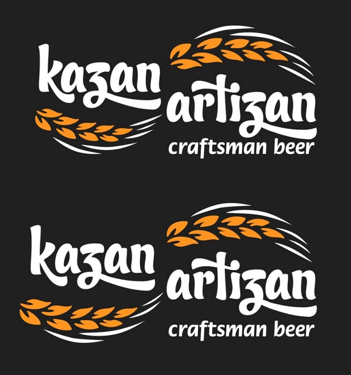
The top example below is yours. The bottom one reflects the small changes I would make if I were you.

The word Kazan is shorter than Artizan. Since you wanted the heads of barley to extend across each word, you’ve made the bottom head of barley smaller. This workaround doesn’t quite work, but a series of smaller changes would enable you to keep both heads the same size.

First, I would make the heads the same size, then remove the one beard hair from the bottom head.

Second, I would add slightly more horizontal space between the k and the a.

Third, lower the leg of the k just a little to add more vertical distance between it and the a.

Fourth, Stretch horizontally the word kazan ever so slightly.

Fifth, Allow the bottom head of barley to protrude to the left beyond the edge of the k. They don’t need to line up perfectly.

All these little cheats are less noticeable than the one big cheat of making the barley head smaller.

In addition, keeping the barley heads the same size extends the bottom head a bit lower, which enables you to move craftsman beer a little lower, creating a bit more leading and room to breathe between artizan and craftsman beer. This also creates room for a visually better alignment between the baseline of craftsman beer and the bottom of the head of barley. (The head of barley needs to be slightly lower than craftsman beer to counter the optical illusion of having both perfectly aligned.)
2 Likes

I didn’t seem to have any problem with it, but I did grow up in the era of learning cursive as a kid.

2 Likes

I like #2 the best!