Hi all, newbie here posting for the first time apart from intros.
I have been taking an online certificate course in typography from Calarts on Coursera. Although the course is well structured and easy to learn from, the downside is that it is peer reviewed. And normally it’s fine when peers critique properly, but it’s frustrating when you put in the effort to critique others’ work only to have yours reviewed by people who leave 1-2 word reviews like “nice” and “good job”. I was hoping for a little more elaborate feedback than that on this assignment because I want to know if there are flaws in my design and improve upon them.
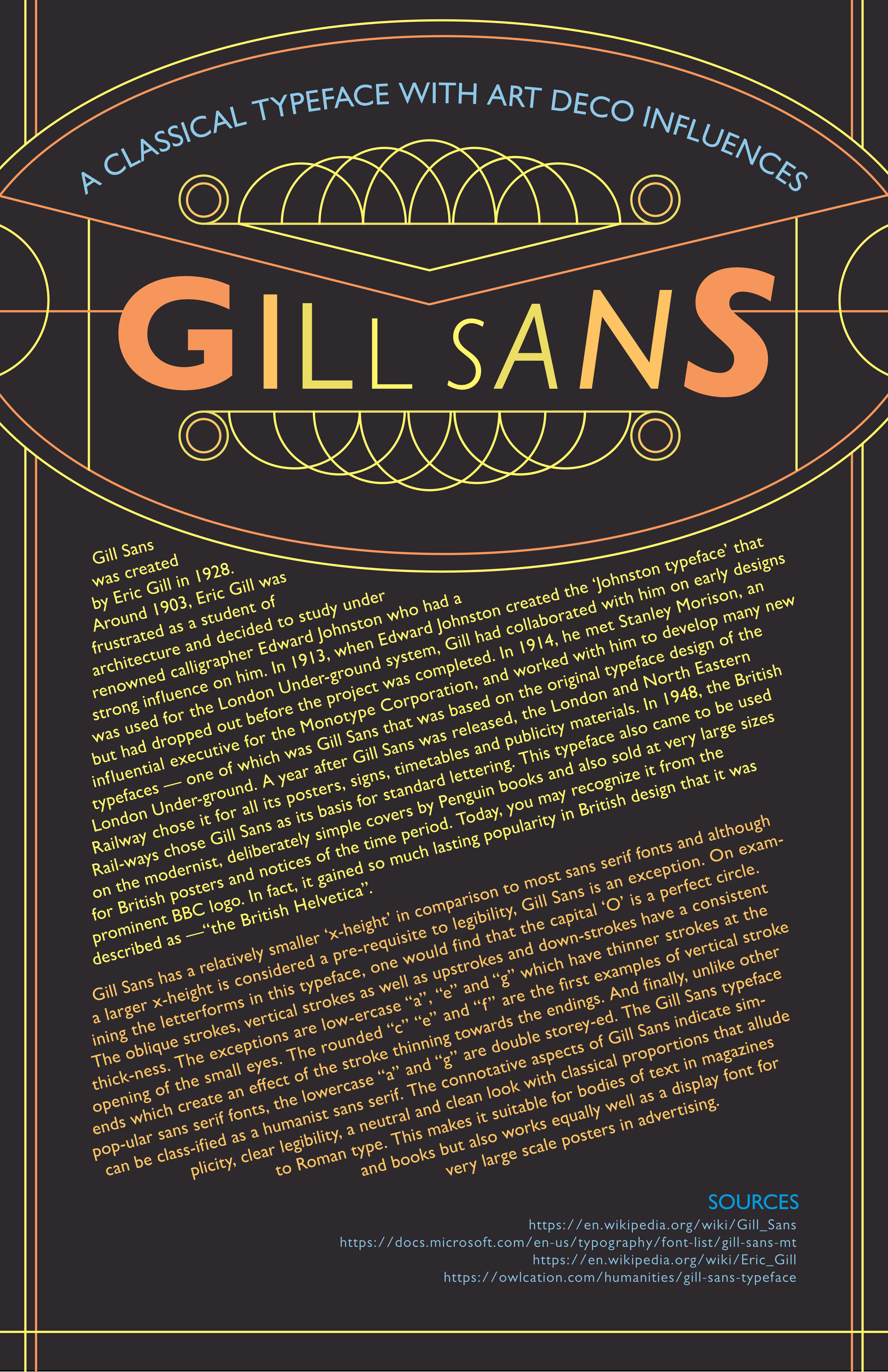
The assignment was to research a typeface, learn how to typeset it and in the final one make a typographic poster with that info using all concepts we had learned so far. The assignment also required us to note down our thoughts/feelings/ideas about the typeface and if it happened to be a person, what would their personality be.
My notes:
“For the title, I varied the weight, size and color of each letter to resemble symmetry found in architecture from that period. For the paragraphs, I’ve tried to depict feelings of upward movement and fun; a rise in arts and culture after the world war. I used elements of art deco in a minimalist way so as to not take away too much focus from the type. If Gill Sans were a person, I imagine they would be elegant and the refined sort - cultured and intellectual, yet slightly whimsical and someone who occasionally doesn’t play by the rules.”
Sorry for the long-ish post and thank you in advance to anyone who reads this and has any feedback to offer!