Hi All!
Can i please get feedback for my t-shirt designs?
The brief is as follows:
Awakened are a Progressive Metal band who are rising up in the scene. They are a four-piece band who come from Sydney, Australia. They met in school and formed an underground band practising in their garage and playing at friend’s parties, until they were old enough to play gigs in local pubs to get a bigger fanbase. Since then they got signed up to a record label, released their debut album and now in six months’ time, they are going on tour around Australia and we need some shirts made for our merch stand.
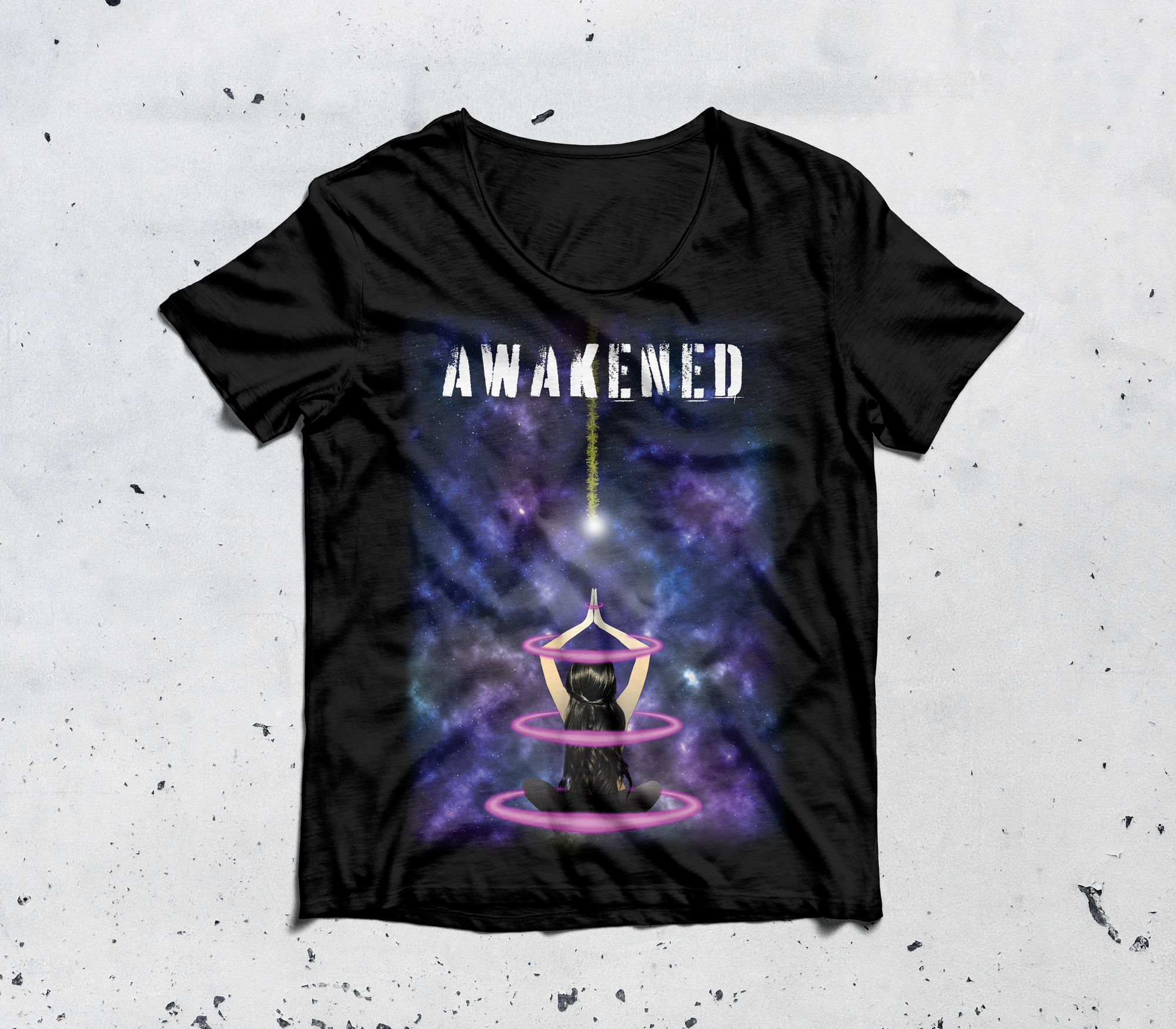
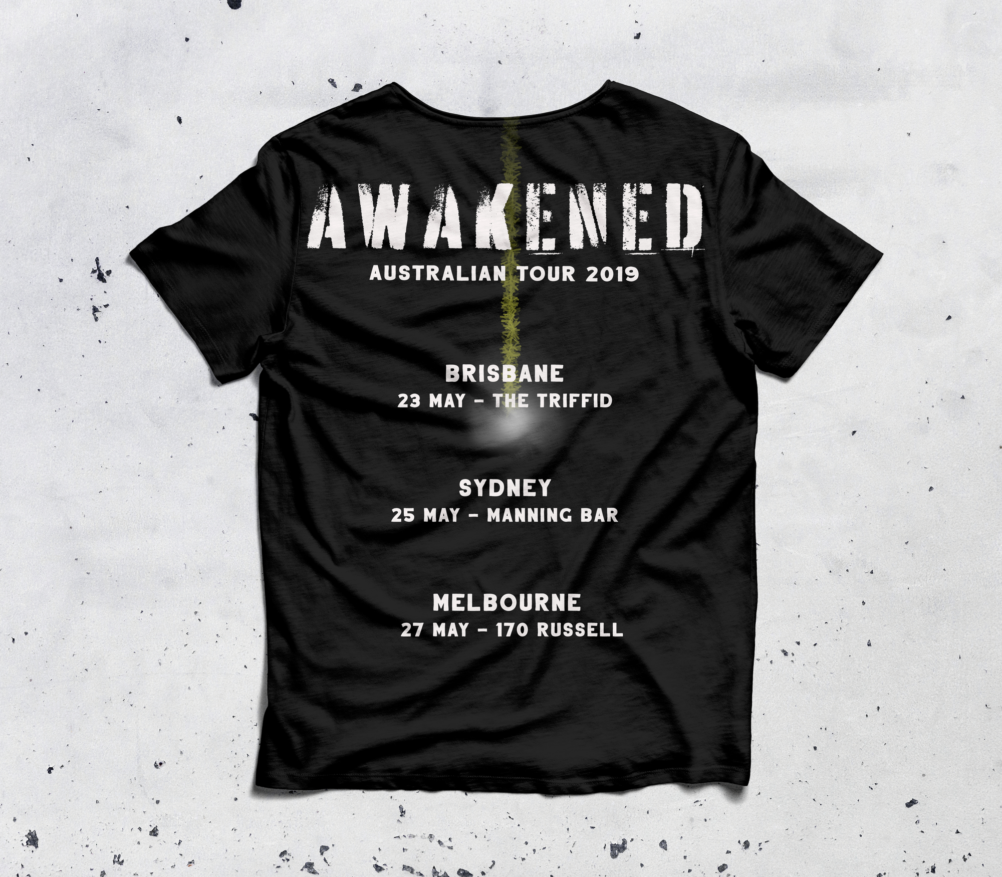
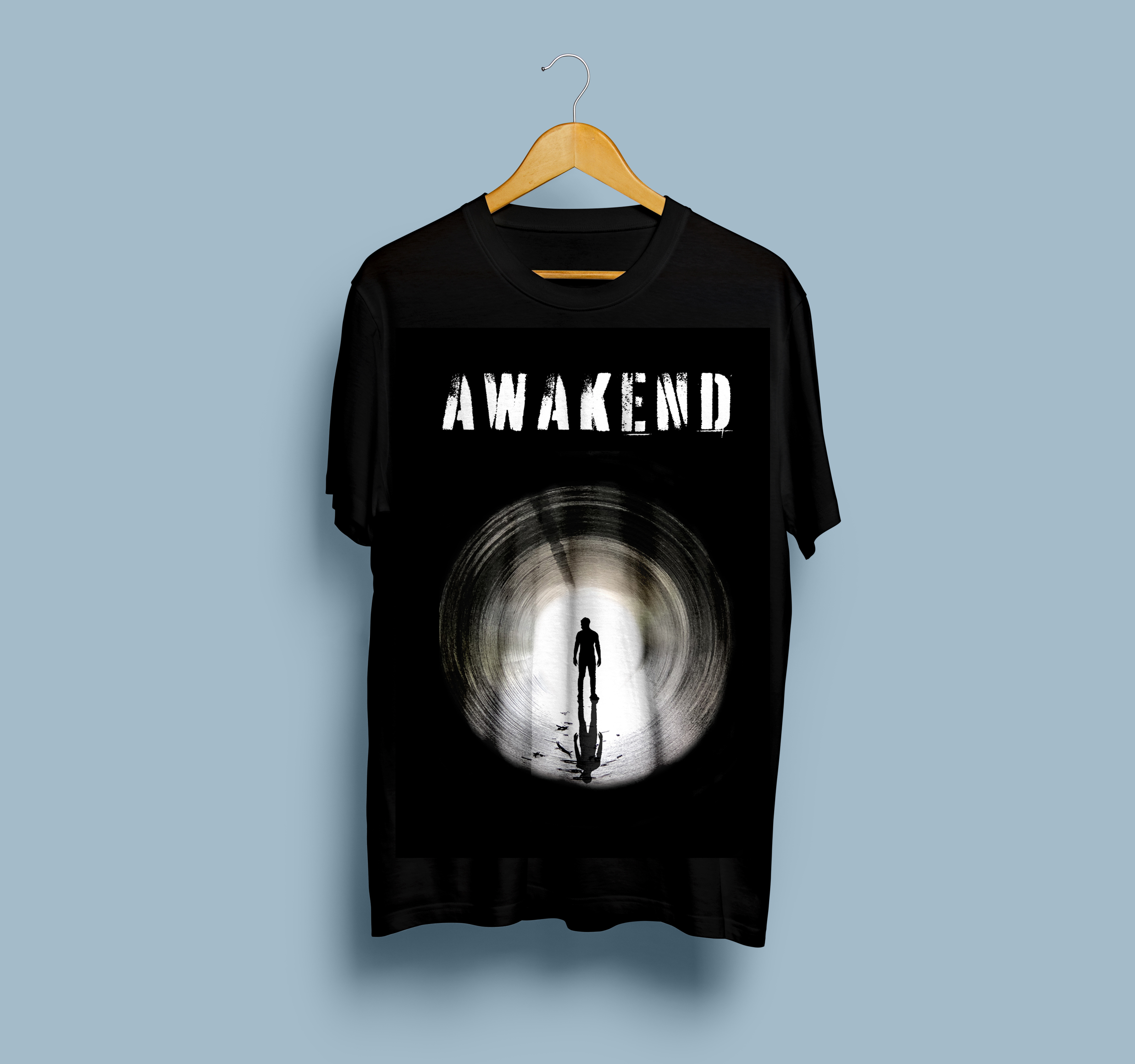
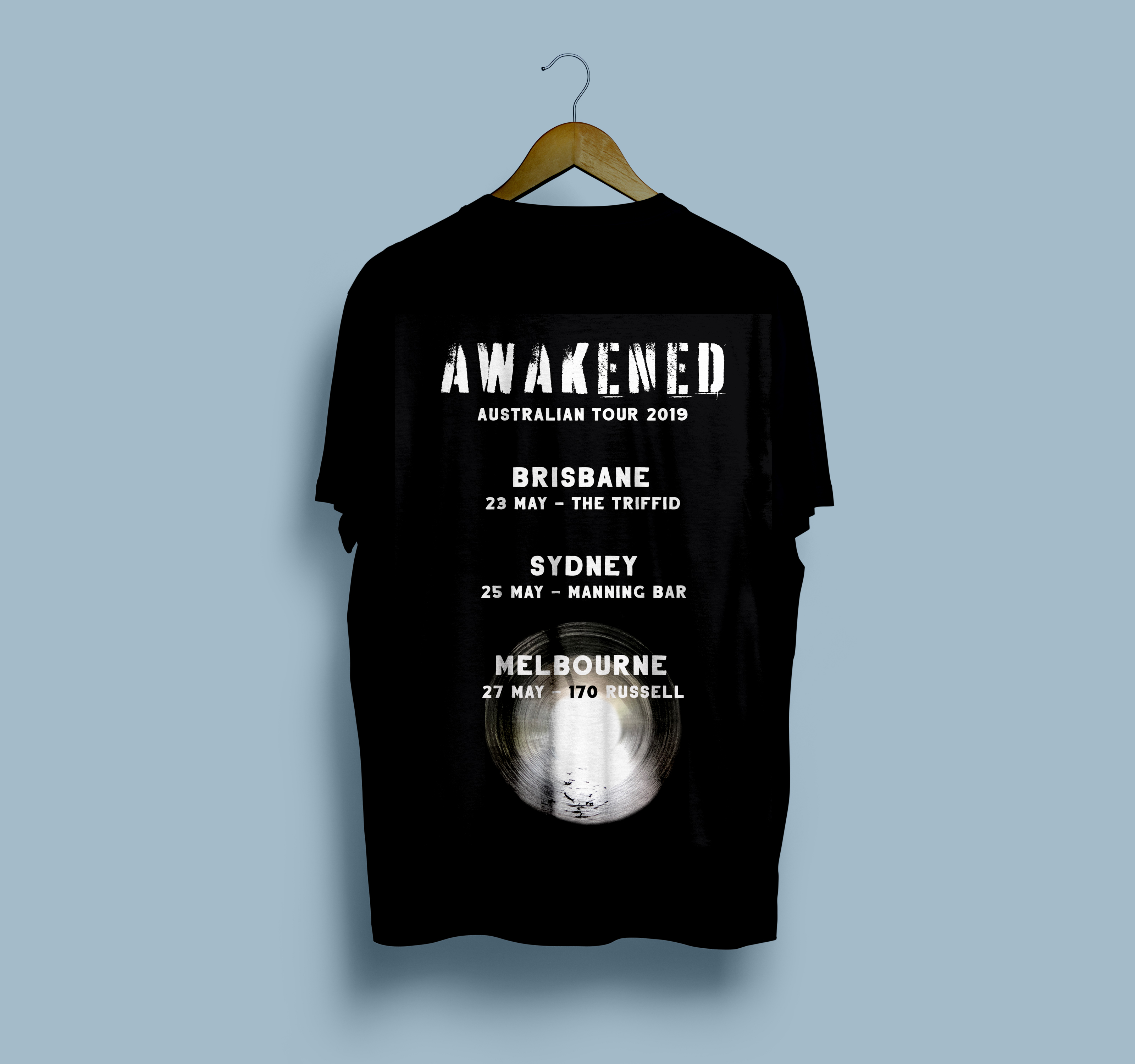
We require two different designs. One for our male fans and another for our female fans. The designs must suit black-coloured shirts and there will be a male and female style. They come in small, medium, large and extra-large.
Y’all know you typo-ed your way right out of this job, right?
And in the most horrible way.
Attention to detail… VERY important.
If those shirts had been produced and showed up to the show like that, not only would they only be selling women’s shirts, they’d look stupid, and you’d be out a lot of money. A whole lot of money. Damages could go beyond the price of the shirts.
As for different designs for different genders… as far as the graphic goes, I would be more inclined to stick with the tour theme (there usually is one,) not two totally separate themes. First of all, it’s cheaper for the band to produce the same design on different style shirts than to pay for an entire second set of film and screen charges for two different designs. But if their hearts are set on it, again, I’d still be more inclined to change just the color of the shirt and keep the designs true to the show theme.
Let me start by saying that you appear to have good taste and skill in tee design!
Putting aside the typo, I prefer the second tee. The first one has a cartoony feel to it. If you did it on purpose, then fair enough, but the second one isn’t cartoony, so… there’s a small lack of consistency there.
I’m not sure what guidelines you’ve been given either. The first tee has a “zen” feel to it. Metal bands are not normally about zen, but then this band is called Awakened (so maybe!). Having said that, the second tee looks like it’s about a guy who’s lost in the tunnel… so again, a bit inconsistent.
Having said all the above, the second tee to me is a completely legit heavy metal tee. I’d wear it!
The first tee I wouldn’t wear, because well… it’s a bit cartoony which I personally don’t like. However, I’ve seen many metal tees like it.
To conclude: if the band is not fussed about consistency and or the the symbolism, then both are legit tees (just fix the typos). However, if someone has a “bigger vision”, then maybe some more work needs to be done.
I am not a fan of metal in the least bit, so it will be tough for me to comment too specifically on the art and how well that works for the audience. But I will say that you need to work on balance, scale, and proportion – especially on the female design.